


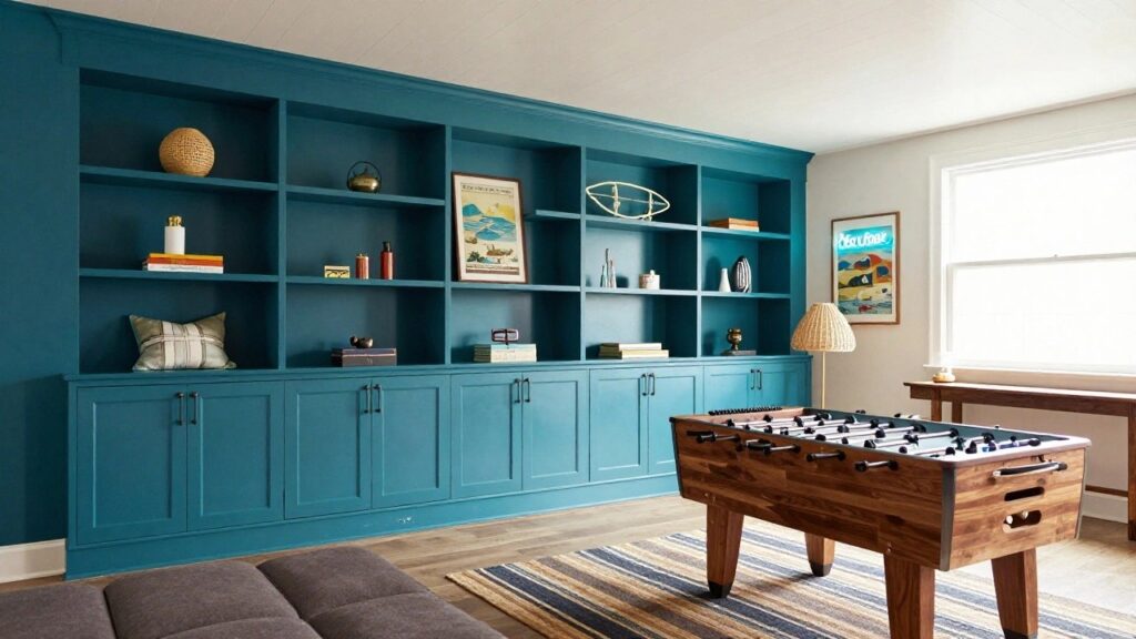
I’ve noticed that rec room walls ask for colors with real personality. They pull you in during game nights or lazy afternoons but never shout over the fun.
I once swatched a playful green that glowed warm in morning light yet cooled off nicely by evening, which sold me on testing bigger patches first.
Too many hues look vibrant on the chip but flatten out or clash once the room’s light hits them all day long. These hold up.
Turquoise Walls
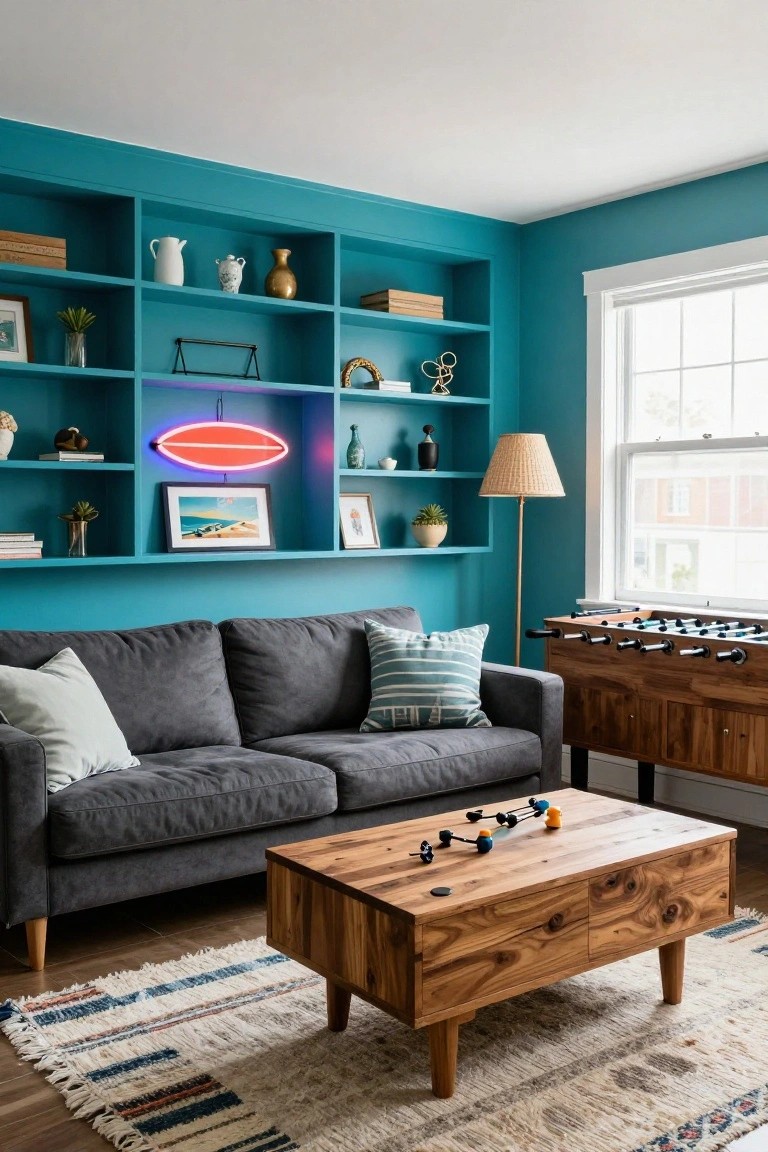
This rec room pulls off a bright turquoise on the walls and built-in shelves. It’s a lively blue-green in the turquoise family, closest to Sherwin-Williams Tropical Tide, Benjamin Moore Wythe Blue, or Behr Secret Aqua. Folks like it because it adds fun energy that plays right off wood furniture without getting too wild.
That blue undertone keeps things crisp and cool. It shines in spaces with window light and games like foosball, teaming up nicely with grays and warm tabletops. Steer clear of pairing it with too many pastels though… might wash out the kick.
Pale Sage Green Walls
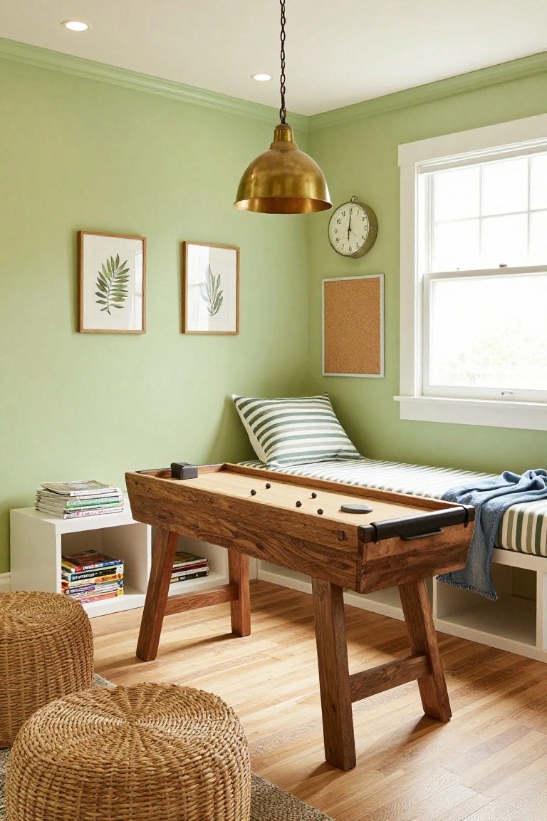
This pale sage green on the walls reads very close to Benjamin Moore’s October Mist or Sherwin-Williams Retreat. Behr’s Silver Sage feels right in the mix too. It’s a soft green from the sage family. Not too yellow. Not too blue. Just gentle enough to keep a rec room feeling lively without any shouting.
That warm undertone picks up nicely in good light. Pairs easy with wood like that foosball table here. White trim keeps it crisp. Try it where you want fresh but settled. Watch it can read grayer in dim spots.
Warm Peach Pink Walls

This soft peach pink covers the walls and ceiling here, giving a gentle warmth that’s lively but stays calm. It seems closest to Sherwin-Williams Peach Fuzz, or Benjamin Moore First Light, with Behr Dreamy Pink reading pretty similar too. Folks like it because it cozies up wood furniture without overwhelming the room.
That peachy undertone shines in sunny spaces like this rec room. Pair it with oak consoles and white trim to keep things fresh, and add plants for life. Just skip cooler grays. They can dull the glow a bit.
Sky Blue Walls
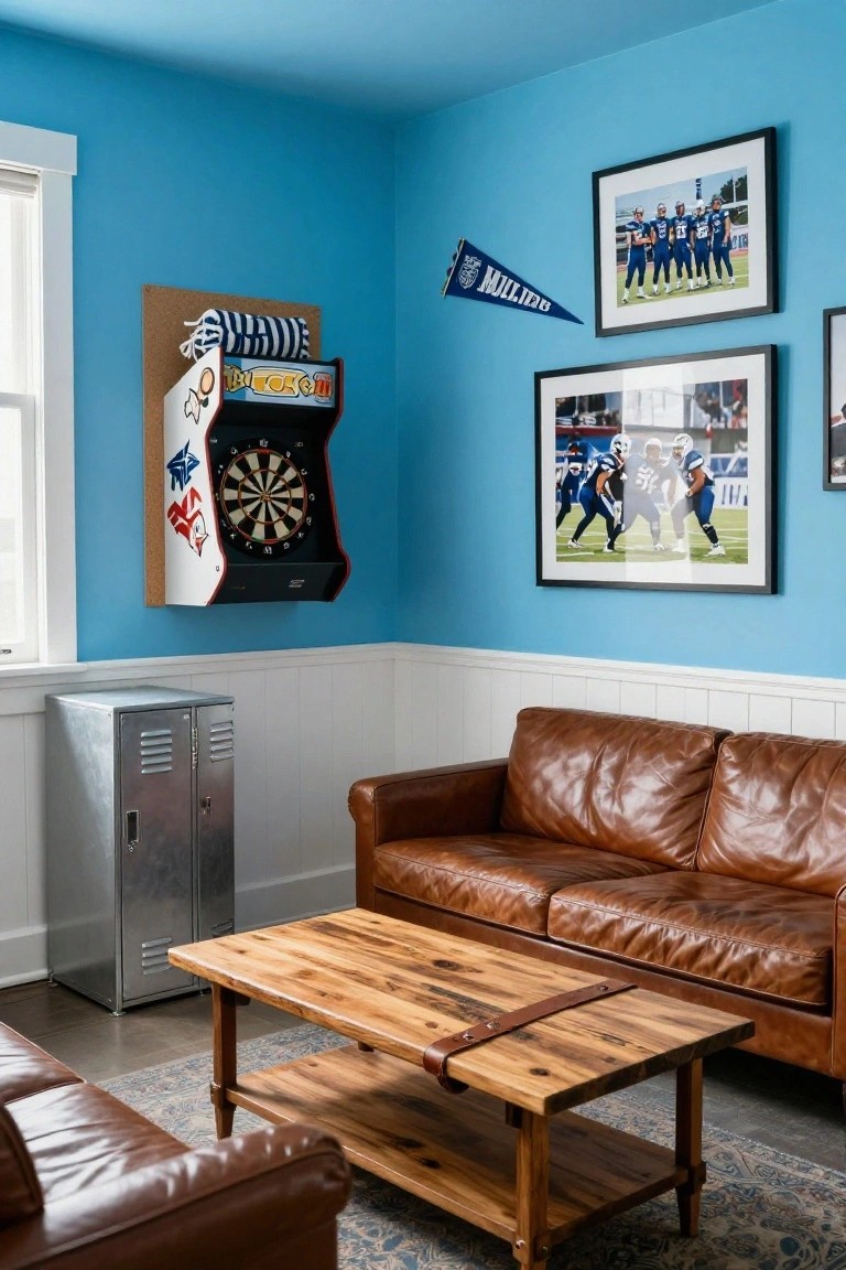
This rec room pulls off a bright sky blue on the walls that keeps things lively and fun. It’s that cool-toned blue family, and it reads very close to Sherwin-Williams Rain, Benjamin Moore Palladian Blue, or Behr Breeze. What stands out is how it bounces light around without shouting, especially next to the brown leather sofa and wood table.
The cool undertone here works best in rooms with good natural light, like near a window. Pair it with warm woods or navy accents to keep the energy up. Just watch it in dim spaces… it can feel a bit chilly then.
Sage Green Wainscoting

This room pulls off a soft sage green on the lower walls and door that feels just right for a rec room. It looks closest to Sherwin-Williams Clary Sage or Benjamin Moore Saybrook Sage, maybe Behr’s Silver Sage too. That kind of muted green adds a bit of life without overwhelming the space. It’s got enough color to notice but stays easygoing.
The warm undertones in this green work best with natural light coming through the windows. See how it sits next to the wood record shelves and that orange sofa. Pair it with warm furniture or rugs like the one here, and skip cooler grays that might dull it down.
Soft Lavender Walls

A pale lavender covers the walls in this rec room setup. It looks closest to Sherwin-Williams Lovie Dovie, with Benjamin Moore Lavender Mist or Behr Blue Lavender reading very similar. This shade brings a fun pop of color that’s lively but stays soft and easy on the eyes. It’s great for play spaces where you want energy without the shout.
That cool undertone plays right off wood toys and furniture, keeping everything looking fresh. It works best in rooms with decent natural light. Stick to white trim and neutral cushions alongside, and you’ll have a spot kids love without it feeling busy.
Muted Teal Walls
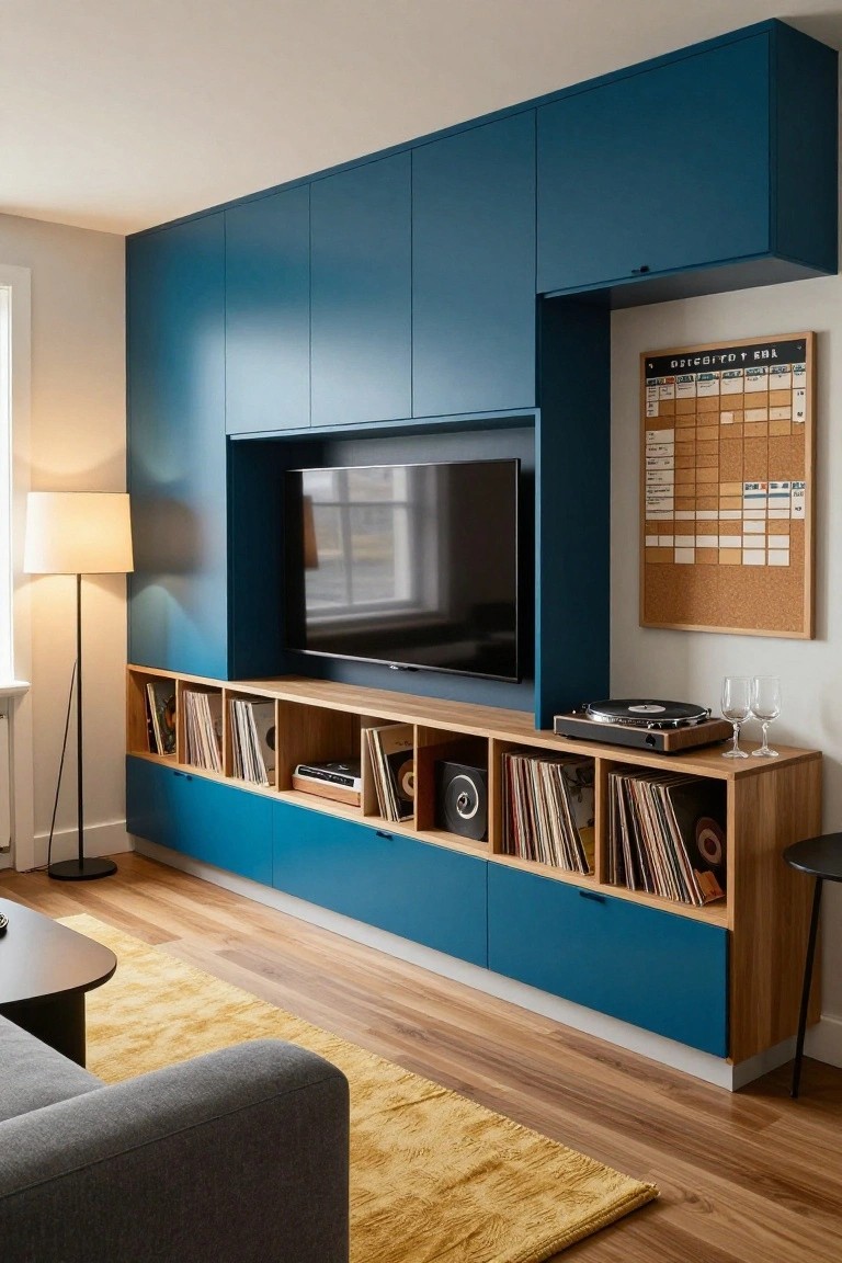
This rec room goes with a muted teal on the walls, the kind that seems closest to Sherwin-Williams Retreat or Benjamin Moore Palladian Blue, maybe even Behr’s Back to Nature. It’s a cool blue-green shade, not bold but lively enough to make the space feel fun. You notice how it plays off the dark bar cabinets without clashing.
The cool undertone keeps it fresh next to brass lights and wood shelves. It suits rooms with some window light best, where it won’t turn flat. Go for black stools or leather seating to balance it, and skip anything too yellow if the green starts reading cooler.
Pale Aqua Walls

These walls show off a pale aqua paint that’s got that soft blue-green vibe. It looks closest to Sherwin-Williams Sea Salt or Benjamin Moore Palladian Blue, maybe Behr’s Hint of Mint too. What I like about it for a rec room is how it brings in a beachy feel. Fresh and lively. But calm enough not to overwhelm.
The cool undertone picks up nicely in bright light, especially with an ocean view like here. It plays well off white sofas and wood floors. Built-in shelves in the same color keep everything tied together. In dimmer spots, though, add warm accents so it doesn’t go flat.
Warm Orange Walls

Warm orange walls give this rec room a fun kick. The color sits close to Sherwin-Williams Marigold or Behr Hula Orange, maybe Benjamin Moore Tangerine Spice too. It’s lively but stays grounded, especially around all the games and gadgets.
That golden undertone keeps it from going flat next to black cabinets or wood floors. Works best in spaces with good overhead light. Stick to gray sofas and neon accents to let the orange shine without overwhelming.
Pale Yellow Walls

This setup goes with a pale yellow on the walls that seems closest to Sherwin-Williams Pale Yellow or Benjamin Moore’s Pale Yellow. Behr’s Lemon Chiffon reads pretty similar too. It’s a soft, warm shade that brightens things up without shouting. Folks like it for rec rooms because it keeps the vibe light and cheerful. Pairs well with that skylight glow.
Warm undertones make the wood table and floor pop just right. It shines in spaces with decent natural light. Go for cream chairs and rugs like you see here to keep it cozy. Might wash out a bit in dim corners though, so test samples first.
Seafoam Green Walls
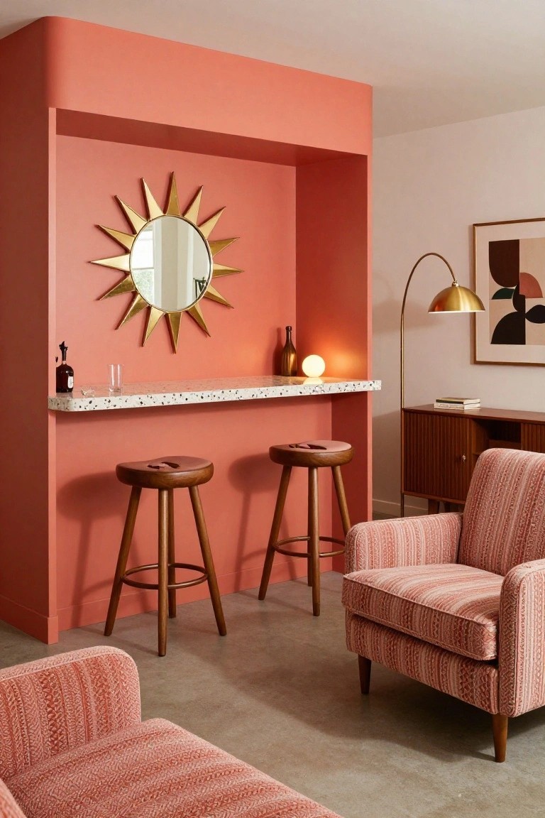
This rec room pulls off a soft seafoam green on the walls. It looks closest to Sherwin-Williams Sea Salt or Benjamin Moore Palladian Blue, maybe Behr’s Breezeway too. That kind of cool blue-green tint feels fresh and fun. Keeps the energy up for playtime but stays calm enough for everyday.
Sunlight through the big windows makes the color pop without getting too bright. It works best with natural wood like that table and pops against colorful touches, say a yellow door. Just pair it with warmer neutrals if the room runs cool overall.
Deep Navy Walls

This rec room goes with a deep navy blue on the walls. It seems closest to Sherwin-Williams Naval, Benjamin Moore Hale Navy, or Behr Midnight Blue. That kind of rich blue gives a fun backdrop without shouting. It keeps things lively around games and wood pieces.
The navy here leans cool but warms up next to the walnut TV stand. It works best in spaces with some ambient light, maybe spots for movie nights. Toss in mustard pillows or brass lamps to balance it. Just skip stark whites nearby.
Warm Terracotta Walls

That main wall shows off a warm terracotta, the kind of earthy red-orange that seems closest to Sherwin-Williams Spiced Cider or Benjamin Moore’s Moroccan Spice. Behr’s Terracotta Tile would be right in the mix too. It’s got enough depth to feel fun in a rec room but stays grounded next to all the wood and concrete.
The warm undertones keep it from going too bright. It works best where you have good light coming in, like here by the bar and fireplace. Pair it with natural woods or black metals, and watch how it makes leather furniture pop just right.
Vibrant Turquoise Walls

These walls go with a bright turquoise paint that punches up a rec room without going overboard. It looks closest to Sherwin-Williams Buoyant Blue or Behr Blue Atoll, maybe Benjamin Moore’s Wythe Blue too. Folks like it because it bounces light around and makes wood details pop, like those beams overhead here.
The cool blue-green undertone keeps it fresh in sunny spaces. It pairs easy with warm tans on a sofa or colorful rugs. Just skip heavy dark furniture… it might dull the vibe a bit.
Blush Pink Walls

A soft blush pink covers these walls, landing close to Sherwin-Williams “Blush” or Benjamin Moore “First Light,” maybe Behr “Dreamy Pink” too. It’s that warm pink family, light and easygoing. Folks like it for rec rooms since it perks up the space around a ping pong table without yelling.
Warm undertones keep it from going cool or flat. Good light makes it glow a bit, and it sits right with wood furniture and green plants. Try it where you want fun that doesn’t overwhelm.
Deep Green Ceiling Beams

That deep green paint on the ceiling beams, trim, and fireplace mantel pulls the room together nicely. It’s a rich hunter green with some warmth to it. Looks closest to Sherwin-Williams Rookwood Green or Benjamin Moore Hunter Green HC-113, maybe Behr’s Deep Emerald too. People go for this color because it feels lively around all the wood and leather without taking over.
The undertone stays cozy next to the oak floors and stone hearth. It shows up best with daylight from the windows. Stick to browns and plaids like the throw here, and watch it doesn’t get too dark in low light spots.
Pale Blue Walls

This pale blue on the walls looks closest to Sherwin-Williams Palladian Blue, or maybe Benjamin Moore Breath of Fresh Air and Behr’s Blue Whisper. It’s a soft, cool-toned blue that’s light and easygoing. Folks like it because it freshens up a space without shouting, and here it lets the wood table really shine.
That gray undertone keeps it from going too baby blue, especially under regular indoor lights. It works best in rooms with wood pieces or simple cabinets. Watch for pairing it with warm neutrals so it doesn’t feel chilly.
Blush Pink Walls

The walls show off a soft blush pink. It falls right in the warm pink family and reads very close to Sherwin-Williams Pink Chablis, Benjamin Moore Blush, or Behr Powder Blush. Folks like this color for rec rooms because it’s got that fun, happy lift without getting too bold. Notice how it holds up next to the woven macrame and those colorful pillows.
The peachy undertone keeps it cozy, especially under bright light. It works best around natural wood like the table here and lots of greenery. In your rec room, try it for a laid-back hangout spot. One thing… go easy on cool grays so it stays warm.
Soft Teal Double Doors

Those tall double doors show off a soft teal paint that seems closest to Sherwin-Williams Rain or Benjamin Moore Palladian Blue. Behr’s Blue Atoll reads pretty similar too. It’s a muted blue-green, cool but not chilly, that adds just enough color to a rec room without shouting. Kids’ climbing holds on the wall next to it look right at home.
The gray undertones help it sit quietly against white shiplap walls and warm wood floors. Natural window light keeps it lively. Pair with beige couches and wicker for easy play. In dimmer spots it can pull more blue, so test samples there first.
Warm Beige Walls

Those walls show a nice warm beige, the kind that sits closest to Sherwin-Williams Accessible Beige or Benjamin Moore Edgecomb Gray. Or maybe Behr’s Wheat Bread. It’s got just enough depth to feel homey in a rec room, without going too dark or flat.
That warm undertone picks up the wood floors nicely and lets the blue door and sofa stand out. Works best in rooms with good natural light, or pair it with colorful accents to keep things fun. Watch for cooler bulbs though, they can make it look a bit gray.
Bright Teal Cabinetry

This setup uses a bright teal on the cabinets and built-in shelves. It reads close to Sherwin-Williams Mayan Jade or Benjamin Moore Hollingsworth Green, maybe even Farrow & Ball St Giles Blue. That blue-green shade brings lively energy without shouting. It’s got enough saturation to stand out against the wood table and light walls.
The color picks up a greenish undertone in sunlight, which keeps it feeling fresh next to natural wood chairs and floors. Pair it with neutrals and plants for a rec room that stays fun and usable. Just test it in your light first, since it can shift a bit cooler in shade.
Frequently Asked Questions
Q: How do I test these colors before painting the whole room?
A: Snag paint samples from the store and brush them onto foam board. Prop the boards in different spots around your rec room over a few days. Watch how they shift with your lights and moods, then commit to the winners.
Q: My rec room’s tiny. Won’t lively colors make it feel smaller?
A: Paint the walls a light base color first, like pale aqua. Add pops on furniture or one fun accent wall. That keeps energy high without closing in the space.
Q: Got rowdy kids and game nights. Will these colors stain or fade fast?
A: Pick paints with a satin or eggshell finish. They scrub up easily after spills or marker mishaps. And… lighter lively shades camouflage everyday wear better than dark ones.
Q: Basement rec room here, no windows. Can these ideas still work?
A: Lean into warm hues like coral or mustard yellow. They wake up dim spaces and make everything cozier. Layer in lamps to amp the glow.
