


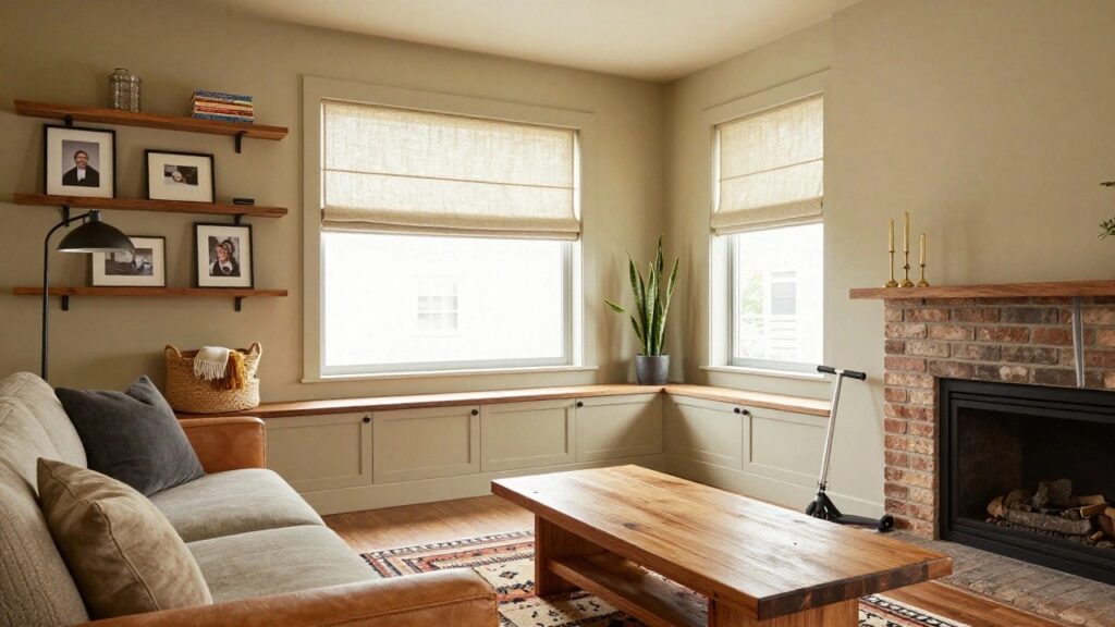
Basements have that dim, tucked-away light that can make even the coziest paint color feel off if you don’t plan for it.
I’ve found colors with gentle brown or terracotta undertones hold their warmth best down there, while some popular beiges just flatten out against concrete walls.
A few years back, I tried a soft greige in mine that promised family-room vibes but looked drained until I layered in lamps.
Real rooms reveal the truth.
Paint a few samples across your walls at different times of day to see what truly warms the space.
Soft Greige Walls
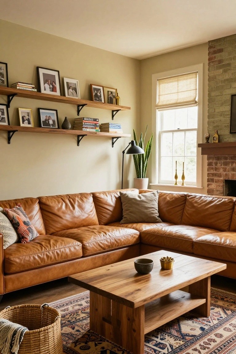
This soft greige on the walls reads very close to Sherwin-Williams Accessible Beige or Benjamin Moore Revere Pewter. It’s that easy warm neutral with just enough yellow undertone to feel cozy without going too yellow. Folks like it because it lets wood furniture and leather seating pop nicely, like you see here with the tan sofa.
Pair it with warm brick or wood accents, and it works best in rooms with decent natural light. Watch for north-facing basements though, it might pull a bit gray there. Still a solid pick for family spaces.
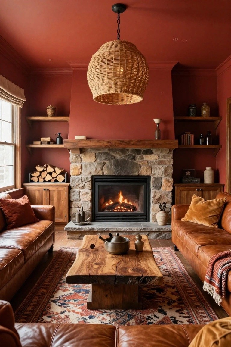
Warm Terracotta Walls

This terracotta red on the walls and ceiling pulls the room together in such a cozy way. It looks closest to Sherwin-Williams Reddened Earth or Benjamin Moore Moroccan Spice, that kind of muted red with orange warmth. Folks like it for basements because it makes the space feel wrapped up and lived-in, especially next to wood cabinets and those velvet couches.
The undertone stays earthy without tipping too orange under basement lights. It works best with creamy trim and natural wood pieces. Just keep cooler grays away or it might fight a bit.
Warm Mustard Walls
This wall paint pulls off a soft mustard yellow that’s got that cozy glow going on. It reads very close to Farrow & Ball Babouche, or maybe Sherwin-Williams Cornmeal, Benjamin Moore Golden Straw, and Behr’s Golden Nugget. Warm yellows like this keep things feeling sunny and easy, especially when you’ve got wood tones nearby.
The golden undertones play nice with natural light coming through the windows. It wraps around shelves and cabinets without overwhelming them. Great for family spots where you want warmth that lasts through evenings too. Just watch it doesn’t go brassy under too many warm bulbs.
Deep Navy Walls

This setup goes with a deep navy blue on the walls. It seems closest to Benjamin Moore Hale Navy or Sherwin-Williams Naval, maybe Behr’s Blue Horizon too. It’s a strong color that turns a basement into something cozy and put-together, especially next to light woods and cream furniture like the sofa here.
That navy has a cool undertone with just enough depth to handle low light without going flat. It works great in family rooms where you want to hide wear and still feel wrapped up. Stick to pale pillows and plants for balance, or it can start to feel a bit heavy.
Soft Blush Pink Walls

This soft blush pink on the walls and built-in bookcase seems closest to Farrow & Ball Setting Plaster, or maybe Sherwin Williams Rosé and Benjamin Moore First Light. It’s a warm pink with just enough peach to feel inviting, not girly. Folks like it because it warms up a space quietly, especially with white trim keeping things crisp.
That subtle warmth shows best against wood like the coffee table here. It suits family rooms or basements with decent light. Pair with cream fabrics and natural rugs. In dim spots it can pull a bit gray, so test samples first.
Soft Greige Walls
This soft greige on the walls and built-ins comes across closest to Sherwin-Williams Agreeable Gray, Benjamin Moore Edgecomb Gray, or Farrow & Ball Skimming Stone. It’s a warm neutral that sits just right between gray and beige, making a basement family room feel snug and easygoing. People go for shades like this because they play well with wood furniture and stone without overpowering anything.
The subtle warm undertones keep it from looking cold, especially next to oak floors or a limestone mantel like here. It works best in rooms with some natural light or warm bulbs. Pair with off-whites on ceilings and brass accents, and you’ve got a setup that’s practical for everyday family hangouts. Just test samples, lighting can shift it a bit cooler.
Warm Terracotta Walls

This warm terracotta color on the accent wall looks closest to Sherwin-Williams Rookwood Red or Benjamin Moore’s Potters Clay. Behr’s Spiced Cider reads pretty similar too. It’s that kind of earthy red-brown that feels grounded and homey right away. People go for it because it wraps the room in coziness without being too bold, especially nice around a fireplace like this one.
The warm undertones keep it from going orange in most lights, though it might read a bit deeper in a dim basement. Pair it with light wood shelves and a neutral sofa to let the beams and tile stand out. Just test samples near your trim first.
Soft Yellow Walls
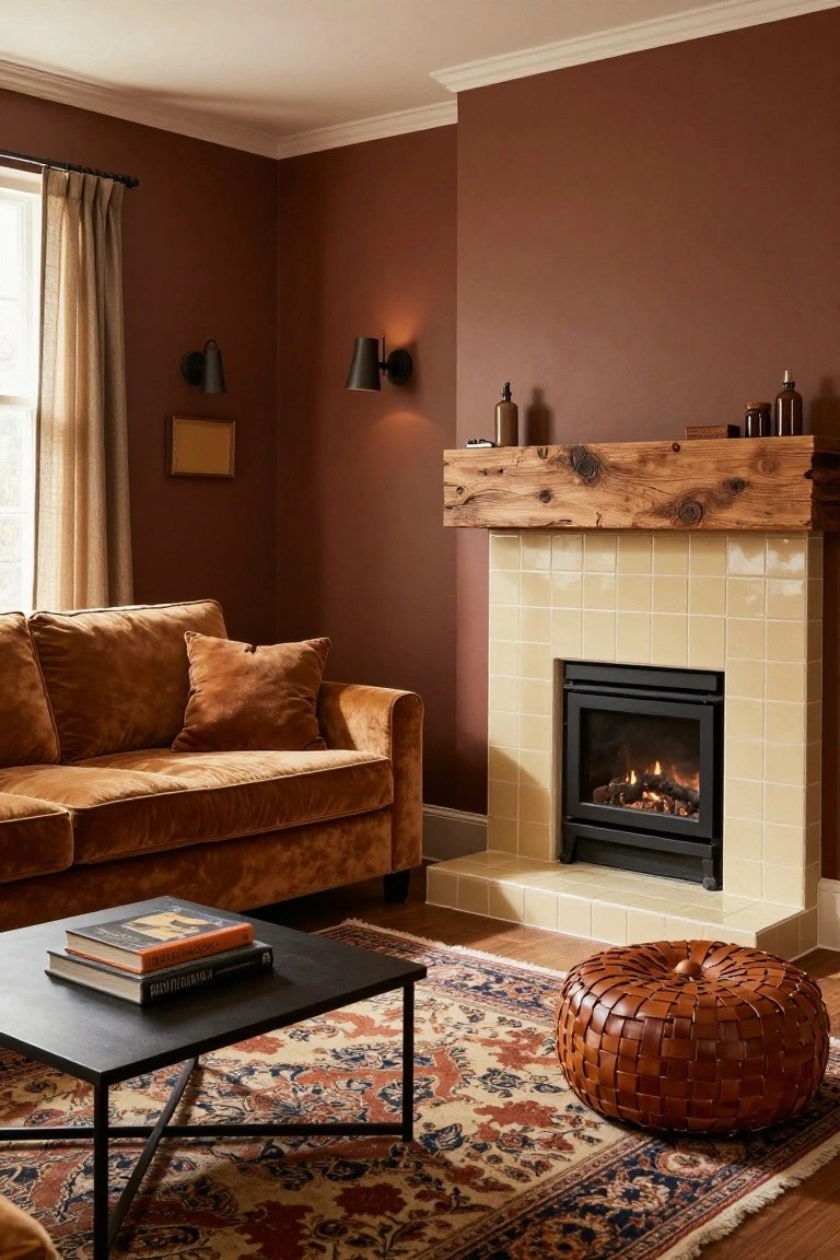
This soft yellow paint reads very close to Sherwin-Williams Corn Silk or Benjamin Moore Golden Straw. Maybe Behr Golden Fleece too. It’s a gentle warm yellow that feels sunny without being too bright. Folks like it because it makes a room cozy right away, especially with all the wood tones around.
The golden undertone picks up light nicely and keeps things feeling warm even on cloudy days. Pair it with beige furniture or natural wood like that coffee table here. It works best in family spaces where you want easy comfort. Just test it first if your basement gets dim.
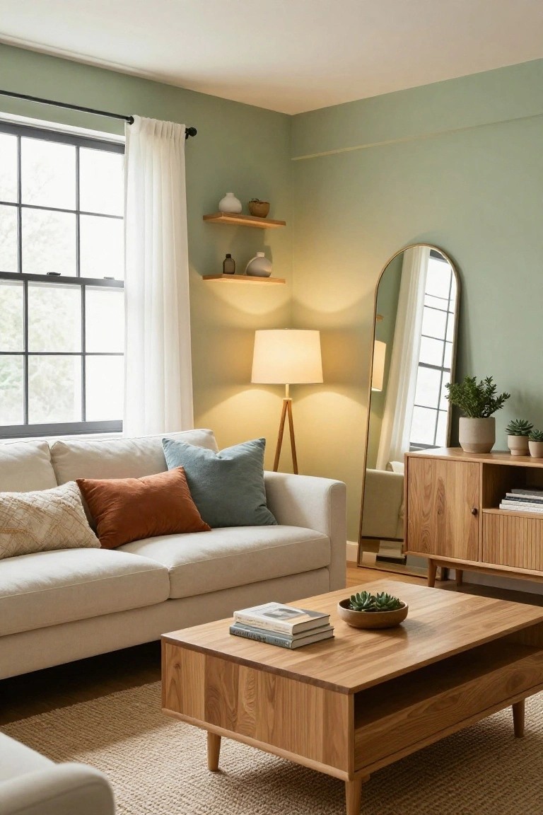
Light Seafoam Walls
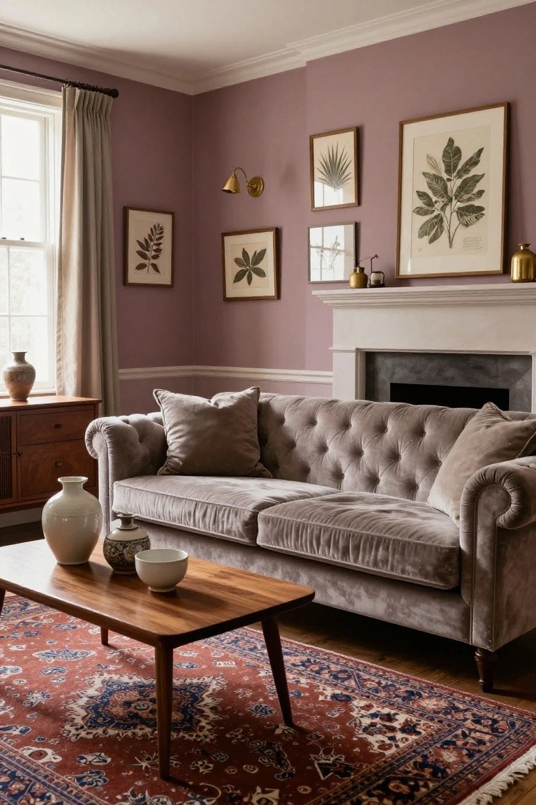
This light seafoam green on the walls looks closest to Sherwin-Williams Sea Salt or Benjamin Moore Palladian Blue. Behr’s Clear Sky reads pretty similar too. It’s a cool pastel that keeps a basement from feeling closed in. Folks like it because it bounces light around nicely, especially with white trim.
The blue-green undertone shows up more in brighter rooms. Here it sits well next to navy cabinets and a wood coffee table. Watch for north-facing basements though. It might lean cooler there, so test a sample first.
Soft Sage Green Walls
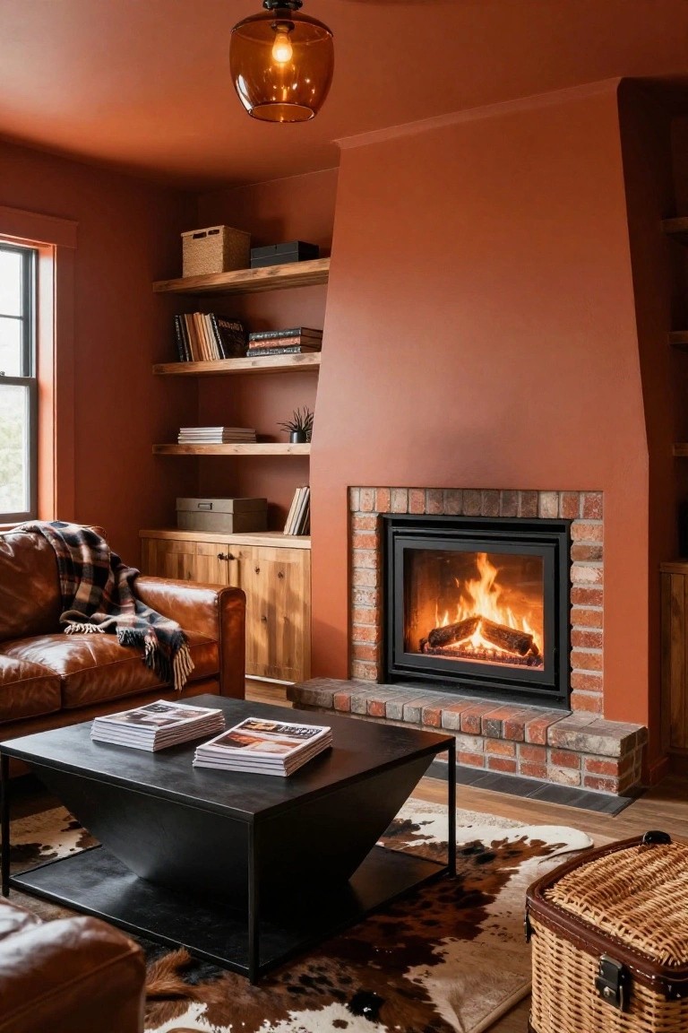
This soft sage green on the walls gives a cozy, lived-in feel that’s perfect for a basement family room. It sits in that nice muted green family and looks closest to Sherwin-Williams Clary Sage SW 6178, Benjamin Moore Saybrook Sage HC-114, or Farrow & Ball French Gray No. 18. Folks like it because it keeps things warm and inviting, especially next to wood floors and leather like on that sofa.
The gray undertone helps it read calm under lower lights, no harsh vibes. It pairs easy with brass lamps or plaid throws. Just go easy on bright whites for trim, or it might feel a touch cool.
Soft Sage Green Walls

This room uses a soft sage green on the walls that gives off such a calm, lived-in feel. It sits closest to Sherwin-Williams Clary Sage SW 6178, Benjamin Moore Saybrook Sage HC-114, or Farrow & Ball French Gray No.18. Folks like it because it’s neutral enough for everyday use but adds that subtle earthy touch, especially next to warm wood shelves.
The color has warm gray undertones that keep it from going too cool in dimmer light. Pair it with gray sofas and natural fibers like that sheepskin throw, and it works great in basements. Just test samples first. Lighting can shift it greener.
Warm Terracotta Walls

This basement setup uses a warm terracotta on the walls that reads close to Sherwin Williams Spiced Cider or Benjamin Moore Potters Clay. It’s an earthy orange-brown with real coziness, especially next to that leather sofa and wood stove. People go for it because it pulls in the firelight without overpowering the space.
The warm red undertone keeps things feeling homey in lower light, like a basement family room. Pair it with natural wood tones or black metal accents, and it works. Just test samples first. Basements can shift colors under their own lighting.
Soft Blue Gray Walls

This muted blue gray on the walls and built-ins reads a lot like Sherwin-Williams Sea Salt or Benjamin Moore’s Gray Owl. Sometimes Farrow & Ball’s Skylight too. It’s a cool shade with just enough depth to feel cozy without closing in the room. People go for it in family spaces because it lets wood tones and soft whites shine right through.
That grayish undertone keeps it from going too beachy. It sits nice next to fireplaces or in lower light, like a basement setup. Pair it with light oak floors and striped pillows. Just watch the trim, creamy white works best or it can look stark.
Warm Terracotta Walls
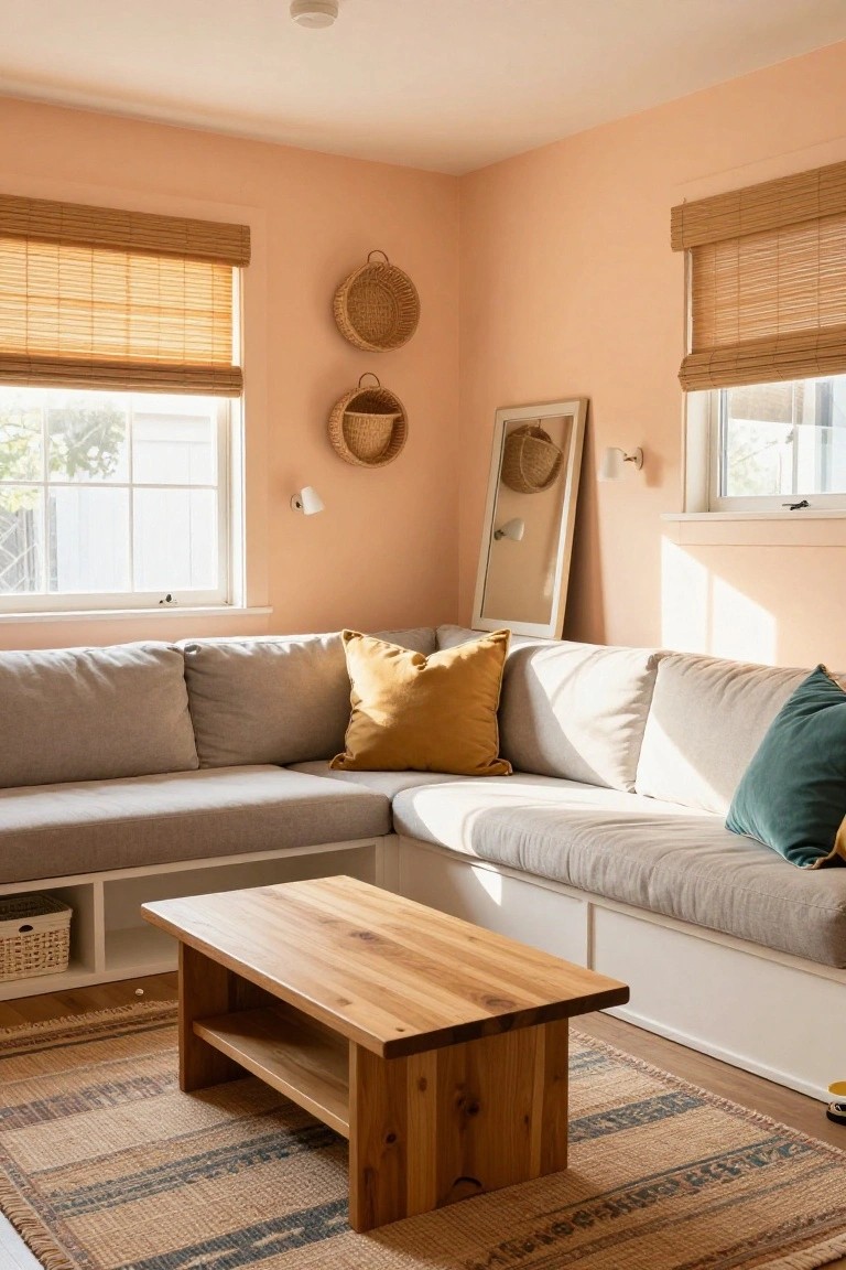
These walls pull off a nice warm terracotta shade. It looks closest to Sherwin-Williams Spiced Cider or Benjamin Moore Potters Clay, maybe Behr Terracotta Flowerpot too. That kind of earthy red-orange keeps things feeling homey and lived-in, not overpowering at all.
The orange undertones really warm up the room… perfect for a basement where you want that family feel. It sits well next to olive greens like on the sofa here and wood furniture. Just watch it in super bright light, might lean too red.
Soft Blush Pink Walls
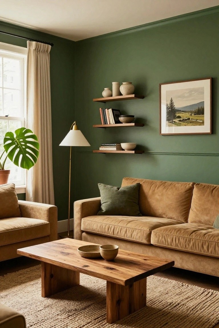
This soft blush pink on the walls pulls off a neutral look that feels closest to Sherwin-Williams Setting Plaster, or maybe Benjamin Moore’s First Light or Farrow & Ball’s Setting Plaster. It’s one of those warm pinks with just enough beige to stay easygoing, not candy-sweet. Folks like it because it adds a little life to a room without overwhelming the furniture or art.
The undertone leans warm and dusty, so it plays well next to oak wood tones like on that low TV console. Down in a basement, it’d brighten things up under softer lights. Watch for pairing with cool grays though, might fight a bit. Stick to natural woods, marble tops, and creamy rugs to keep it family-room cozy.
Warm Brick Red Walls

Those red brick walls catch your eye right away. It’s a warm brick red, the kind that feels cozy and lived-in. Looks closest to Sherwin-Williams Brick Paver or Benjamin Moore Caliente, maybe Behr Spiced Brick too. What I like is how it brings real warmth to a basement without overpowering things.
The warm undertones keep it from going too orange or pink. It works best with wood furniture like that credenza and some green accents, as you see here with the sofa. In basement lighting, it just glows a bit. Watch for pairing it with too much cool gray though.
Soft Creamy Walls
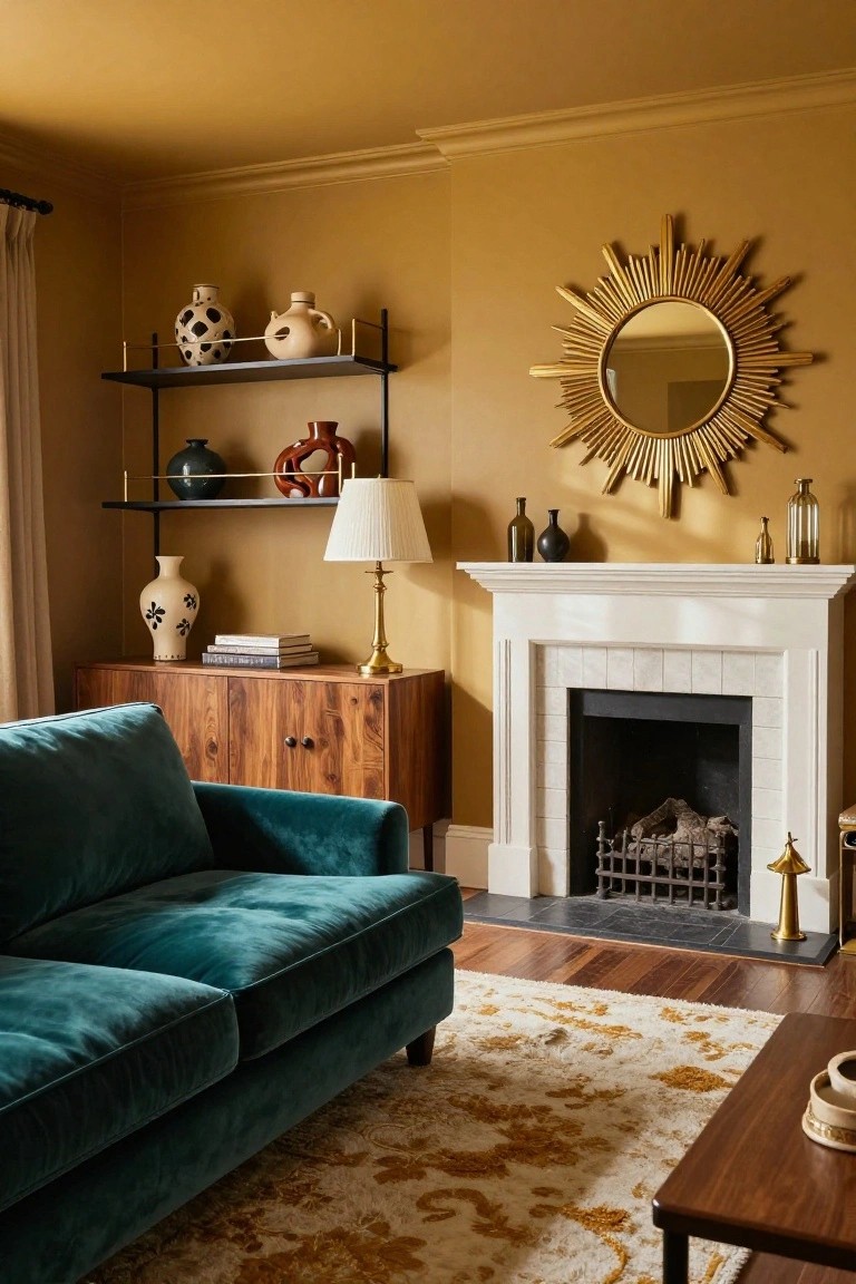
These walls pull off a warm creamy beige that’s super cozy for family spaces. It reads closest to Sherwin-Williams Alabaster or Benjamin Moore’s White Dove, with maybe a nod to Behr’s Swiss Coffee too. That gentle tone keeps things light but inviting, especially next to natural wood like the coffee table here.
The warm undertones make it perfect for basements, where it bounces light around without washing out. Go for it with blue fabrics and woven textures. Just test in your lighting first… it can shift a bit.
Soft Sage Walls

This soft sage green on the walls feels like a cozy pick for basements, reading closest to Sherwin-Williams Retreat or Benjamin Moore October Mist. Or maybe Behr’s Silver Sage if you’re shopping there. It’s that muted green family with just enough warmth to make a family room feel lived-in and calm.
The undertone leans gray-green, which plays nice next to wood tones like the coffee table here or navy fabrics. It works best in rooms with some natural light. Avoid pairing with too much cool white trim, or it can look flat.
Dusty Mauve Walls
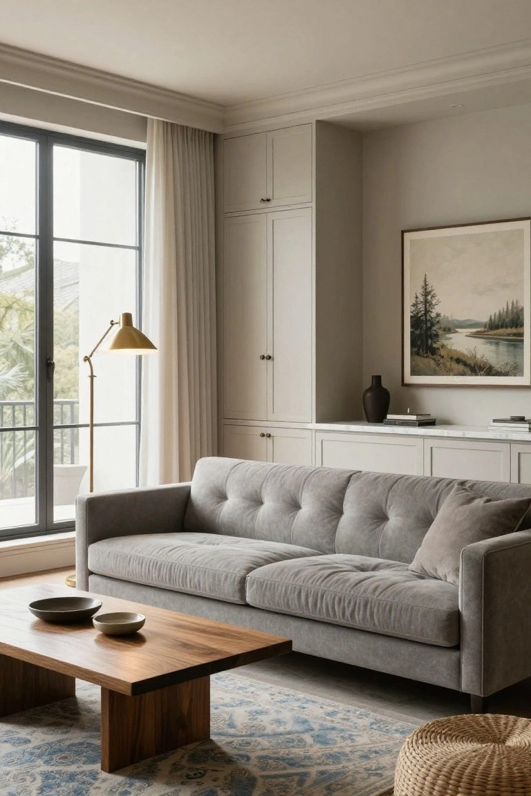
A dusty mauve like these walls gives your basement that soft, lived-in warmth without shouting. It sits closest to Sherwin-Williams Rain or Benjamin Moore Silver Marigold, maybe Behr’s Dreamy Lilac too. You see how it plays nice next to the gray sofa and wood table. People go for this color because it feels cozy right away, especially in family spaces.
The warm pink undertone keeps things friendly under basement lights. It works best with natural wood, terracotta throws, and neutral rugs like the seagrass one here. Watch that it doesn’t pull too gray in north-facing rooms… test it out.
Warm White Walls
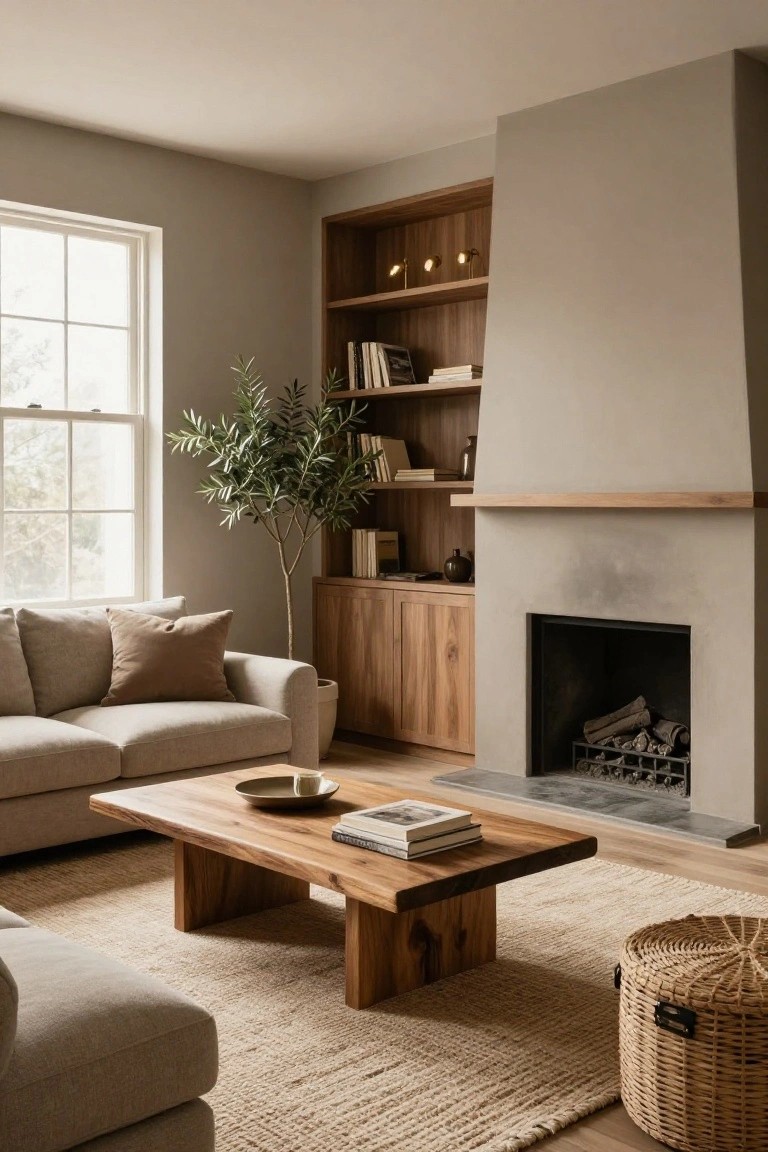
This warm white on the walls seems closest to Sherwin-Williams Alabaster or Benjamin Moore White Dove, maybe even Behr’s Wheat Bread. It’s a soft off-white with just enough cream to keep things cozy in a basement. You see how it makes that big redwood bar pop without competing.
The warm undertone plays right off the wood tones here. Good for family rooms with low light… pairs easy with leather furniture or natural floors. Skip cool grays if you want that same relaxed feel.
Warm Beige Walls
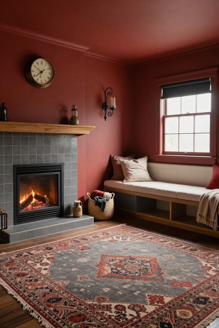
These walls pull off a warm beige that’s just right for a family room. It reads close to Sherwin-Williams Accessible Beige or Benjamin Moore Edgecomb Gray, maybe even Behr’s Toasted Almond. That soft tone keeps things relaxed without going too yellow or gray. People go for it because it makes wood floors and furniture pop nicely, like the navy sofa sitting there.
The undertone leans golden, which works great in basements with limited light. Pair it with deeper blues or rust rugs to keep the warmth going. Watch for north-facing rooms though. It can pull cooler there.
Pale Warm Beige Walls

The walls in this setup go with a pale warm beige that seems closest to Sherwin-Williams Accessible Beige or Benjamin Moore Edgecomb Gray. Or Behr’s Toasted Almond if you’re shopping there. It’s the sort of easy neutral that lets wood furniture and brick details stand out without competing. Folks like it because it keeps things calm and livable.
Warm golden undertones give it life around a fireplace like this. It suits basements fine, especially with decent window light. Pair with tan sofas or jute rugs, and it pulls the room together. Just test samples, since it can read a touch yellower in some spots.
Warm Terracotta Walls

This terracotta orange on the walls seems closest to Sherwin-Williams Spiced Cider or Benjamin Moore Potter’s Clay. Or maybe Behr’s Spiced Brandy too. It’s an earthy warm orange that settles right into a room without overpowering things. People go for it in family spaces because it adds that lived-in coziness, especially next to wood furniture.
Golden undertones make it pick up light well, like on this wooden credenza stacked with records. It works great in basements with some windows for that glow. Pair with grays and plants to keep it relaxed. Just test samples if your light is dim.
Deep Maroon Walls
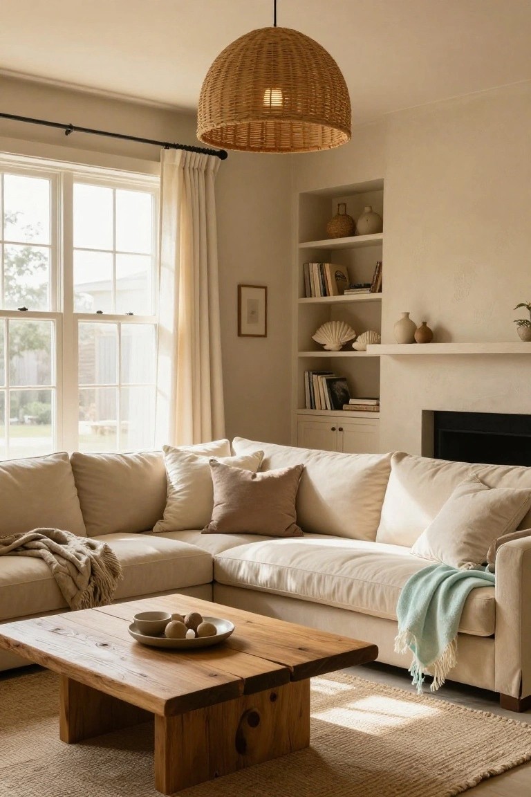
This deep maroon on the walls sits right in the burgundy family. It reads very close to Sherwin-Williams Rookwood Red, or Benjamin Moore Black Mission Fig, maybe Behr Moorish Spice too. What stands out is how it wraps the room like a hug, especially next to that white fireplace and bookshelves. Keeps things feeling warm without going too dark.
Warm red undertones make it work well with wood floors and brass lights. I’d use it in basements where you want intimacy… pairs easy with black velvet sofas or cream pillows. Just watch it in super bright spaces, might feel heavy.
Soft Gray-Green Walls

These walls pull off a soft gray-green that’s closest to Sherwin-Williams Pewter Green or Benjamin Moore Saybrook Sage. Maybe even Farrow & Ball French Gray. It’s the kind of muted tone that feels cozy without trying too hard. Makes a basement look lived-in and warm, especially next to wood stairs and trim.
That subtle green undertone keeps it from going flat in dimmer spots. Works best with natural light or warm bulbs. Pair it with earthier rugs or pillows like the ones here. Just test samples first, since basements can shift colors a bit.
Frequently Asked Questions
Q: My basement gets almost no natural light. Which colors from the list help the most?
A: Pick the earthy warms like spiced cinnamon or creamy taupe. They reflect what little light you have and make the space feel inviting right away. Slap a sample on the wall at different times of day to confirm.
Q: Should I paint my basement ceiling the same color as the walls?
A: Go lighter on the ceiling, maybe two shades up from your walls. It lifts the room and keeps that cozy hug without squeezing the air out. White works too, but warm it with a hint of beige.
Q: How do I test these colors before painting the whole basement?
A: Grab sample pots and paint big swatches on cardboard, then prop them around. Live with them for a few days, flipping lights on and off. You’ll spot the winner quick.
Q: What if my floors are cold concrete? Will color warm things up?
A: Layer rugs in similar tones to your walls for instant coziness. The color ties it all together and tricks the eye past the chill. Boom, family room vibes.
