


Basements test dark paints hard because low light exposes any lack of depth right away.
I painted one wall a deep slate that seemed flat at first, until the warm bulbs brought out its subtle green shift and made the room breathe.
Colors with those built-in layers work best since they adapt to whatever glow you have down there, avoiding the dead weight of simpler shades.
Without it, even moody picks can pull the energy right out of the space.
Test them where the light lives.
Navy Blue Walls
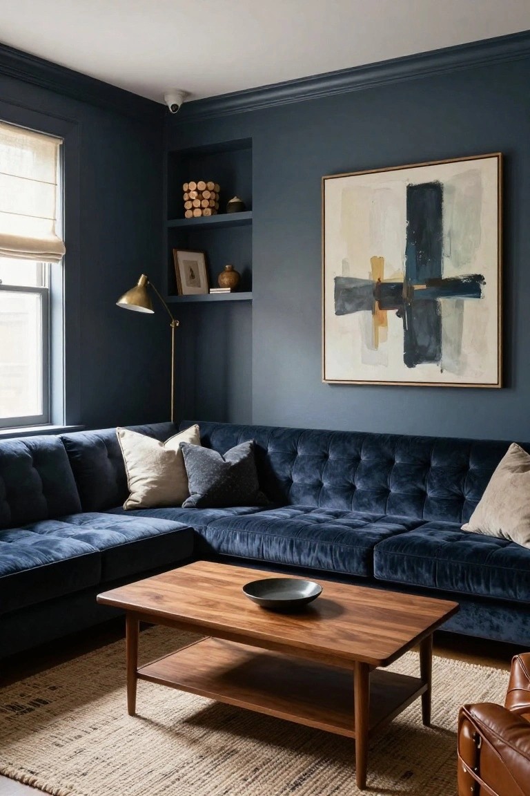
This setup uses a deep navy blue on the walls. It seems closest to Sherwin-Williams Naval or Benjamin Moore Hale Navy, with Farrow & Ball Hague Blue reading pretty similar too. That kind of moody navy adds real depth to a basement. It feels cozy, not cave-like, and pulls in light from windows or lamps just right.
The blue has a subtle gray undertone that works with warm wood furniture, like the coffee table here. Good for low-light spots. Pair it with velvety textures or leather for comfort. Just test samples first. Basements can shift colors under artificial lights.
Deep Teal Walls

This deep teal paint covers the walls and ceiling here, giving the whole room a cozy wraparound feel. It reads very close to Sherwin-Williams Black Lagoon or Benjamin Moore Night Whale, with that same moody blue-green depth. Folks like it because it makes spaces feel intimate without going totally dark, and it plays nice with warm woods.
The undertone leans a bit green, which keeps it from feeling cold, especially next to the rattan headboard and cream bedding. In a basement, try it where you get some natural light. It pairs well with textured rugs or baskets. Just test samples first. Lighting can shift it greener or bluer.
Deep Black Walls

The walls and ceiling in this basement theater are done up in a deep matte black. It reads very close to Sherwin-Williams Tricorn Black or Benjamin Moore Onyx, those true neutral blacks with real depth for moody spaces. Folks like it because it makes the room feel wrapped up and focused, perfect for movie nights without any distractions.
No warm or cool undertones to fight with here. It works best under recessed lights like these, so the space stays cozy not gloomy. Pair it with natural wood like that coffee table or dark leather seating, and it keeps everything looking rich down in the basement.
Deep Maroon Cabinets

A deep maroon like Sherwin-Williams Rookwood Red or Benjamin Moore Oxblood covers the cabinets and walls here. It’s that rich burgundy family with plenty of depth for a basement bar. Folks like it because it warms up the space without going too red or purple.
Warm undertones keep it from feeling cold down there. It sits well next to oak floors and concrete counters. Brass fixtures pop against it too. Good pick for low-light spots, just test it in your own basement first.
Deep Green Wainscoting

This deep forest green on the lower walls, vanity, and shower surround looks closest to Sherwin-Williams Pewter Green (SW 6208) or Farrow & Ball Studio Green. Benjamin Moore’s Cushing Green (HC-125) reads pretty similar too. It’s the kind of moody green that brings real weight to a space, cozy without overwhelming, and it holds its own next to whites and brass.
That subtle warmth in the undertone keeps it from going flat or cold. Works best in basements with a bit of window light, like this bathroom setup. Pair it with light gray up top and black fixtures… just sample it under your own bulbs first.
Deep Green Walls
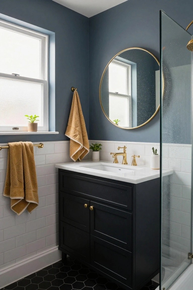
These walls show off a deep green that seems closest to Sherwin-Williams Pewter Green or Benjamin Moore Guilford Green, with Farrow & Ball Studio Green having the same rich vibe. It’s a moody shade perfect for basements, adding that layer of depth without going full black. The color pulls warmth from nearby wood shelves and that tan leather chair.
With its subtle olive undertone, it glows under warm lamp light like you see here. Stick to spots with decent overhead or task lighting so it doesn’t flatten out. Pair with brass accents, plants, or natural fibers to keep the room feeling lived-in and not cave-like.
Deep Navy Walls

Those walls show a deep navy blue paint that seems closest to Sherwin Williams Naval or Benjamin Moore Hale Navy, maybe even Farrow & Ball Hague Blue. It’s solidly in the moody blue family, dark with real depth for a basement feel. Folks go for this because it pulls a small space in close, warm against the wood tones without going flat.
Next to the oak table and gold light, it picks up a subtle warm undertone. Pair it with natural wood furniture and gray upholstery like here, and it shines in corner nooks with a bit of window light. Just keep accents light or brass to avoid gloom.
Navy Blue Walls
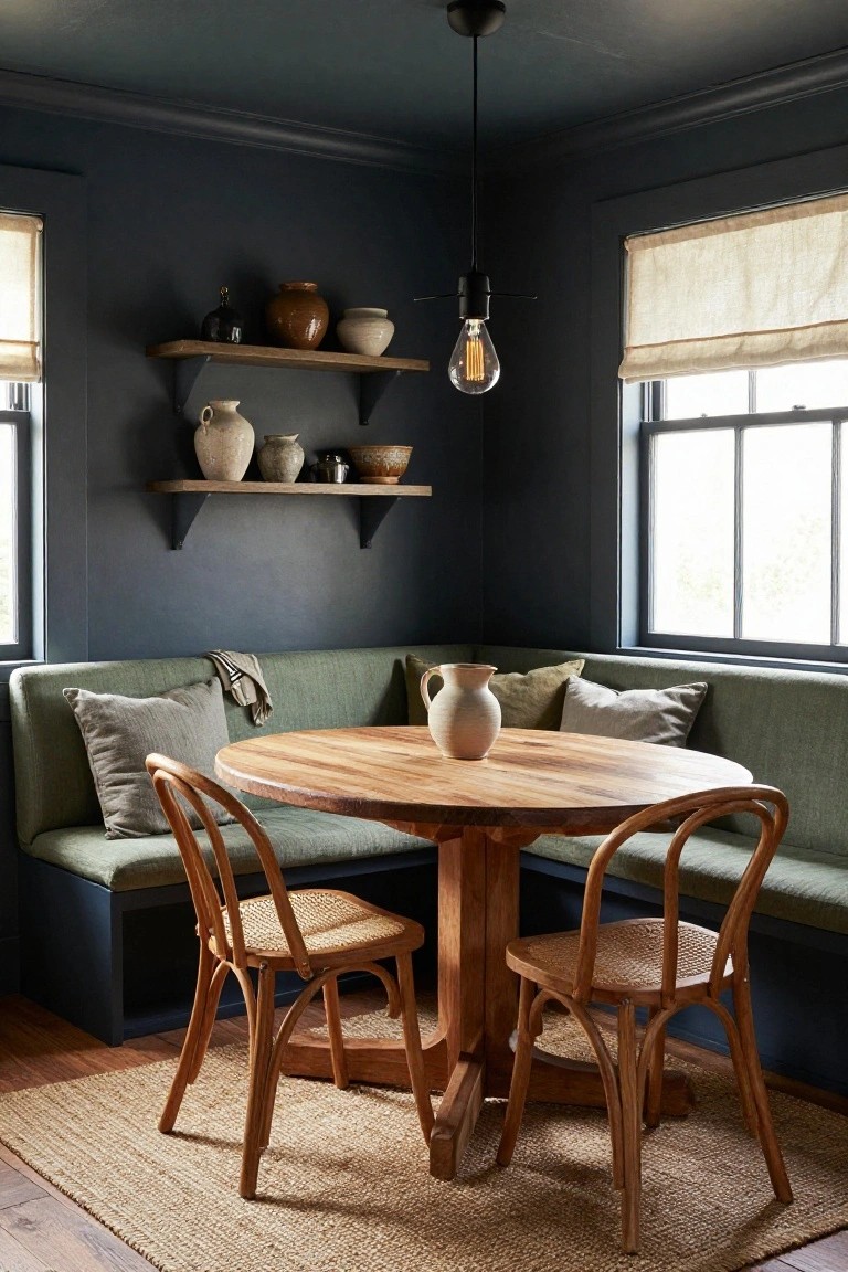
The walls in this room pull off a deep navy blue that seems closest to Sherwin-Williams Naval or Benjamin Moore Hale Navy, maybe even Farrow & Ball’s Hague Blue. It’s the kind of moody color with real depth, not too bright but just right for wrapping a space in coziness. Folks like it because it hides scuffs well and makes even a basement feel put-together.
That cool undertone keeps it from going too warm, and it sits nicely next to wood floors or shelves. Go for it in play areas or family spots, paired with cream textiles and toys for contrast. Just add good overhead light… otherwise it might read a touch heavy.
Deep Purple Walls

This deep purple paint reads closest to Benjamin Moore Eggplant or Farrow & Ball Brinjal, maybe even Sherwin Williams Ripe Plum. It’s the kind of rich, moody purple that works great in basements. What stands out is how it wraps the room without overwhelming, especially around a little bar like this.
The warm undertones keep it from feeling cold down there. It sits nice next to wood stools and racks, and that bit of evening light from the window shows it off. Try it in a wine nook or lounge area, just watch it doesn’t make super narrow spots too cave-like.
Navy Blue Cabinets

This setup uses a deep navy blue on the cabinets, the kind that reads close to Sherwin-Williams Naval or Benjamin Moore’s Hale Navy. It’s a moody blue with real depth, perfect for a small basement laundry room. Folks like it because it makes the space feel put-together and not so plain, even next to everyday stuff like a white washer.
The cool undertones keep it from going too dark in a spot with limited light. It pairs nicely with black tiles behind the sink and wood shelves up top. Watch for gray walls around it though, they let the navy stand out without overwhelming things.
Deep Green Paneled Walls

This deep green on the walls and built-ins has that moody feel perfect for basements. It looks closest to Sherwin Williams Pewter Green or Benjamin Moore Essex Green, maybe Farrow & Ball Studio Green too. The color pulls warmth from nearby wood tones without overwhelming the room.
The blue undertone keeps it from going too earthy. It works best where there’s some natural light or warm lamps, like around a fireplace. Pair it with brass accents and leather furniture to keep things cozy down there.
Deep Navy Walls

This basement shows off a deep navy blue on the walls. It looks closest to Sherwin Williams Naval or Benjamin Moore Hale Navy, maybe even Farrow & Ball Hague Blue. That kind of moody dark blue gives real depth to lower level spaces. Folks go for it because it turns a plain room into something cozy and pulled together, like with those warm pendant lights glowing against it.
The color leans cool with a bit of gray undertone. It sits nice next to wood side tables and black leather seating. Basements with a window or two work best, so it doesn’t go too cave-like. Add game tables or plants for balance… keeps things lively down there.
Deep Green Cabinets

This deep forest green on the cabinets and pegboard wall seems closest to Farrow & Ball Studio Green, or maybe Sherwin-Williams Hunt Club and Benjamin Moore Black Forest Green. It’s got that rich, moody depth that works great in a basement setup. The color pulls warmth from the wood tones around it, making a small workspace feel bigger and more lived-in.
With its warm undertones, it holds up well under basement lighting, especially paired with a butcher block top like this one. Skip cool metals or bright whites if you want to keep the cozy vibe. Rattan chairs or natural wood shelves play right into it.
Deep Navy Walls

This setup uses a deep navy paint on the walls and ceiling that reads very close to Sherwin-Williams Naval or Benjamin Moore Hale Navy, maybe even Farrow & Ball Hague Blue. It’s that moody blue family with real depth, the kind that works well in basements to create a snug hideaway feel without going pitch black.
The cool undertones keep it crisp next to the oak slats and warm mustard bedding. Recessed lights up top help it stay balanced. Pair it with natural wood and soft textiles in a low-ceiling spot like this, and it turns a tight basement corner into something restful.
Deep Green Cabinets

This deep green paint on the cabinets and lower walls pulls from the moody green family. It looks closest to Sherwin Williams Pewter Green or Benjamin Moore Guilford Green HC-116, maybe Farrow & Ball Studio Green too. What stands out is how it adds that basement depth without going full black. People go for it in small spots like this bar area because it warms things up around wood shelves.
The gray undertone keeps it from feeling too forest-like. It sits right next to brass stools and quartz counters. Best in spaces with pendant lights overhead. Just sample it first, lighting can nudge it greener or grayer.
Warm Greige Walls

Those paneled walls show off a warm greige that seems closest to Sherwin-Williams Dorian Gray or Benjamin Moore Kendall Charcoal. It’s a moody neutral with brown undertones that adds real depth to everyday spaces like mudrooms or basements.
The color sits nicely next to leather benches and wicker storage. It works best where you get some natural light through a window. Watch for cooler bulbs though. They can make it read a touch gray.
Deep Cool Gray Walls

This setup uses a deep cool gray on the walls, closest to Sherwin-Williams Iron Ore or Benjamin Moore Kendall Charcoal. It’s a moody basement pick that adds real depth to small bathrooms. Folks go for it because it feels modern and wraps the room up nice, especially next to black fixtures and that wood vanity.
The cool undertone reads clean in decent light from a window like this. Pair it with white sinks or light tile floors to keep things balanced. Watch for poor lighting though. It can turn flat down there.
Deep Burgundy Cabinets
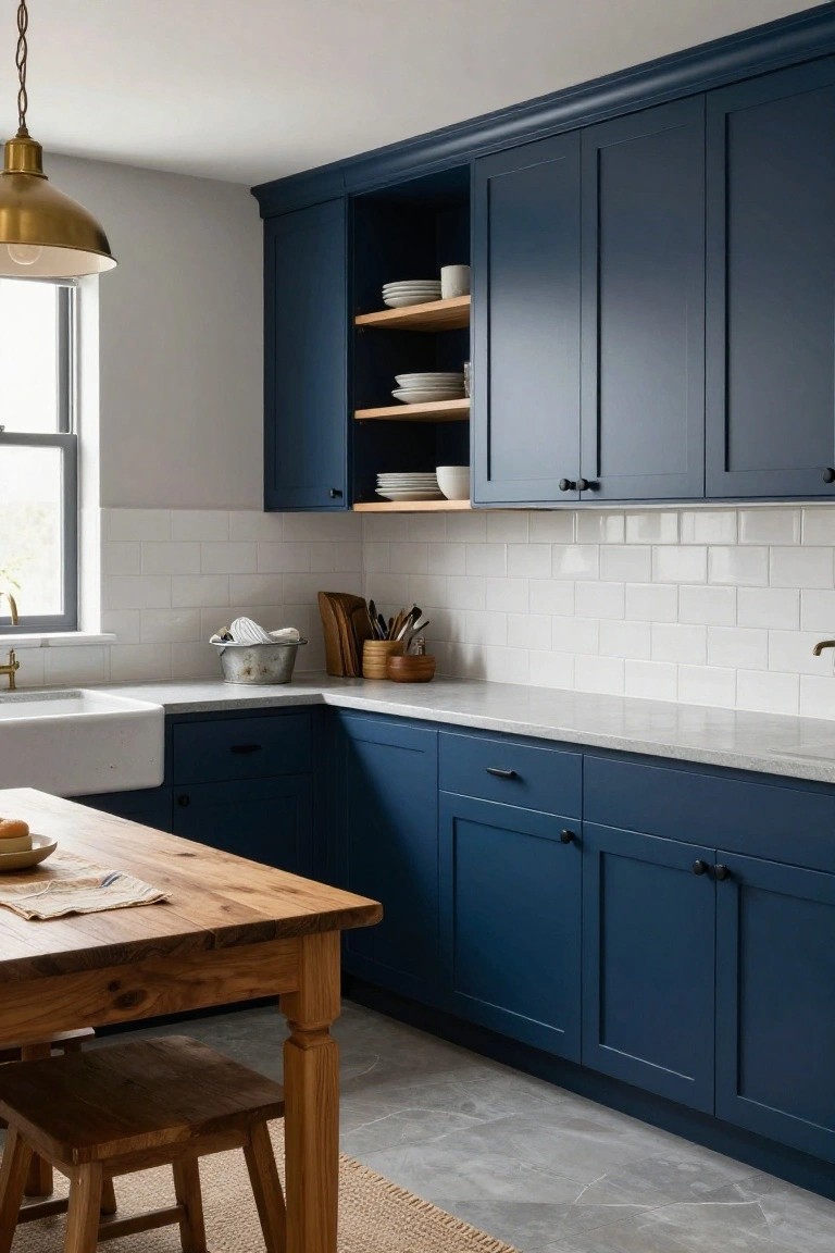
This deep burgundy paint on the cabinets reads very close to Sherwin-Williams Rookwood Red, or maybe Benjamin Moore Oxblood or Behr Cordovan Leather. It’s that moody dark red-brown family with plenty of warmth baked in. Folks like it because it gives a kitchen real depth without going full black, and it lets wood tones pop right alongside.
The warm undertones keep it from feeling cold, even in lower light like a basement setup. Pair it with light counters and natural wood floors or tables, like you see here with the oak tabletop. Just test samples first, since it shifts a bit under different bulbs.
Deep Teal Walls

This deep teal paint covers the walls and ceiling here. It has that same rich feel as Sherwin-Williams Retreat or Farrow & Ball Teal Blue, maybe Benjamin Moore Van Deusen Blue too. What stands out is how moody it gets without going flat. The color pulls in light from the windows but keeps a basement-feel cozy and wrapped up.
With its blue-green undertone, it works best where you want some depth, like low-lit corners or meditation spots. Pair it with natural wood shelves and beige rugs to keep things warm. Just watch the trim, white works fine but test it first in your light.
Deep Navy Cabinets

This deep navy blue on the cabinets pulls off that moody basement look without feeling too heavy. It sits closest to Sherwin Williams Naval or Benjamin Moore Hale Navy, maybe even Farrow & Ball Hague Blue. Folks like it because it has enough blue punch to stand out, but the subtle warmth keeps things from turning cold.
Pair it with black granite tops and brass stools like here, and it really shines. Test it in decent lighting first. The undertone leans a touch gray in low light, so add warm bulbs or wood nearby to balance it out.
Deep Plum Walls

Those deep purple walls pull off a moody vibe that feels right at home in a basement. They read very close to Farrow & Ball Brinjal, or maybe Benjamin Moore Eggplant or Sherwin Williams Dramatic Purple. What stands out is the warmth in this shade. It has just enough red undertone to keep things cozy instead of cold.
Pair it with crisp white like on that clawfoot tub and black fixtures for contrast. The wood stool nearby keeps it grounded. Watch the lighting though. It shines best with some natural light or warm bulbs to avoid going too cave-like down in the basement.
Deep Teal-Green Shiplap Walls

Those shiplap walls show off a deep teal-green paint that looks closest to Behr Briar, or maybe Sherwin-Williams Pewter Green and Benjamin Moore Caldwell Green. It’s a moody shade with blue undertones that gives basements real depth. Folks like it because it feels rich but not heavy, especially on textured walls like this.
The color picks up light from a nearby window nicely, so it stays lively even downstairs. Pair it with warm woods like the coffee table here, and black or gray furniture. Just test samples in your lighting first… cooler bulbs might push the blue too much.
Deep Navy Walls

Those paneled walls are painted in a deep navy blue that really fits a moody basement vibe. It looks closest to Sherwin-Williams Naval, or maybe Benjamin Moore Hale Navy and Farrow & Ball Hague Blue. This shade has enough depth to make a space feel cozy and pulled together.
The blue picks up a cool undertone but plays nice with warm wood pieces like that nightstand. In basement lighting it keeps things intimate. Just pair it with mustard yellows or soft whites so it doesn’t go too heavy.
Deep Charcoal Gray Walls

This setup leans on a deep charcoal gray for the walls and ceiling. It reads very close to Sherwin-Williams Iron Ore or Benjamin Moore’s Kendall Charcoal. That kind of moody dark gray gives basements real depth without going full black. The warmth shows up nice next to the plain wood table.
Warm undertones make it work here. Not too cool or stark. It plays well with natural wood shelves and a metal bucket like you see. Stick it in low light spots. Just test samples since it can shift a bit in dim basements.
Frequently Asked Questions
Q: How do I stop dark walls from making my basement feel like a cave?
A: Pile on the lights. Scatter floor lamps and wall sconces to wash the space in soft glows. Warm LEDs cut right through that heavy mood.
Q: What paint finish hides basement wall flaws best with dark colors?
A: Grab matte or flat finishes. They soak up light and mask cracks or uneven spots you often find down there.
Q: Can low-light basements really pull off these deep shades?
A: Pick paints with subtle shimmer or gray undertones…they reflect what little light you get. Test samples at different times of day to see the magic.
Q: How do I pick furniture that plays nice with moody dark walls?
A: Lean into plush fabrics and matte metals. They add tactile interest without clashing, and lighter pieces ground the drama.
