


I have painted plenty of basements over the years, and zero natural light forces you to pick colors that actually hold their own under lamps.
Shades promising vibrancy on a store wall often flop down there, looking tired or oddly tinted by the glow.
A soft greige I rolled on once caught unexpected life from overhead bulbs, easing the whole space open.
Tones leaning just warm enough bounce back artificial light without going muddy.
Test a sample or two in your own room first.
Warm Greige Walls

This room uses a soft warm greige on the walls. It seems closest to Sherwin-Williams Accessible Beige, Benjamin Moore Edgecomb Gray, or Behr Silver Drop. That neutral tone keeps things light and easy, even without much natural light coming in. It’s the kind of color folks pick for basements because it doesn’t make spaces feel smaller or dingy.
The warm beige undertones help it play nice with wood pieces like the bench and shelves. In low light it stays balanced, not going flat or gray. Just pair it with a bit of pink or brass to keep some life there.
Soft Gray Walls
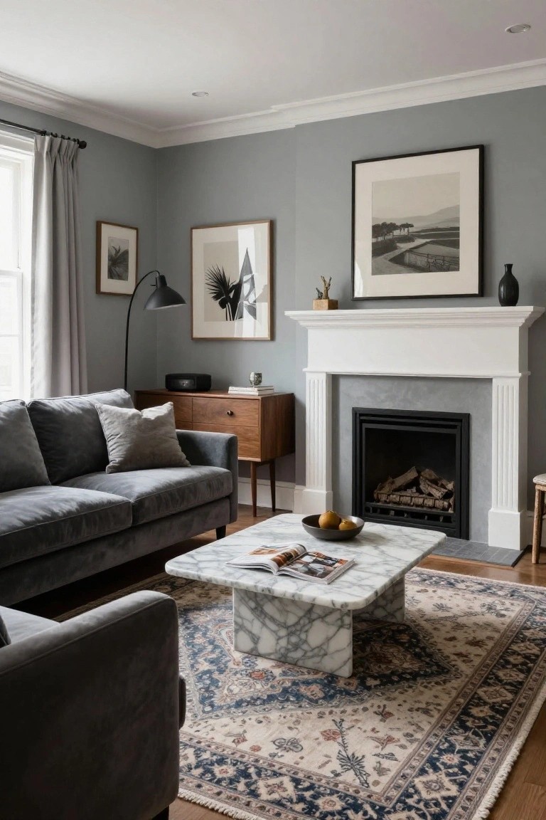
This soft gray on the walls reads very close to Sherwin-Williams Repose Gray or Benjamin Moore Gray Owl. It’s a light cool gray that keeps things calm and open, even without much light coming in. Folks like it because it doesn’t go too dark or feel cold, especially next to wood furniture like that sideboard here.
The cool undertone helps in basements where you want to avoid yellowing over time. Pair it with white trim around the fireplace and warm wood floors to balance it out. Just watch that it doesn’t look flat against all cool metals… warm accents fix that quick.
Deep Navy Walls

A deep navy blue covers the walls and ceiling here. It looks closest to Sherwin-Williams Naval or Benjamin Moore Hale Navy, maybe Behr’s Black Saphire too. This shade turns a dark basement into something clubby and fun, like a home theater without feeling closed in.
Cool but not stark, it plays well under those recessed lights. Warm woods on the bar and table keep it balanced. Good for media rooms or bars. Just add some brass lamps to lift it a bit.
Creamy Off-White Cabinets

This kitchen uses a creamy off-white on the cabinets that looks closest to Sherwin Williams Alabaster or Benjamin Moore White Dove. It’s a warm neutral white, not stark at all. People like it because it keeps things bright even with low light, and it lets wood tones stand out without clashing.
That subtle beige undertone works well next to oak counters and brass lights. Down in a basement kitchen it would reflect artificial light nicely. Just pair it with warmer woods or metals, nothing too cool or gray.
Pale Blue-Green Cabinets
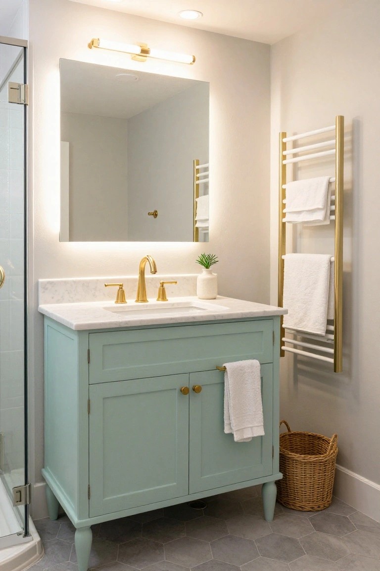
That soft blue-green paint on the vanity cabinet looks closest to Sherwin-Williams Sea Salt. Or maybe Benjamin Moore’s Breath of Fresh Air, Behr’s Breezeway too. It’s a pale aqua shade in the blue-green family, easy on the eyes and just right for adding subtle life to a basement room. People go for colors like this because they lift the mood without overwhelming tight spaces.
The cool undertone keeps it from going too minty, especially next to the gold faucet and white marble. In a basement with no windows, it stays fresh under artificial lights. Stick to crisp whites on towels or walls, and maybe a woven basket for texture… nothing fussy.
Warm Greige Walls

This greige on the walls comes across closest to Sherwin-Williams Accessible Beige or Benjamin Moore Edgecomb Gray, maybe even Behr’s Silver Screen. It’s a light warm neutral that sits right between gray and beige, which is why it feels so steady in dim spaces. No harshness, just quiet reflection that helps a room breathe.
That beige undertone plays well off wood like the console table here, and the white wainscot keeps it from closing in. Try it in basements where light is scarce. It holds up with brass fixtures or natural rugs, but test samples at different times of day.
Pale Sage Green Cabinets

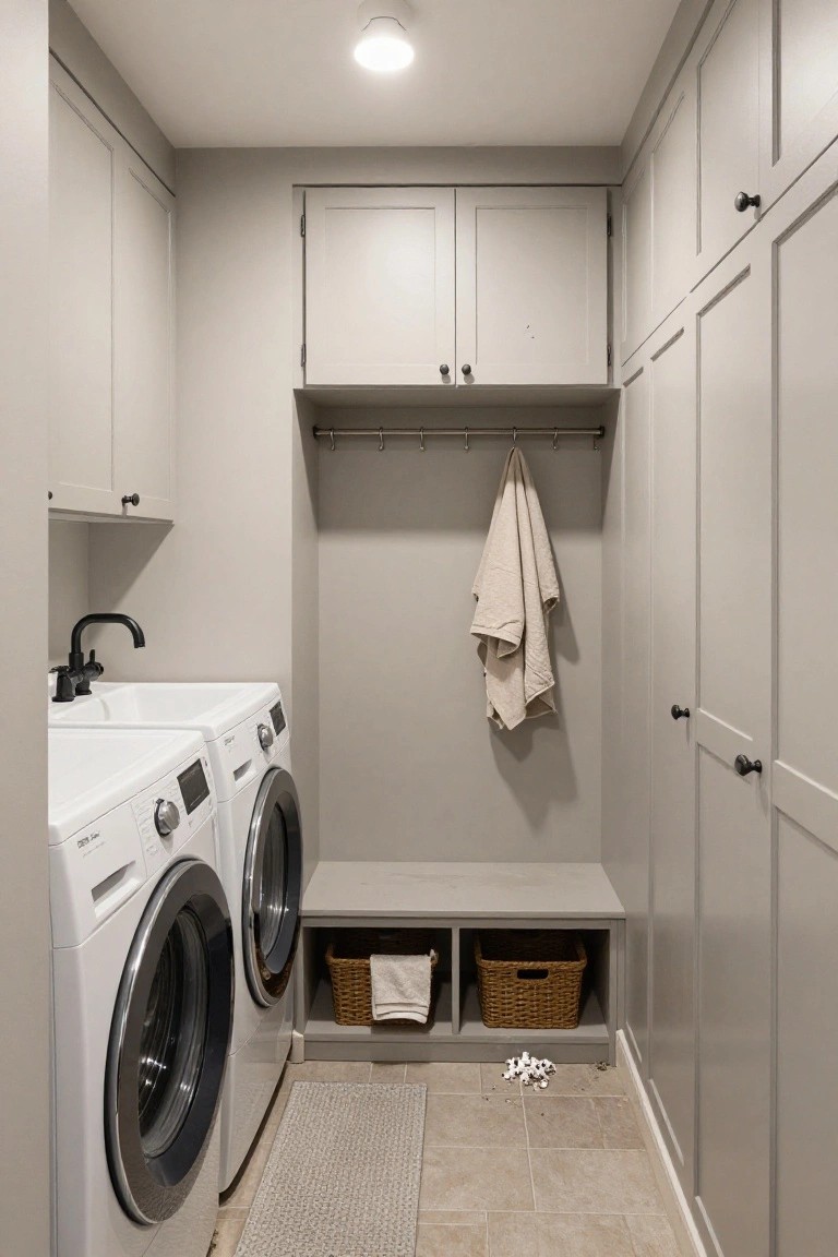
This laundry area paints its cabinets and lower shelving in a pale sage green. It seems closest to Sherwin Williams Retreat or Benjamin Moore Saybrook Sage, maybe Behr Silver Sage too. That muted green stays light and easy on the eyes. It’s a good pick for basements since it doesn’t make the space feel closed in.
The undertone leans a bit gray, which helps in dim light. Pair it with white counters and gold hardware, like the faucet here. Wicker baskets fit right in for storage. Just avoid cooler grays nearby, or it might look flat.
Deep Navy Walls

This setup uses a deep navy blue on the walls, desk, and built-ins. It comes across closest to Sherwin-Williams Naval, Benjamin Moore Hale Navy, or Farrow & Ball Hague Blue. That kind of rich blue works great in basements with no windows. It feels put-together and hides everyday dirt without showing every smudge.
The cool undertone keeps things calm next to wood floors and that leather chair. In dim light, it pulls the room in close, like a quiet study spot. Pair it with brass lamps or green plants to warm it up a bit… otherwise it might lean chilly.
Pale Yellow Walls

This pale yellow shows up on the walls and shelves here, giving a soft, sunny feel even in windowless spots. It’s a warm yellow in the pale family, the kind that perks up a basement without being too bold. Looks closest to Sherwin-Williams Lemon Sorbet or Benjamin Moore Lemon Drop, with Behr Butter Up reading pretty similar too.
That golden undertone makes it forgiving under basement lights, mimicking daylight nicely. Notice how it plays well next to the wood toys and orange chairs. Try it in a play area or rec room, just test samples first since yellow can shift a bit on different walls.
Deep Green Walls

This deep emerald green paint covers the walls and cabinetry here. It reads very close to Farrow & Ball’s Studio Green, or Sherwin-Williams Pewter Green, maybe Benjamin Moore’s Guilford Green HC-116. It’s a rich, saturated green that feels warm and enveloping, perfect for a basement with no windows. That color turns a dark space into something cozy, like a little speakeasy hideaway.
The undertone leans warm, not too blue, so it won’t go cold under artificial lights. Pair it with brass fixtures and marble counters like you see here, plus those rattan stools for some texture. Watch for too much black trim though. It can muddy things up. Stick to gold accents instead.
Pale Lavender Walls

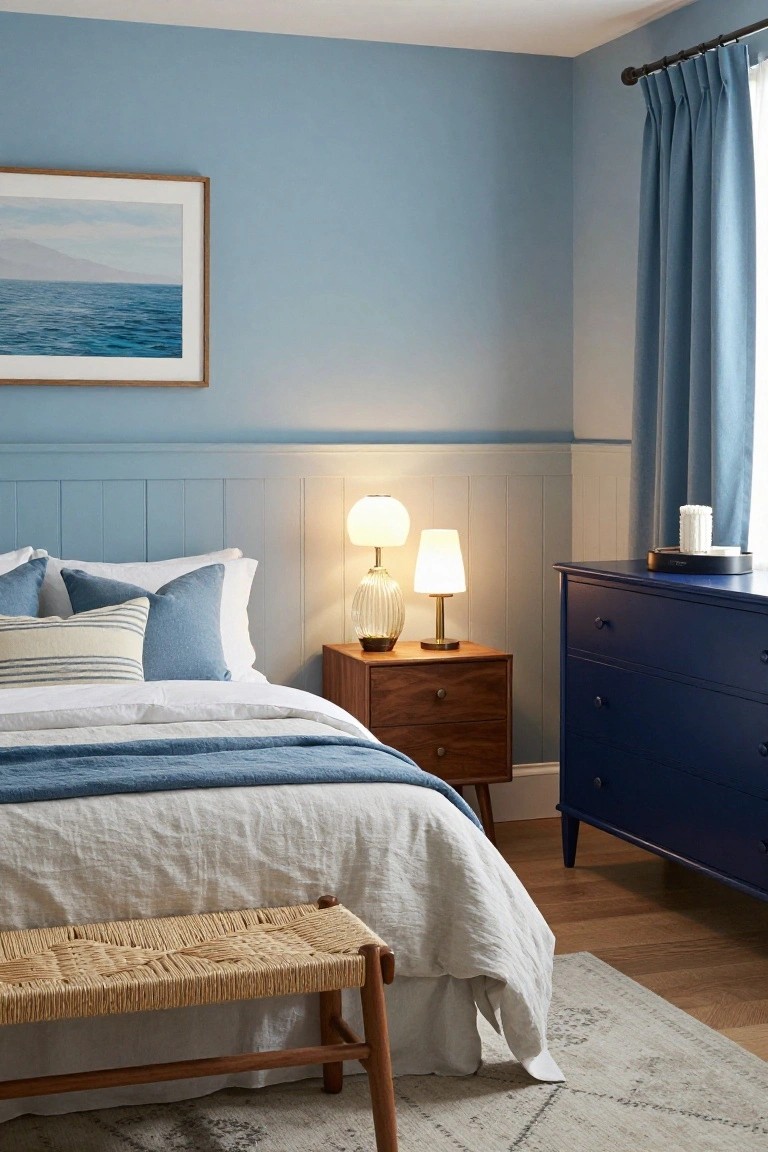
This pale lavender on the walls seems closest to Sherwin-Williams Lilac Lane or Benjamin Moore First Light, with Behr’s Dreamy Lilac reading pretty similar too. It’s a gentle purple from the lilac family, light enough to stay subtle. People go for it since it opens up a room nicely, even when light is scarce.
That warm gray undertone plays well off wood tones like the nightstands here. Stick to creamy whites and beiges on the bed to keep it grounded. Heads up, test it first in your basement setup. It can shift cooler under fluorescents.
Pale Aqua Walls
These walls show off a pale aqua that’s got that fresh, open feel, reading closest to Sherwin Williams Sea Salt or Benjamin Moore Breath of Fresh Air. It’s a soft blue-green in the turquoise family, light enough to make a basement craft corner feel bigger even with no windows. People go for it because it perks up the space without overwhelming.
The cool undertone keeps things crisp next to warm wood like the desk here. Works best in hobby areas or home offices down below, paired with natural baskets and metal accents. Just avoid heavy dark floors, they can make it read flatter.
Warm Beige Walls
The walls in this dining spot pull off a warm beige that’s just right for basements without any natural light. It looks closest to Sherwin-Williams Accessible Beige or Benjamin Moore Edgecomb Gray, maybe a touch of Behr’s Toasted Almond too. This kind of color stays bright and easy on the eyes, even when the bulbs are the only light around.
That warm undertone works well next to wood furniture like the oak table here. It plays nice with navy cabinets without clashing. Stick to it in low-light rooms, and watch how it keeps everything from feeling too cave-like… just add some candles for extra coziness.
Deep Navy Walls

This powder room pulls off a deep navy on the walls that reads very close to Sherwin Williams Naval or Benjamin Moore Hale Navy. Maybe Behr’s Abyss too. It’s the kind of color that feels rich without going full black. In a basement spot with no windows, it makes the space look finished and a little mysterious.
That grayish undertone keeps things from getting too intense under the recessed light. Pair it with white sinks and wood shelves like here, and the navy stays balanced. Watch for matte finishes though. They hide fingerprints best in tight spots like this.
Soft Greige Walls

This laundry setup uses a soft greige on the walls and cabinets that looks closest to Sherwin-Williams Agreeable Gray. Benjamin Moore Revere Pewter reads very similar too, along with Behr’s Wheat Bread. It’s the kind of neutral that stays light and easy in dim spaces. Keeps everything feeling calm without turning dingy.
The warm beige undertone works with the wood floors here. It bounces around whatever light you have, and that gold faucet pulls it together nicely. Good pick for basements. Just test it in your own spot first.
Soft Blue-Gray Built-Ins

This setup uses a soft blue-gray on the tall built-in bookcases, and it looks closest to Sherwin-Williams Sea Salt or Benjamin Moore Palladian Blue. Maybe even Farrow & Ball Pavilion Gray. It’s that gentle cool-toned shade that stays light and easy on the eyes. In a basement with no natural light, something like this keeps things from feeling closed in.
The gray undertone helps it read neutral without turning muddy. It works best around warm woods or leather pieces, like the floors and sofa here. Go for bright white trim so it doesn’t dull down. One thing to watch. Test samples in your actual lighting first.
Pale Blue Ceiling

This little powder room goes with a pale blue ceiling that reads very close to Benjamin Moore’s Breath of Fresh Air or Sherwin-Williams Rain. It’s a soft cool blue, not too bold, that lifts the whole room without fighting the white walls. Folks like it because it adds just enough color to keep things from feeling too closed in.
That cool undertone helps in low-light spots, reflecting whatever bulbs you have up there. Stick it over white tile or plain walls, maybe some gold taps like these. Watch for pairing with warm woods though, it stays fresher with cooler finishes.
Soft Mint Green Walls

This soft mint green on the walls looks closest to Sherwin-Williams Sea Salt or Benjamin Moore Quiet Moments, with Behr’s Silver Drop reading pretty similar too. It’s a cool pastel in the blue-green family that stays light and fresh. What I like about it for basements is how it opens things up without much natural light, just reflects whatever glow you’ve got.
The blue undertones keep it crisp, not muddy. It works best around wood floors or simple furniture, like the bunk bed here that’s painted to match. Watch for pairing with too much warm brass, though. Stick to whites and stripes for that clean kid-room feel.
Cool Gray Basement Walls

This cool gray on the walls seems closest to Sherwin-Williams Repose Gray or Benjamin Moore Gray Owl. Maybe Behr Silver Screen too. It’s a medium shade that stays balanced in dim basements. Folks like it because it lets black workout gear and wood floors stand out without the room turning gloomy.
Cool undertones give it a clean feel next to the matte shelves and bench. Works best in gyms like this. Add some warm lamps or rugs so it doesn’t go too chilly.
Warm Terracotta Walls

This warm terracotta paint brings real life to spaces without much light. It sits close to Sherwin Williams Spiced Cider or Benjamin Moore Caliente, maybe Behr Canyon Clay too. What I like is how the earthy red-orange tone feels cozy right away, not harsh.
The undertones lean warm and rusty, which works well next to wood shelves or creamy trim. In a basement setup, it bounces light from fixtures without washing out. Pair it with natural materials like that terrazzo floor, but ease up on cool grays.
Deep Navy Walls

This reading nook shows off a deep navy paint color. It reads very close to Sherwin-Williams Naval or Benjamin Moore Hale Navy, maybe Farrow & Ball Hague Blue too. That kind of rich blue works great in basements with no natural light. It makes the space feel wrapped up and cozy, not dark or cave-like.
The navy has a cool undertone but the gold lamp and mustard pillows warm it right up. Wood bookshelves keep things from going flat. Try it on built-ins like this bench, or full walls if you want drama. Just test samples first, since it can shift under different bulbs.
Light Gray Walls

This basement spot shows off a soft light gray on the walls. It reads very close to Sherwin-Williams Repose Gray or Benjamin Moore Gray Owl, maybe Behr Silver Drop too. It’s the kind of easy gray that stays bright in rooms with no windows. Folks pick it because it opens up small areas without looking stark.
That gray pulls a little warmth from the black doors nearby. It works best with warm bulbs down there. Go ahead and add black trim or a wood bench like this one. One thing. It can lean cool so test a sample first.
Frequently Asked Questions
Q: How do I pick one color from your 22 without guessing wrong?
A: Look at your basement’s fixed stuff like floors and furniture first. Choose a color that pulls those tones together. That keeps everything harmonious down there.
Q: Should I paint the ceiling the same as the walls?
A: Paint it the same light shade to blur the lines and make the room feel taller. Skip contrast, it chops up the space visually.
Q: What if I have dark furniture already?
A: Go for warm mid-tones… they bridge the gap between dark pieces and windowless walls. Layer in lamps to warm it all up.
Q: Do lighter colors show every bit of dirt?
A: They do pick up dust faster than deeper shades. But a quick wipe with mild soap keeps them fresh. And pick a satin finish, it cleans right up.
