


Basements always challenge me with their low light, where even the sunniest days barely filter through. I’ve learned that paint colors shift dramatically from the store sample to real walls, often losing their promised glow under dim bulbs or northern exposure.
One time I painted a corner greige thinking it would warm things up, but it just dulled the whole room further. Brighter shades with clean undertones tend to bounce back what little light they get, making the space feel open without screaming for attention. A handful here prove worth sampling in your own setup.
Warm Off-White Walls

This warm off-white on the walls seems closest to Sherwin Williams Alabaster or Benjamin Moore White Dove, maybe Behr Swiss Coffee too. It’s a soft neutral in that creamy family, not too yellow but with just enough warmth to brighten things up. What makes it nice is how it lets wood furniture and brick details stand out without competing.
That subtle beige undertone helps in low-light spots like basements. It plays well next to a white brick fireplace and keeps the room feeling open. Stick to natural textures around it, like a seagrass rug, and skip anything too glossy.
Soft Greige Walls
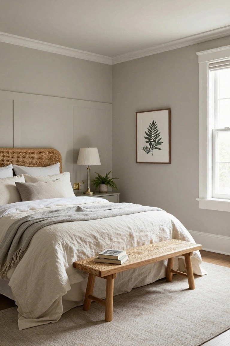
This soft greige on the walls pulls together gray and beige in a way that feels light and easy. It looks closest to Sherwin Williams Agreeable Gray or Benjamin Moore Revere Pewter, maybe even Behr’s Wheat Bread. Folks like it because it bounces back what little light comes in, without turning harsh or dingy in low-light spots like basements.
The warm undertone plays nice with wood tones, like the rattan headboard and bench here. Try it in a basement bedroom or rec room, paired with off-white linens and simple plants. Just test samples, since it can shift a bit under different bulbs.
Pale Yellow Cabinets

This pale yellow on the cabinets feels like a soft butter shade, closest to Sherwin-Williams Ricegrain or Benjamin Moore’s Pale Yellow. Or maybe Behr’s Daisy Cream. It’s the kind of gentle yellow that brightens a space without shouting. In a basement, it could really wake up those dim corners.
The warm undertone keeps it cozy next to white counters and wood chairs. Those blue tiles stand out nicely too. Use it where light is low, but pair with crisp whites so it doesn’t go dull. Watch for too much gray in the mix, though. It stays fresh.
Pale Yellow Walls
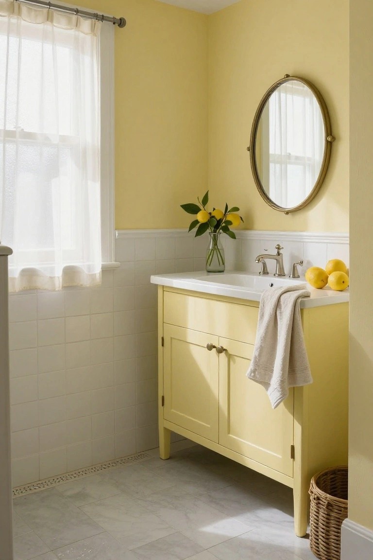
This soft pale yellow on the walls looks closest to Sherwin-Williams Lemon (2023-60), Benjamin Moore Lemon Sorbet, or Behr Lemon Glow. It’s the kind of gentle yellow that wakes up a room without shouting. People go for it in low-light spots because it pulls in whatever sun there is and spreads it around.
Warm buttery undertones keep it cozy next to white tile wainscoting or a matching yellow vanity like this one. Works best in a basement bath or powder room. Just pair with brass fixtures and simple whites to avoid it feeling too candy-like.
Pale Sage Walls
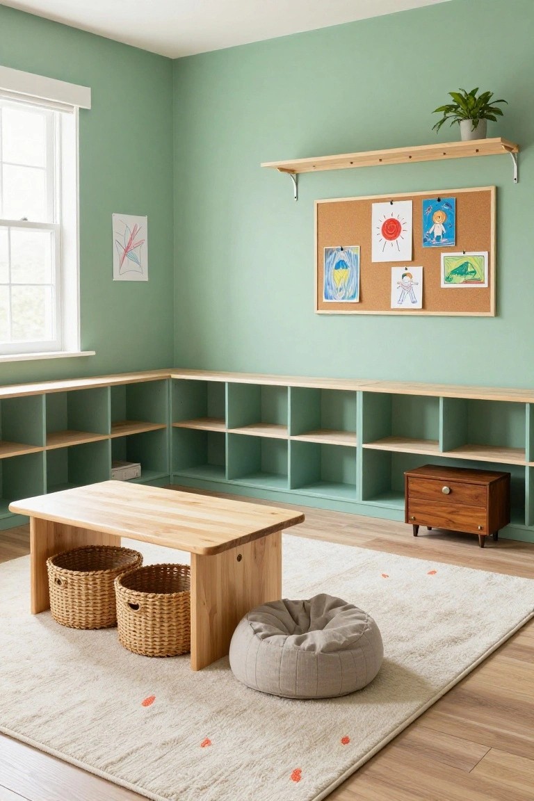
This pale sage green on the walls looks closest to Sherwin-Williams Sea Salt or Benjamin Moore October Mist, maybe Behr’s Back to Nature too. It’s a soft green from the mint family, light and airy enough to make any low-light spot feel bigger. You see how it sits nice next to all that natural wood shelving. Keeps the room fresh without trying too hard.
That gentle gray undertone gives it balance, so it won’t shift yellow in dimmer corners. Works best in basements or play spaces where you want calm vibes. Pair with wood tones and neutrals like the rug here. Test a sample though… lighting changes everything.
Pale Blue Cabinets

This pale blue on the cabinets looks closest to Sherwin-Williams Rain or Benjamin Moore Palladian Blue. Maybe Behr’s Silver Screen too. It’s a gentle cool blue that stays light and open. People go for it in home offices because it lifts the whole area without shouting, and it plays right off wood tones.
That cool gray undertone keeps it from going too sweet. Down in a basement it’d bounce around any light you have. Stick with natural wood desks or leather chairs like here, and add a plant or two. Just test samples first, lighting can shift it greener.
Bright Purple Walls

This room goes with a bright purple paint on the walls and ceiling. It looks closest to Sherwin-Williams Violetta or Benjamin Moore Amethyst Lace, maybe Behr Violet Verbena too. That violet shade feels lively without being too loud. It’s the kind of color that wakes up a basement fast.
The cool undertones keep it from going pink or muddy in low light. Pair it with dark pieces like a charcoal sofa or wood shelves, and it stays balanced. Just test a sample first. Some basements might need warmer bulbs nearby.
Soft Mint Walls
That pale mint green covering the walls here seems closest to Sherwin-Williams Sea Salt. Benjamin Moore Palladian Blue or Behr Dream Drop would be right in the same family too. It’s a gentle cool green, light enough to brighten up a low-light spot without overwhelming the room. You get that fresh coastal feel, even indoors.
Cool blue undertones make it pop against white trim and cabinets. It works great in a basement laundry or utility area, especially with wood accents like those baskets. Just pair it with warm neutrals so it stays lively, not flat, in dimmer corners.
Blush Pink Walls

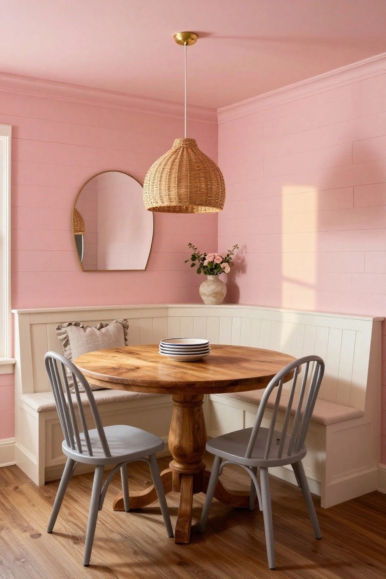
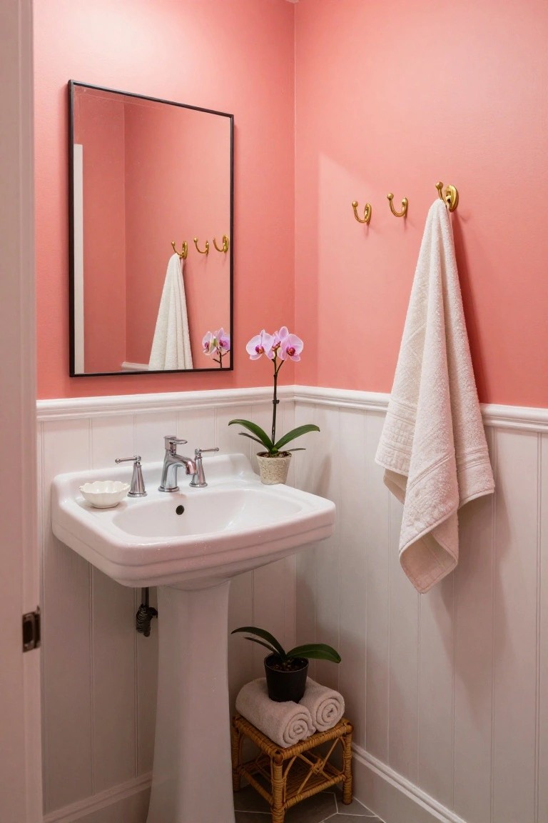
This soft blush pink covers the walls and door here. It reads very close to Farrow & Ball’s Setting Plaster, or maybe Sherwin Williams Rosé or Benjamin Moore’s First Light. It’s the kind of gentle pink that brightens without shouting. Folks go for it in dimmer spots because it pulls in any available light and keeps things feeling open.
Warm undertones make it cozy next to wood furniture or rattan like you see on that table. Pairs easy with creams and beiges too. Watch it in super low light though… might need a bit more glow from lamps to really pop.
Soft Sage Green Walls

This pale sage green on the walls comes across closest to Benjamin Moore October Mist or Sherwin-Williams Retreat, with Farrow & Ball French Gray not far off. It’s a muted green-gray that’s soft and easy on the eyes, the kind that brightens a low-light basement without overpowering the room. Folks like it because it feels fresh yet grounded.
The cool green undertones keep it from going too yellow, and it works well next to warm wood furniture like the chairs and table here. Try it in a dining corner or family space where you want subtle lift. Pair with olive accents if you like, but watch how it shifts under basement bulbs.
Soft Mint Walls

This pale mint green on the walls reads very close to Sherwin-Williams Sea Salt or Benjamin Moore’s Saybrook Sage. It’s a light, cool green that feels fresh without being too bold. Folks like it because it opens up a space, especially in dimmer spots like basements.
The cool undertones keep it from going yellow in low light, and it plays nice next to warm wood like that table here. Pair it with natural fibers or metals for balance. Just test a sample first, since it can shift a bit with your lighting.
Soft Turquoise Walls

This bathroom pulls off a soft turquoise on the walls and floor that would brighten any dim basement. It reads very close to Sherwin Williams Sea Salt or Benjamin Moore Palladian Blue, maybe even Behr’s Blue Haven. People like how it feels crisp and lively, especially around a simple white sink.
The cool blue-green undertone keeps things fresh in low light, and it pairs easy with black faucets or gold mirrors. Stick it in a half bath down below, but mix in some wood trim if the room stays shady.
Soft Gray Walls

This soft gray on the walls and cabinets seems closest to Benjamin Moore Gray Owl or Sherwin-Williams Repose Gray. It’s a light cool gray that brightens corners without going too blue. What stands out is how it lifts the whole nook, making family photos and that oak shelf pop nicely.
The cool undertone works best in low-light spots like basements. It pairs easy with wood tones or wicker baskets. Watch it next to super warm lights though… might need a sample test.
Pale Lilac Walls
This pale lilac purple on the walls feels light and fresh. It’s in the soft lavender family and comes closest to Sherwin-Williams Lively Lilac or Benjamin Moore March Wind. What stands out is how it brightens the space gently. Without shouting, it lifts wood tones around it. Folks pick colors like this for dimmer rooms because they reflect light back nicely.
That subtle warmth in the undertone keeps it from going too cool or pink. Pair it with natural wood like the bedframe here or simple white bedding. It suits basements with low windows best. Just test samples first; lighting can shift it a bit.
Soft Blush Pink Walls

This room’s walls show off a soft blush pink that looks closest to Sherwin-Williams Setting Plaster or Benjamin Moore First Light. It’s a gentle warm pink in the peach family, not too sweet or overpowering. What I like about it is how it bounces light around, making even a low-light basement feel brighter and more open.
The peachy undertone keeps it from going flat next to wood floors or a console in the same shade. It works best in living areas with plants and neutral furniture… just watch it doesn’t clash with cooler grays.
Warm Pale Yellow Walls

These walls pull off a warm pale yellow that reads very close to Sherwin-Williams Alabaster or Benjamin Moore White Dove. Farrow & Ball Slipper Satin has that same gentle feel too. It’s a soft color that lifts low-light basements without shouting, and it keeps wood shelves looking rich.
The yellow’s warm undertones work well next to navy chairs or natural wood. Try it in a reading nook where some window light comes through. Just pair with warm accents so it doesn’t go flat.
Soft Warm Beige Walls

Those paneled walls show off a soft warm beige that reads very close to Sherwin Williams Accessible Beige or Benjamin Moore Edgecomb Gray. Behr’s Toasted Almond has that same easy feel too. It’s the kind of light neutral that lifts a dim basement corner, making the space feel open and not so cave-like.
The yellow undertones keep it from going cold, especially next to wood benches like these. It works best in mudrooms or entry spots with low light. Pair it with natural wood or rugs for that grounded look, but test samples first since it can shift a bit under different bulbs.
Crisp White Walls

This room uses a crisp white on the brick walls that brightens the whole space. It looks closest to Sherwin-Williams Extra White or Benjamin Moore Chantilly Lace, maybe Behr Ultra Pure White too. That clean white family makes low-light basements feel way bigger and fresher. No muddiness here.
The cool undertone keeps it sharp next to metals like that bed frame and desk. It works best in spare rooms with plants or simple furniture. Pair with grays or woods, but clean it often since whites show dust. Still worth it for the lift.
Soft Greige Walls

This soft greige on the walls looks closest to Sherwin Williams Agreeable Gray, or Benjamin Moore Edgecomb Gray. Behr’s Silky White reads pretty similar too. It’s a warm neutral with just enough beige to feel cozy, but light enough to keep a room from closing in.
Those subtle warm undertones help it glow next to wood floors and white trim like the crib here. In a basement, it’d lift low light without washing out. Stick to brass or soft woods alongside, and skip anything too cool toned.
Pale Blue Walls

Those pale blue walls come across closest to Benjamin Moore’s Palladian Blue or Sherwin-Williams Rainwashed, maybe Behr’s Blue Whisper too. It’s a soft sky blue in the cool family, just bright enough to push back dim basement light without feeling chilly. You see it here wrapping around wood bookshelves and a simple desk, making the whole spot feel open.
The cool undertone picks up whatever natural light filters in and spreads it. Works great in home offices or reading nooks down below. Pair with warm oak tones like the desk here, brass accents, or leather chairs to keep it cozy. Steer clear of pairing with stark whites, though. Might wash out.
Pale Yellow Walls

This pale yellow paint covers the walls and even the vanity, giving off a soft buttery glow that perks up tight spaces. It’s the kind of warm yellow that feels cheerful but not overwhelming, perfect for chasing away basement gloom. Looks closest to Farrow & Ball’s Babouche, or maybe Sherwin-Williams Corn Silk and Benjamin Moore’s Pale Yellow.
Warm undertones keep it cozy next to whites like that marble floor or gold hardware. Works best in low-light spots like powder rooms or basements, where it bounces light around. Just pair with simple neutrals so it doesn’t compete.
Warm Peach Walls

This room’s walls show off a warm peach color that seems closest to Sherwin-Williams Peach Fuzz, or maybe Benjamin Moore Peach Parfait and Behr Spiced Peach. It’s from that cozy peach family, not too orange but enough to add a gentle glow. Folks like it because it lifts a space quietly, especially where light is dim.
The undertone leans warm and peachy, picking up nicely on wood tones like the credenza here. Try it in basements with some window light. Pair with leather chairs or plants to keep it grounded. Just test samples first, since it can shift a bit in low light.
Soft Mint Green Walls

This soft mint green paint looks closest to Sherwin-Williams Sea Salt or Benjamin Moore Saybrook Sage, maybe even Behr’s Back to Nature. It’s a light, breezy green in the cool family that perks up dim basements like this yoga corner. The color stays bright even under artificial lights, making tight spaces feel open and calm.
Cool blue undertones give it a fresh spa vibe next to wood dowels and cork blocks. It works best in low-light spots with some natural elements around. Pair with whites or light woods, but test samples first if your basement faces north.
Frequently Asked Questions
Q: How do I test these bright colors in my super dim basement?
A: Grab small sample pots of your top picks and paint big swatches right on the wall. Walk around at different times of day to see how they shift in that low light. Live with them for a couple days before committing.
Q: Do I need to prime first if my basement walls are kinda rough?
A: Yep, slap on a good primer to seal the surface and help that fresh paint grip better. It smooths out imperfections too so your color pops clean.
Q: What if my basement gets a little damp sometimes?
A: Pick paints labeled mildew-resistant and fix any water leaks up top first. Paint seals things in but won’t stop moisture from wrecking your work later.
Q: And how many coats does it usually take down there?
A: Two solid coats cover most spots nicely, especially over darker paint. Let the first dry fully overnight, then hit it again for that bright lift.
