


I’ve noticed how kitchen cabinet colors shift in real rooms, pulling warmth from nearby wood or cooling down under overhead lights. Certain pairings just settle in without fighting the space around them, like they were made for it.
I once chose a navy that seemed bold in the paint store, only to see it soften into something reliable once our morning sun filtered through. What makes them timeless is how they handle the everyday glow of your kitchen, from dawn coffee to evening cooking. Try samples of these in your light.
Navy Blue Kitchen Cabinets

Navy blue cabinets anchor this kitchen setup, with that deep shade on the island and base cabinets. It’s a true navy, not too bright or grayed out, and it reads close to Sherwin-Williams Naval or Benjamin Moore Hale Navy. What stands out is how steady it feels next to white marble and wood tones. Folks keep coming back to navy because it gives a kitchen some weight without overwhelming the room.
The color picks up a touch of warmth in natural light from the window. It works great with gold faucets and rattan stools like you see here. Stick to brighter spaces though. In a dim kitchen it might close things in a bit.
Soft Yellow-Green Lower Cabinets

This kitchen goes with a soft yellow-green on the lower cabinets that sits well under the cream uppers. It looks closest to Sherwin-Williams Dried Thyme or Benjamin Moore Saybrook Sage. That kind of muted green keeps things feeling light and a bit country fresh, especially around a big white farmhouse sink like this one.
The yellow undertones give it warmth without going brassy. It plays right off wood counters and shelves, and morning light from a window makes the color pop just enough. Stick to creamy whites above and maybe some brass pulls. Avoid cool grays nearby, or it might look off.
Deep Gray Kitchen Cabinets

The cabinets in this kitchen go with a deep gray paint that’s cool and understated. It reads very close to Sherwin-Williams Iron Ore or Benjamin Moore Kendall Charcoal, maybe Behr’s Cracked Pepper too. Folks like it because it’s neutral enough for everyday use but adds some weight next to lighter walls and wood.
That cool undertone keeps things feeling fresh, especially under the natural light coming through the window. It pairs nicely with oak counters like these and brass fixtures. In a north-facing space, though, watch that it stays balanced with warmer accents.
Pale Yellow Kitchen Cabinets

This kitchen uses a pale yellow on the cabinets that reads very close to Sherwin-Williams June Day or Benjamin Moore Hawthorne Yellow. It’s a warm, gentle yellow that feels sunny but not too bold. Folks like it because it perks up the whole room without clashing, especially next to white tiles and wood.
The warm undertone keeps it from looking stark. It works best in kitchens with good natural light, paired with creamy counters or simple wood shelves. Watch for pairing it with cooler grays though, that can muddy the cheer.
Soft Blue Cabinets
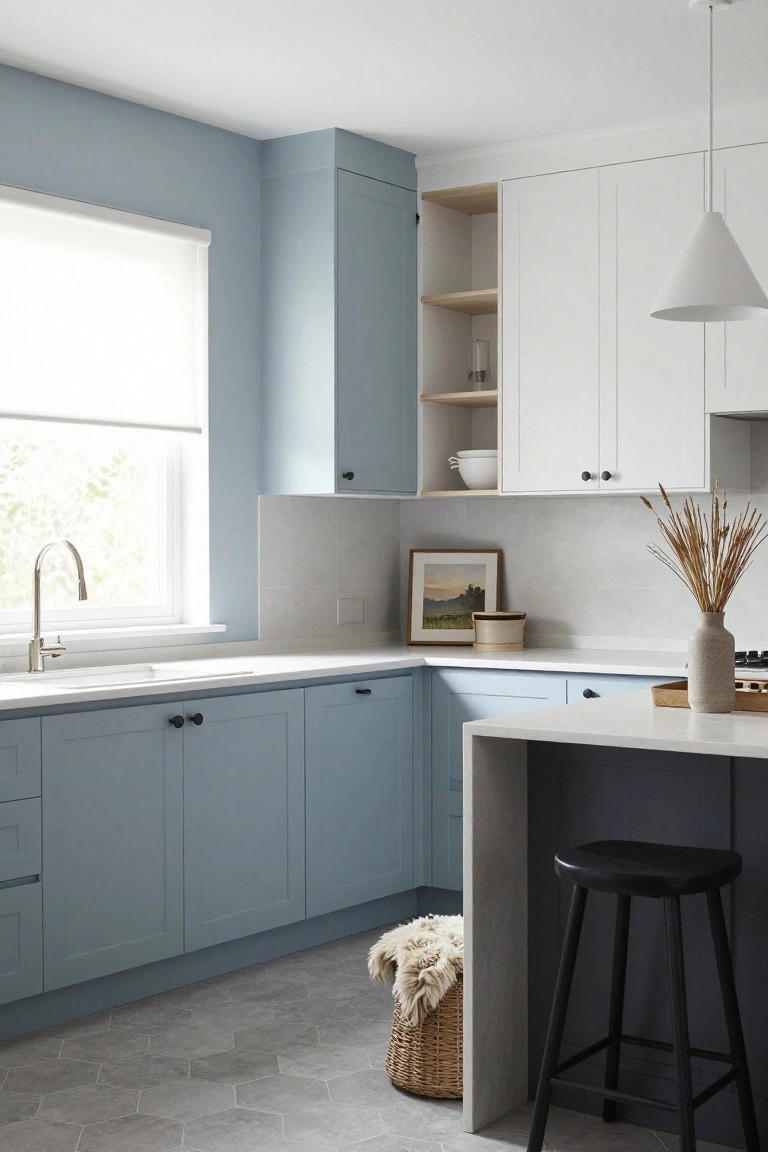
This kitchen goes with a soft blue on the lower cabinets that feels calm and easygoing. It looks closest to Sherwin-Williams Rain or Benjamin Moore Palladian Blue. That kind of muted blue keeps things fresh without being too bold. People like it because it pairs so well with everyday whites and lets wood tones pop a bit.
The color has a cool gray undertone, which shows up nice in rooms with good window light. Stick it on cabinets under white uppers and stone counters like you see here. It works best in spaces that get some sun. Just watch it doesn’t read too gray in dimmer spots.
Deep Green Kitchen Island

This kitchen features a deep green on the island cabinets that looks closest to Sherwin-Williams Pewter Green, Benjamin Moore Essex Green HC-188, or Farrow & Ball Studio Green. It’s a rich, grounded green with a touch of cool undertone. Folks like it because it adds real life to plain white cabinets without overwhelming the room.
Sunlight brings out the depth here, next to the marble top and brass faucet. It suits open kitchens best, paired with light woods or creamy whites. In dimmer spots, it might read darker, so test samples first.
Deep Gray-Green Cabinets
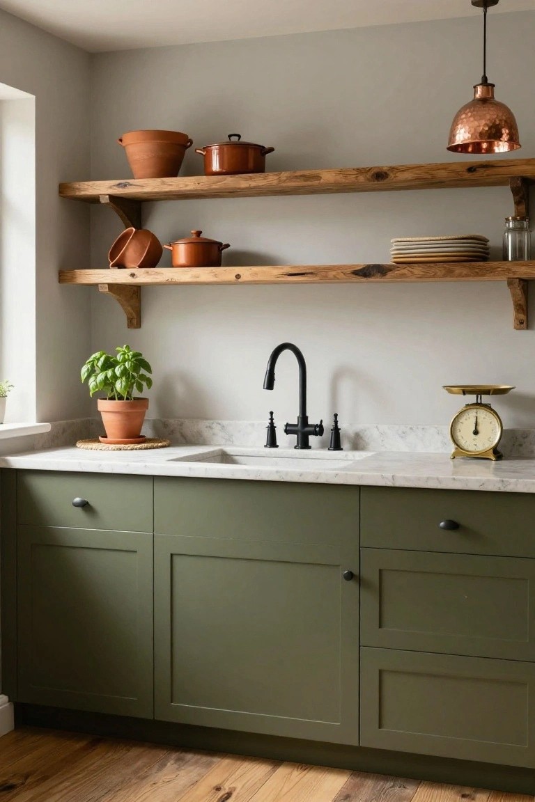
These kitchen cabinets show off a deep gray-green color. It has that same feel as Farrow & Ball’s Pigeon, or close to Sherwin Williams’ Iron Ore and Benjamin Moore’s Kendall Charcoal. It’s a cool shade that sits nicely between gray and green, making it a solid pick for modern kitchens. People go for it because it feels moody without being too dark, and it lets metals and wood stand out.
The undertone leans cool with a hint of green, so it works best in rooms with good natural light. Pair it with stainless counters like you see here, or warm wood shelves to balance things. Just watch it in smaller spaces, it can read almost black on dim days.
Deep Black Cabinets
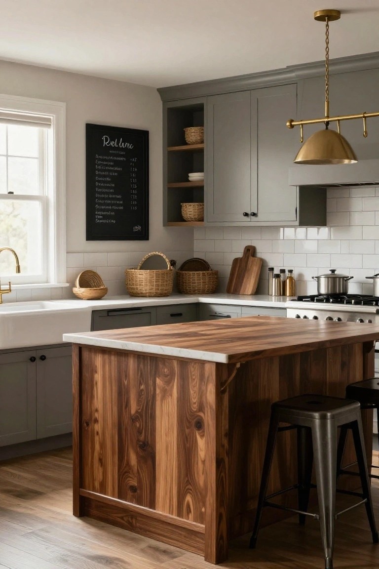
You can’t go wrong with deep black cabinets like these. This shade sits right in the true black family, reading very close to Sherwin-Williams Tricorn Black or Benjamin Moore Onyx, maybe even Farrow & Ball Railings on a good day. It’s got that clean, matte finish that makes white subway tile and marble counters pop without feeling harsh. Folks keep coming back to black because it hides fingerprints okay and gives kitchens a pulled-together look year after year.
Black like this has neutral undertones, so it plays nice in natural light without going too blue or brownish. Pair it with gold hardware and wood stools for balance, but test it first if your space is small… it can shrink things a bit. Brightens right up with white backsplash though.
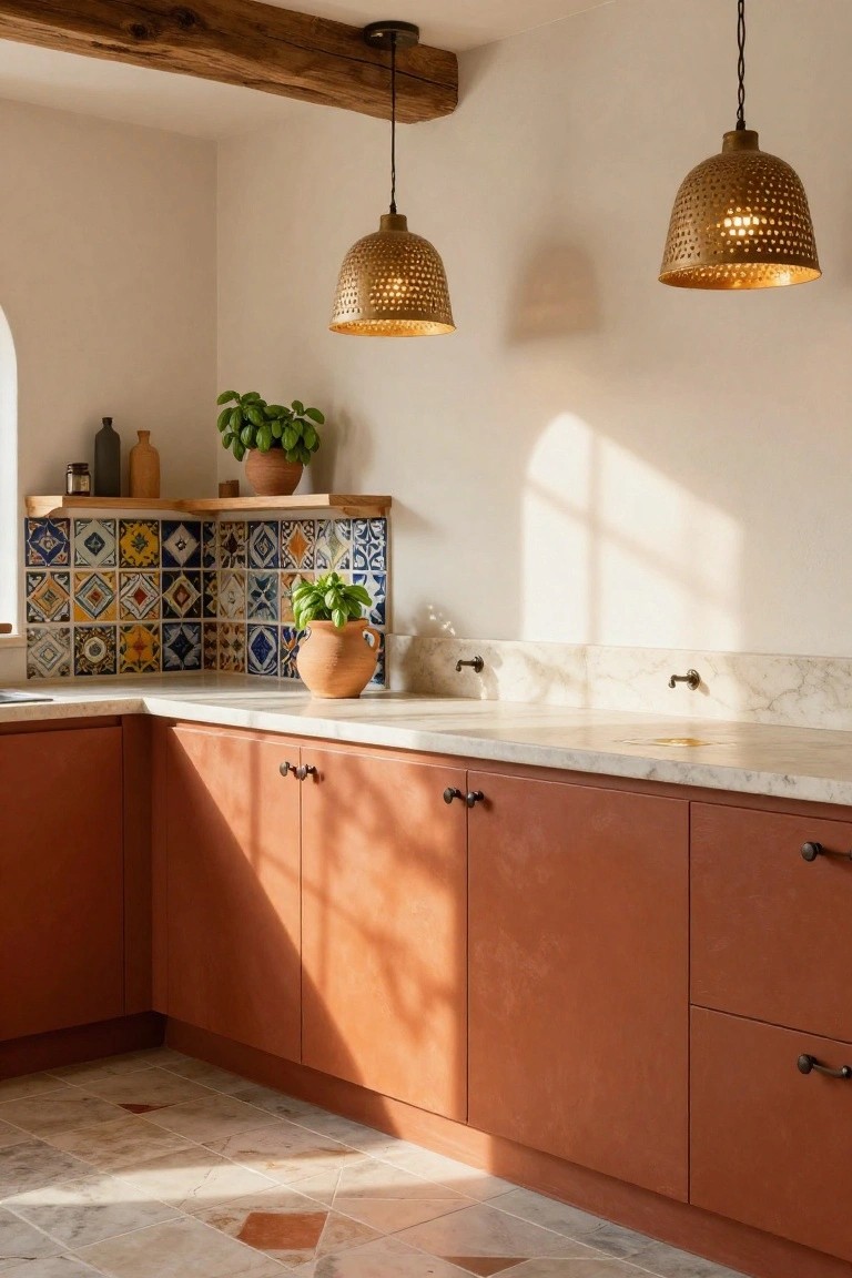
Muted Terracotta Cabinets

This kitchen uses a muted terracotta on the lower cabinets that pulls everything together. It looks closest to Farrow & Ball Red Earth or Benjamin Moore Potters Clay, maybe Behr Terracotta Pot too. That dusty orange-red family has a soft warmth, not too bold, and sits just right next to wood counters and plants.
The peachy undertones come alive in natural light, like here with the blue tiles nearby. It works well in sunny kitchens paired with creamy walls or stone hoods. Steer clear of stark whites if you want to keep the cozy vibe going.
Soft Teal Cabinets

This kitchen goes with a soft teal on the cabinets. It sits in the blue-green family and looks closest to Sherwin-Williams Retreat or Benjamin Moore Palladian Blue. Maybe Farrow & Ball Selvedge too. What stands out is how calm it feels. Not screaming for attention but still fresh against the wood.
That gray undertone keeps it from going too tropical. It works best in rooms with good natural light, like this one. Wood stools and black counters balance it nicely. Just watch for pairing with anything too yellow… cooler woods are safer.
Soft Mint Green Cabinets

This kitchen island pulls off a soft mint green on the cabinets that seems closest to Sherwin Williams Sea Salt or Benjamin Moore Saybrook Sage. It’s a cool, muted green in the family that stays light and easygoing. People go for it since it adds a fresh touch without overpowering the room.
That gray undertone helps it read calm next to white counters and wood stools. Works best in bright kitchens with ocean or garden views. Just pair with natural materials, and watch it doesn’t fade against super dark floors.
Deep Green Kitchen Cabinets
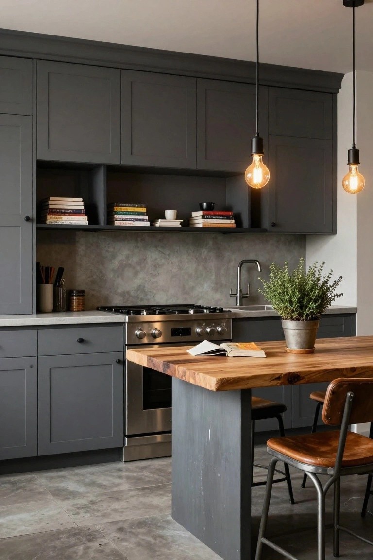
This kitchen uses a deep green on the cabinets that feels rich and grounded. It looks closest to Sherwin-Williams Ireland or Benjamin Moore Hunter Green, with Farrow & Ball Studio Green also in the mix. That shade has enough depth to stand up without overwhelming the room. Folks like it because it brings some personality to everyday spaces.
The green picks up a bit of blue undertone next to those green tiles, but stays warm enough with the gold taps and cream uppers. It works best where you get decent light from a window. Pair it with white counters or wood for balance, and skip anything too bright on the walls.
Cool Gray Cabinets

Cool gray takes center stage on these kitchen cabinets, reading close to Sherwin-Williams Iron Ore or Benjamin Moore Kendall Charcoal. Maybe Farrow & Ball Railings too. It’s a matte finish gray with a subtle cool undertone that feels steady without going too dark. Folks like it because it lets other bits like wood counters or those white bowls pop right out.
That blue undertone keeps it from looking stark, especially under pendant lights like these. Works best in kitchens with some natural light and pairs easy with pale walls or subway tiles. Steer clear if your space is all warm woods, though. Might need white trim to lift it.
Blush Pink Cabinets

This kitchen goes with a soft blush pink on the lower cabinets. It looks closest to Sherwin-Williams Rosé or Benjamin Moore Blush, maybe Behr Dreamy Pink too. That pastel pink family has a gentle warmth to it. People like how it brightens things up without overpowering the room.
The color picks up a bit of peach undertone in the light here. It sits well against white uppers and that black-and-white checkered floor. Try it in spaces with some sunlight. Wood stools or gold pulls keep it from going too sweet.
Soft Gray Cabinets

Soft gray cabinets anchor this kitchen, reading close to Sherwin-Williams Repose Gray or Benjamin Moore Gray Owl. Maybe even Behr’s Silver Shadow. It’s a medium neutral gray, not too cool or stark. People go for it since it lets white counters and wood shelves stand out without stealing the show.
That gray picks up a slight warm undertone next to the marble. Natural window light keeps it from looking flat. It fits older homes with hardwood floors. Just pair it with brass hardware or open shelves… and you’re set.
Muted Teal Cabinets

These kitchen cabinets show off a soft muted teal that reads closest to Sherwin-Williams Sea Salt, Benjamin Moore Palladian Blue, or Farrow & Ball Dix Blue. It’s that kind of relaxed blue-green that feels fresh but not too bold. People go for it because it pairs so nicely with warm woods and metals, keeping the kitchen looking lived-in and easy.
The color has a cool undertone with just enough green to keep it from going stark blue. It shines in spaces with good natural light, like near a window, and works best against butcher block counters or gold fixtures. Pair it with crisp white uppers and subway tile, but skip anything too orange in the wood tones.
Clean White Kitchen Cabinets

This kitchen goes with a clean white on all the cabinets. It’s bright but not stark, the kind that keeps a space feeling open and easy. I’d say it reads close to Sherwin-Williams Pure White or Benjamin Moore Chantilly Lace, maybe Behr’s Ultra Pure White too.
That neutral tone picks up the gray counters and backsplash without clashing. It lets the wood shelves stand out nice. Works best in good light, pairs with cool grays or warm woods. Just watch it doesn’t look too cold next to yellow tones.
Sage Green Lower Cabinets
This kitchen goes with a soft sage green on the lower cabinets. It reads very close to Sherwin-Williams Clary Sage or Benjamin Moore Saybrook Sage, maybe Behr’s Silver Sage too. That muted green family feels calm and easygoing. People like it because it keeps things fresh without being too bold, especially next to wood tones.
The gray undertone keeps it from going too yellow in most lights. Pair it with creamy upper cabinets like these, and it lets the wood table and stone floor stand out. Works best in kitchens with good natural light. Just test a sample first, since it can shift a bit on cabinets.
Navy Blue Kitchen Cabinets

A deep navy blue takes over the cabinets in this kitchen setup. It looks closest to Sherwin-Williams Naval or Benjamin Moore Hale Navy, maybe even Farrow & Ball’s Hague Blue. Folks like this shade because it feels strong and steady. Makes the room look put-together right away.
That navy sits with a cool undertone next to the white brick and gray counters. It holds up in bright light without washing out. Pair it with warm woods or brass for balance. Just watch it doesn’t crowd a small space.
Warm Sage Cabinets

The cabinets in this kitchen show off a warm sage green, the kind that feels earthy and settled. It looks closest to Sherwin-Williams Clary Sage or Benjamin Moore Saybrook Sage, maybe Farrow & Ball French Gray too. Folks like it because it nods to nature without shouting, and it holds up next to all sorts of wood tones.
That subtle yellow undertone keeps it from going cold, especially under natural light like you see here on those terracotta floors. It works best in kitchens with some rustic touches. Go for creamy counters and brass pulls to keep things easy and right. Just test it in your space first, since greens can shift.
Soft Seafoam Green Cabinets
The lower cabinets in this kitchen are done up in a gentle seafoam green. It looks closest to Sherwin-Williams Sea Salt or Benjamin Moore Palladian Blue, maybe even Behr’s Blue Horizon. Folks like this shade because it feels light and coastal without overpowering the room. Keeps things fresh next to all that white and wood.
That cool blue-green undertone works best in kitchens with good natural light. It plays nice with white uppers, oak shelves, and bits of texture like those shell tiles. Avoid dim spots though. It can pull a little gray if the lighting’s off.
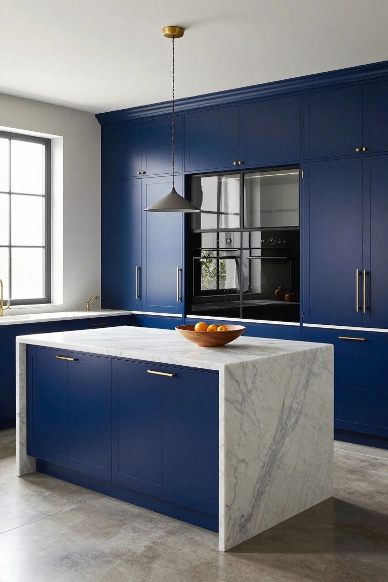
Deep Navy Cabinets

Deep navy takes over these kitchen cabinets in a way that feels solid and calm. It sits closest to Sherwin-Williams Naval or Benjamin Moore Hale Navy, maybe a touch toward Behr’s Deep Space. Folks keep coming back to this shade because it holds its own next to wood without stealing the show.
That cool undertone picks up nicely in good light, like from the slim fixture overhead. Gold hardware and marble counters keep it from going too dark. I’d use it where you have wood accents or white nearby… just test it in your space first, since navy can shift a bit by room.
Soft Blue-Gray Cabinets

Those kitchen island cabinets show off a soft blue-gray paint that’s got that muted, easy feel. It sits closest to Sherwin-Williams Sea Salt or Benjamin Moore Palladian Blue, maybe Farrow & Ball Parma Gray too. Folks like it because it’s calm without being cold, and it lets the wood countertop and nearby cream cabinets stand out nice.
The gray undertone keeps it from going too blue in different lights, especially with sunlight coming in like here. It works great in kitchens with lots of wood or stone details. Just watch it doesn’t look flat against stark white, so warmer accents help.
Frequently Asked Questions
Q: Will these combos work in a small kitchen?
A: Pick light cabinets like soft white or pale gray paired with a warm wood island. They bounce light around and make the room feel bigger right away. Skip all-dark setups unless you crave cozy drama.
Q: How do I test these colors with my current countertops?
A: Grab paint swatches or sample doors from the store. Hold them up next to your counters under morning and evening light. That shows if the tones play well or clash.
Q: What if I rent and can’t change my cabinets?
A: Paint the inside of cabinet doors or swap hardware for instant impact. And add peel-and-stick backsplash tiles in a matching hue. It refreshes the look without permanent changes.
Q: Do these ideas fit a modern kitchen too?
A: Totally. Swap vintage woods for matte black with brass accents. It keeps the timeless feel but amps up the sleek edge.
