


I’ve painted my share of kitchen cabinets over the years, always chasing that balance between uppers and lowers that feels just right in daily use. Natural light pours in differently across rooms, so a color that glows warm in one kitchen can cool off starkly in another.
I learned that the hard way with a taupe I tested, which brought out unexpected green undertones against my oak floors by evening. What usually works best involves picking hues with complementary depths that enhance each other without clashing. Sample a few in your own space before committing.
Deep Navy Lower Cabinets

This kitchen goes with a deep navy on the lower cabinets and island, the kind that feels closest to Sherwin-Williams Naval or Benjamin Moore Hale Navy. Maybe even Farrow & Ball’s Hague Blue. It’s a strong blue, not too black and not too bright. Folks like it because it adds real weight down low while keeping things airy up top.
That navy sits with a cool undertone but picks up warmth from nearby wood and brass. It shines in sunny spots like this one, next to white cabinets and marble counters. Pair it with rattan stools for a casual touch. Just test samples in your light first… navy can shift a bit.
Pale Yellow Uppers with Sage Green Lowers

This kitchen splits the cabinet colors nicely, with pale yellow on top that seems closest to Farrow & Ball Hay or Sherwin-Williams Butter Up. The lowers go with a muted sage green, reading a lot like Benjamin Moore Saybrook Sage or Behr Silver Sage. That combo keeps things light and fresh without going too bold. It’s a good pick for folks who want some color but nothing overpowering.
The yellow has a warm buttery undertone that plays well off the wood table and copper pots hanging nearby. Sage brings a bit of cool gray-green calm, best in rooms with good natural light so it doesn’t turn dingy. Pair it with creamy whites on walls or soapstone counters. Just test samples, since sage can shift under different bulbs.
Pale Grey Upper Cabinets

These upper cabinets use a pale grey paint that keeps things calm and clean. It looks closest to Sherwin-Williams Repose Gray or Benjamin Moore Gray Owl, maybe Behr Silver Drop too. Folks like it because it lets the light wood lowers stand out without competing, and it makes the whole kitchen feel open.
That cool grey undertone shows up best in rooms with windows like this one. It pairs easy with oak cabinets below and black faucets. Just test samples in your light first, since it can read whiter on some walls.
Navy Blue Lower Cabinets

The lower cabinets in this kitchen go with a deep navy blue paint. It looks closest to Sherwin-Williams Naval or Benjamin Moore Hale Navy, maybe even Farrow & Ball’s Hague Blue. This kind of color gives the base a solid, grounded look that feels classic and not too trendy.
That navy has cool undertones that play nice with white marble counters and brass pulls. It works best in kitchens with decent window light, paired up with pale gray cabinets overhead and wood shelves. Watch it doesn’t overpower small spaces, though.
Pale Aqua Upper Cabinets

The upper cabinets in this kitchen pull off a pale aqua color that looks closest to Sherwin-Williams Sea Salt, or maybe Benjamin Moore’s Palladian Blue. It’s a gentle blue-green in the seafoam family, cool without being chilly. Folks like it because it brightens the space just right, especially next to cream lowers and wood counters.
That cool undertone with a hint of gray shows up best in rooms with good natural light, like this one overlooking the water. It pairs easy with brass hardware and white sinks. Just test it in your own lighting first… it can shift a bit greener in some spots.
Deep Green Kitchen Cabinets

This kitchen paints both upper and lower cabinets in a deep, rich green that looks closest to Sherwin-Williams Pewter Green or Benjamin Moore Hunter Green HC-123. Maybe even Farrow & Ball Studio Green. It’s the sort of green that’s moody but welcoming, especially next to warm wood. People go for it when they want cabinets to feel like furniture, not just storage.
That green pulls a bit yellow in the light here, which keeps it from going too dark. It suits rooms with plenty of windows and pairs easy with marble counters or brass hardware. Watch the floors though. Too cool a wood might fight it.
Muted Teal Lower Cabinets

Lower cabinets in a soft muted teal give this kitchen a calm pop of color against white uppers. It reads close to Sherwin-Williams Sea Salt or Benjamin Moore Palladian Blue, maybe Behr Back to Nature too. Folks like it because it’s lively but settled, not screaming for attention. Makes the wood island and creamy counters feel right at home.
Gray undertones help it stay cool next to the brass pulls and plants. Brightens up in natural light like here, on that speckled floor. Try it in medium-sized kitchens, paired with warm woods. Just test samples, lighting can shift the blue-green read a bit.
Deep Navy Lower Cabinets
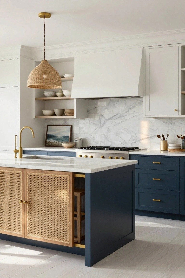
This kitchen paints the lowers and island in a deep navy. It looks closest to Sherwin Williams Naval or Benjamin Moore Hale Navy, maybe Farrow & Ball Hague Blue too. That shade gives a solid, grounded feel without overpowering the white uppers or marble counters.
Navy like this has a cool gray undertone. It sits right in spaces with bright windows. Brass pulls and warm rugs balance it out nicely. Just watch it doesn’t read too dark in low light.
Soft Blue Lower Cabinets

This setup pairs crisp white upper cabinets with a pale blue on the lowers. It reads very close to Sherwin-Williams Sea Salt or Benjamin Moore Palladian Blue, maybe Behr’s Blue Whisper too. That soft blue keeps things calm and coastal without going overboard. Folks like how it brightens a kitchen on a budget.
The color has cool gray undertones that play nice next to wood stools and gold hardware. It shines in rooms with good natural light, like near a window here. Pair it with white uppers to keep the space open. Just test samples first, since it can shift cooler in dim spots.
Soft Blue Upper Cabinets

Those upper cabinets show off a soft blue that’s got a hint of gray in it. It reads very close to Sherwin-Williams Sea Salt, or maybe Benjamin Moore Palladian Blue, even Farrow & Ball Borrowed Light. This kind of muted blue keeps things calm and open, especially over light wood like the oak down below. Nobody wants uppers that overpower a kitchen.
The cool undertone plays right with white tiles and counters, picking up light from the window. It works best in brighter spaces where the wood cabinets can warm it up a bit. Pair it with natural tones, and skip anything too yellow underneath.
Blush Pink Cabinets

Those upper and lower cabinets show off a muted blush pink that seems closest to Sherwin-Williams Roseful or Farrow & Ball Setting Plaster, with Benjamin Moore Head Over Heels also in the mix. It’s the kind of soft pink that’s warm but not shouty. What stands out is how it keeps everything feeling lived-in and easy around the black stove.
That peachy undertone comes through best next to the copper kettles and wood details. Stick it in a sunny kitchen spot, and pair with creamy whites or beiges on counters. Just watch it doesn’t fade under too much yellow light.
Navy Blue Lower Cabinets

The lower cabinets in this kitchen pull off a deep navy blue that seems closest to Benjamin Moore’s Hale Navy or Sherwin-Williams Naval. Behr’s Deep Breath sits right in there too. It’s a cool-toned blue with some richness to it. Folks go for this shade because it anchors everything nicely, especially against those white uppers and light counters.
That cool undertone keeps it from going too black in normal light. It works best in kitchens with good windows or nearby wood like those stools. Pair it with pale quartz and brass touches. One thing. In a smaller room, test samples first to avoid a cave feel.
Sage Green Cabinets
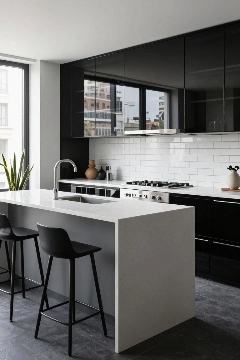
This kitchen pulls off sage green on the upper and lower cabinets in a way that feels right at home. It’s a soft, muted green with that earthy warmth people keep coming back to. I’d say it reads closest to Sherwin-Williams Evergreen Fog or Benjamin Moore October Mist, maybe even Farrow & Ball’s Sage Green. The color stays mellow next to all the wood, letting those tones shine without stealing the show.
That subtle green has warm gray undertones that play nice in morning light, like you see here on the beams and counters. It works best in open kitchens with natural wood or creamy tiles. Pair it with black metal stools or a white farm sink, and skip anything too bright. North light can make it feel a touch cooler though.
Cool Gray Kitchen Cabinets

This kitchen runs a cool mid-tone gray across both upper and lower cabinets. It looks closest to Sherwin-Williams Repose Gray or Benjamin Moore Gray Owl, maybe even Behr’s Silver Screen. That gray feels solid and modern without going too dark. It holds its own next to the black counters and those wood shelves.
The cool undertone gives it a clean edge. Works best in spaces with good natural light, or pair it with warm wood details to balance things out. Skip it if your room runs cold already… might feel a touch stark there.
Purple Upper Cabinets

Upper cabinets get a fresh take here with a dusty purple paint. It sits in the purple family and seems closest to Benjamin Moore November Rain, Farrow & Ball Brinjal, or Sherwin-Williams Liter. Folks go for this shade because it adds quiet color up high, without taking over the whole room.
That purple has a warm violet undertone, which shows up well next to the soft greige lowers and brass knobs. It suits kitchens with window light like this one. Pair it with creamy tiles or wood boards, but test in your space first… smaller rooms might need a touch lighter version.
Soft Sage Lower Cabinets

This setup paints the lower cabinets and island in a soft sage green. It looks closest to Sherwin-Williams Clary Sage or Benjamin Moore Saybrook Sage, maybe even Farrow & Ball French Gray. From the green family, it’s muted and gentle. People go for it because it adds a fresh touch without stealing the show from white uppers or marble tops.
That grayish undertone helps it stay balanced, especially in bright light. It works best in airy kitchens like this, paired with wood accents and oak floors. In low light it can feel a touch dull though.
Deep Purple Kitchen Cabinets

This kitchen pulls off deep purple on both the upper and lower cabinets. It looks closest to Sherwin Williams Mystical Grape or Benjamin Moore Eggplant, maybe even Farrow & Ball Brinjal. That shade gives a rich, modern feel that’s not overpowering. It stands out against the white marble backsplash without stealing the show.
The purple here leans cool with blue undertones. Good light from the window helps it read softer. Try it in open kitchens, paired with gold hardware and dark counters like this. Just test samples, since it can shift in dimmer spots.
Soft Blush Pink Upper Cabinets

This kitchen goes with a soft blush pink on the upper cabinets. It reads very close to Sherwin-Williams First Light or Benjamin Moore Head over Heels, maybe Behr’s Wishful Blush too. It’s that gentle pink family that’s warm without shouting, and it leaves room for wood shelves and cream cabinets below to shine.
The color pulls a little gray undertone in cooler light but stays cozy next to the light blue tile. Kitchens with morning sun handle it best. Stick to natural wood or rattan seats, and skip anything too stark white.
Warm Brown Wood Cabinets

These kitchen cabinets use a warm medium-brown wood finish that pulls everything together nicely. It looks closest to Sherwin-Williams Nomadic Desert or Benjamin Moore Pashmina, maybe Behr’s Warmed Amber too. This tone has a cozy, lived-in quality that makes a kitchen feel welcoming without trying too hard.
The golden undertones show up best in good window light, like you see here next to the white tile backsplash. It pairs simple with white counters and black hardware. Stick to rooms with some brightness, or it might read a touch darker.
Deep Teal Kitchen Cabinets

This kitchen goes with a deep teal on the upper and lower cabinets. It reads very close to Farrow & Ball Vardo or Sherwin-Williams Rainwashed, maybe Benjamin Moore’s St. Lucia Teal too. That kind of rich blue-green shade brings a moody feel without going full navy. It’s handy for updating older kitchens, holding its own next to white counters and warm woods.
The color has a cool undertone with green leaning through. It works best where there’s decent light coming in, like near a window. Steer clear of super dark rooms, or it’ll turn almost black. Woods like the oak stools here keep it balanced.
Creamy White Kitchen Cabinets

These cabinets show off a creamy white paint that’s warm and easy on the eyes. It reads very close to Sherwin-Williams Alabaster or Benjamin Moore Simply White, maybe even Behr Swiss Coffee. That soft tone keeps the kitchen feeling bright without going too cool or clinical. It’s a go-to for folks who want clean lines that highlight brass pulls and copper accents.
The warm undertone picks up nicely on wood floors and marble counters. It suits rooms with decent light, north or south facing. Just watch it doesn’t yellow too much next to very warm metals… pair thoughtfully there.
Pale Mint Green Cabinets
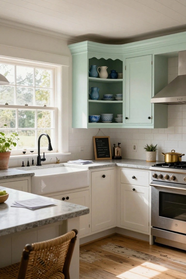
This kitchen goes with a pale mint green on the upper and lower cabinets. It reads very close to Sherwin-Williams Sea Salt, Benjamin Moore Quiet Moments, or Behr Breezeway. It’s that soft green family that’s fresh and easy on the eyes. People pick it because it keeps things light and pairs so well with wood tones.
The color has a cool blue undertone that pops in good daylight. Like here with the butcher block island and brass lights. It suits open kitchens best. Just test it in your space first, since low light can make it feel cooler.
Dusty Blue-Gray Cabinets

The cabinets in this kitchen go with a dusty blue-gray paint that seems closest to Sherwin-Williams Cyberspace or Farrow & Ball Pigeon. Benjamin Moore Stonington Gray reads pretty similar too. It’s the kind of cool muted blue that stays quiet but makes the whole space feel settled and fresh, especially around a white sink like this one.
Cool undertones give it that crisp edge without going stark. It works best where there’s decent window light. Pair with light wood floors or marble tops, but layer in some brass or plants if your kitchen runs dim.
Frequently Asked Questions
Q: Should uppers always match the lowers, or can I mix it up?
A: Mix them up for more personality, especially if you want to highlight your counters or backsplash. Pick lowers in a richer tone like deep charcoal to ground the space, then go lighter on uppers with off-white. Your kitchen will feel balanced and fresh.
Q: What colors work best in a small kitchen?
A: Choose light colors for both uppers and lowers to make the room feel bigger, like pale sage green paired with crisp white. Skip dark shades unless you add lots of lighting. This combo tricks the eye into seeing more space.
Q: How do counters play into cabinet color choices?
A: Match your cabinet colors to the undertones in your counters for a seamless vibe. Grab a quartz sample with gray veins? Layer on cool blue-grays for lowers and soft grays up top. Everything flows without fighting.
Q: My kitchen’s dark—how do I lighten it with cabinets?
A: Paint lowers a warm mid-tone like greige to anchor things. Keep uppers bright white. Light bounces right off and opens everything up.
