


I’ve noticed how two-tone paint schemes wake up a kitchen by playing off cabinets and walls in ways a single color never could.
The real trick comes down to how those shades shift throughout the day, with some pulling cooler in the evening light while others warm up unexpectedly under fluorescents.
I once paired a soft sage on the island with matte black lowers, surprised at how the sage stayed true instead of fading to dull green like so many do.
What makes them succeed is picking tones that echo your counters or backsplash without fighting the natural flow of the room. Test these in your light.
Navy Island Cabinets

This kitchen paints the island cabinets in a deep navy blue. It looks closest to Sherwin-Williams Naval or Benjamin Moore Hale Navy. That shade stands out nicely against the creamy upper cabinets without taking over the whole room. Folks like it for how it adds some weight down low.
The navy pulls a bit cool in this light, pairing easy with warm oak floors and brass pulls. Stick it in spots with decent windows, and keep the counters light like this marble. Just watch it doesn’t crowd a small kitchen.
Soft Sage Green Cabinets

This kitchen goes with a soft sage green on the cabinets that reads very close to Sherwin Williams Clary Sage or Benjamin Moore Saybrook Sage. Behr Silver Sage would work too. It’s a muted green in the sage family, not too bold but enough color to feel fresh. People like it because it keeps things calm while adding a bit of nature without overwhelming the room.
The undertone leans a touch blue which helps it stay cool in bright light, like you see here with the sunlight pouring in. It works best on cabinets paired with white tile and wood floors… keeps everything grounded. Just pair it with warm woods or rattan to avoid it feeling flat.
Cool Light Gray Cabinets

This kitchen uses a cool light gray on the upper cabinets that feels just right for a modern setup. It looks closest to Sherwin-Williams Repose Gray, Benjamin Moore Gray Owl, or Behr’s Cracked Pepper in a lighter shade. What stands out is how it keeps the space feeling open and clean, especially next to those white lowers.
The cool undertone plays well with natural light coming through the window. Pair it with wood like that table for some warmth, or crisp whites to stay simple. In north-facing kitchens it might read a touch cooler, so test samples there first.
Deep Green Cabinets
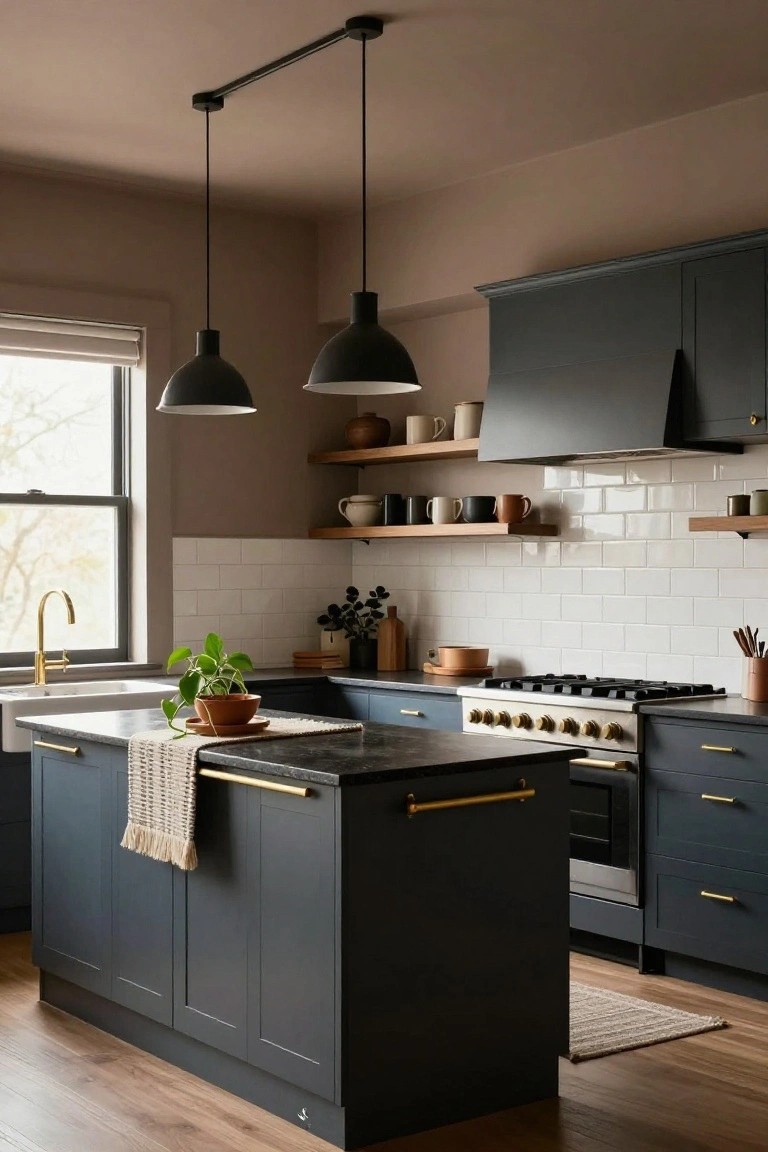
This kitchen uses a deep green on the cabinets that reads very close to Sherwin-Williams Pewter Green or Farrow & Ball Studio Green. It’s a muted green in that cozy family, with a bit of gray to soften it. Folks like it because it adds real presence without shouting, and it plays nice with wood cutting boards and warm tones around it.
The undertone leans warm, especially in sunlight like this. It suits kitchens with some natural light, where it glows a touch. Go for beige counters or creamy ovens to balance it, and skip anything too cool or bright.
Pale Blue Walls
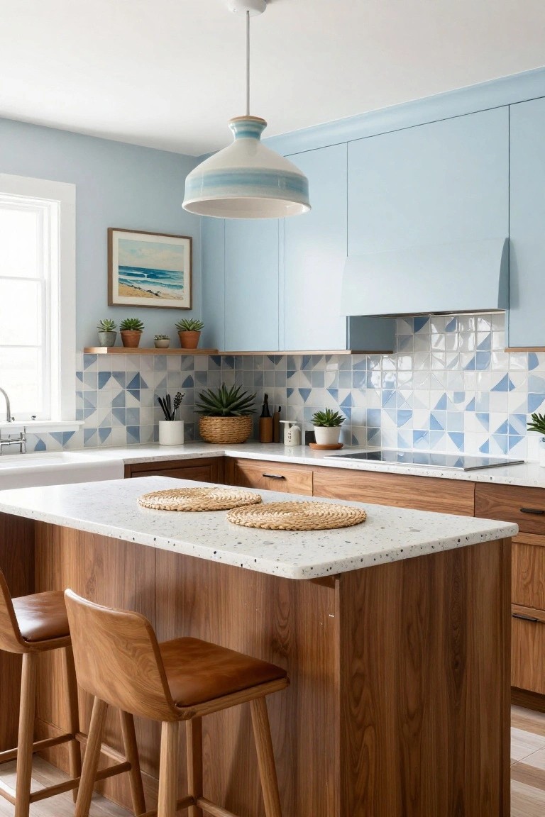
This kitchen goes with pale blue on the walls, ceiling, and upper cabinets. It looks closest to Benjamin Moore Palladian Blue, or maybe Sherwin-Williams Rain, Behr Blue Whisper. That kind of soft sky blue feels airy and calm. It brightens the room without overpowering the cream cabinets underneath.
The cool undertone keeps it from turning muddy in low light. It works best with white subway tile and wood accents like those stools here. Watch for pairing it with warm brass fixtures… they bring out the best in it.
Navy Kitchen Island Cabinets

This kitchen goes for a deep navy paint on the island cabinets. It reads very close to Sherwin-Williams Naval or Benjamin Moore Hale Navy, maybe even Farrow & Ball Hague Blue. That moody blue family gives a solid contrast to the white upper cabinets. Folks like it because it feels fresh and grown-up, not like the usual all-white look.
The cool undertones keep it from going too dark next to the marble tops and wood floors. It works best in brighter kitchens where sunlight hits it right. Pair it with gold hardware like here, and brass faucets. Just make sure your lighting is good, or it might read grayer.
Brick Red Lower Cabinets

This kitchen pulls off a nice warm brick red on the island and base cabinets. It looks closest to Sherwin-Williams Red Bay or Benjamin Moore Caliente, maybe even Farrow & Ball Rectory Red. That kind of earthy red keeps things grounded and homey, especially next to the creamy white uppers.
The warm undertones come through best in morning light like this. It works great with wood counters and copper details. Stick to off-whites or soft woods above and below to let the red shine without overwhelming the room.
Muted Teal Lower Cabinets

Those lower cabinets catch the eye with a muted teal paint. It sits in the blue-green family and comes across closest to Sherwin-Williams Sea Salt or Benjamin Moore Wythe Blue, maybe Behr’s Blue Horizon too. What I like about this shade is how it stays calm and modern. Not too bright. It gives the kitchen a fresh base without overwhelming the space.
The cool undertones read best in good natural light, like from that nearby window. It works nicely next to beige uppers and wood floors. Pair it with white counters to keep things clean. One thing. In dimmer spots it might lean a bit gray, so test your samples there.
Navy Blue Kitchen Cabinets

This kitchen goes with a deep navy blue on the cabinets and island, and it reads very close to Sherwin-Williams Naval or Benjamin Moore Hale Navy. Maybe Farrow & Ball Hague Blue too. It’s that rich navy family people turn to for a solid, grown-up look that doesn’t fade into boring.
The color picks up a cool undertone next to the white walls and wood shelves, keeping everything crisp. It works best where you have good light, like near windows, and holds up against beachy vibes or simple modern ones. Stick to white quartz tops so it doesn’t crowd the room.
Warm Terracotta Cabinets

These lower cabinets show off a warm terracotta orange paint that’s full of earthy character. It looks closest to Sherwin-Williams Koral Kicks or Benjamin Moore Moroccan Spice, maybe Behr Spiced Brandy too. That muted orange brings a cozy feel to the kitchen without going too bold, especially next to the soft gray walls.
The color has warm red undertones that pick up nicely on brass hardware and wood accents. It works best in spaces with good natural light, like near a window, and pairs easy with white counters or black appliances. Just test a sample first. Lighting can shift it cooler sometimes.
Soft Sage Green Walls

This kitchen pulls off a soft sage green on the walls that reads very close to Sherwin-Williams Clary Sage or Benjamin Moore Saybrook Sage, maybe even Farrow & Ball Pigeon. It’s that gentle green-gray family, not too bold, just enough color to feel fresh without overwhelming the space. Folks like it because it keeps things light and ties right into the wood tones here.
The undertone leans warm and muted, so it works best in rooms with natural light coming through windows like these. Pair it with gray cabinets and light wood counters, and it stays balanced. North-facing kitchens might need a test swatch first, though, to avoid looking flat.
Matte Black and Pale Cream Cabinets

This kitchen pulls off a simple two-tone look with matte black cabinets on one side and pale cream ones on the other. The black feels pretty much like Sherwin-Williams Tricorn Black. For the cream side, it comes closest to Benjamin Moore White Dove or Behr Swiss Coffee. That combo gives you a fresh modern vibe without going overboard. It’s clean but still feels lived-in.
The cream has a soft warm undertone that keeps things from looking too stark next to the wood island top. Stick it in a space with decent light, like this one with its terrazzo floor and marble backsplash. Just watch that the black doesn’t overpower small rooms.
Pale Mint Cabinets

This pale mint green on the cabinets gives a fresh, airy feel to the kitchen. It looks closest to Sherwin-Williams Sea Salt or Benjamin Moore Quiet Moments, maybe Behr’s In a Pinch too. That soft green keeps everything light and modern without overwhelming the space, and it really lets the white counters pop.
The cool blue undertones make it read cooler in bright light, which works great against white tile and marble here. Pair it with natural rattan or wood stools like these to warm it up a bit. It shines best in sunny kitchens, but test samples since it can shift a touch gray in low light.
Soft Blue Cabinets

Those cabinets show off a soft blue that seems closest to Sherwin-Williams Sea Salt or Benjamin Moore Palladian Blue. It’s a muted blue-gray in the cool family, easy on the eyes and not too bright. What makes it nice is how it livens up a kitchen while letting wood counters and white sinks stand out.
The cool undertones keep it from going too green, especially in natural light from a window like this. It pairs well with brass taps and oak tops. Just test it in your space first, since lighting can shift it a bit cooler.
Charcoal Gray Kitchen Island

This kitchen island pulls off a deep charcoal gray that’s rich but not quite black. It sits on the cabinets in a matte finish, giving that strong modern base people turn to for two-tone looks. What stands out is how it lets the warm wood top and light shelves shine right up against it.
The gray here leans neutral with a touch of cool undertone, perfect next to concrete walls or polished floors like this setup. It works great in brighter spaces with big windows. Closest matches I’d go for are Sherwin-Williams Iron Ore, Benjamin Moore Kendall Charcoal, or Behr Cracked Pepper.
Creamy White Walls

This kitchen pulls off a classic two-tone look with creamy white walls that read closest to Sherwin Williams Alabaster or Benjamin Moore White Dove. It’s a warm white, not too stark, with just enough beige undertone to feel cozy next to those honey-toned wood cabinets. Folks like it because it lets colorful pottery and copper accents stand out without overwhelming the space.
In good natural light, that subtle warmth keeps everything feeling fresh and open. Pair it with warm woods or terracotta floors like here, and skip cool grays that might clash. Works great in sunny kitchens… just test a sample first to see how your light plays with it.
Cool Gray Lower Cabinets

This kitchen pulls off a clean two-tone look with cool gray on the lower cabinets and island. It seems closest to Sherwin-Williams Repose Gray or Benjamin Moore Gray Owl, maybe even Behr’s Silver Shadow. That soft gray keeps things feeling fresh and modern. It’s not too dark. Just enough color to set off the white uppers.
The cool undertone shows up best in rooms with good natural light, like here by the window. Pair it with white counters and a bit of wood, such as those stools, and it stays balanced. Watch for north-facing kitchens though. It might read a touch colder there.
Soft Sage Lower Cabinets

This kitchen goes with a soft sage green on the lower cabinets. It looks closest to Sherwin-Williams Clary Sage or Benjamin Moore October Mist. That gentle green family feels easygoing and ties right into the wood countertop without stealing the show.
The color picks up a bit of gray undertone. It sits well next to warm woods and light uppers. Best in rooms with some daylight. Watch for pairing it with matte black hardware if you want contrast.
Navy Blue Kitchen Cabinets

This kitchen uses a deep navy blue on the cabinets that reads really close to Sherwin-Williams Naval or Benjamin Moore’s Hale Navy. It’s that rich, not-too-black blue that feels bold but still cozy in a modern setup. Folks like it because it stands up to white marble counters and gold hardware without washing out.
The color has a cool undertone that picks up nicely in natural light from the window. Pair it with light wood floors like here, and it keeps things grounded. Just watch it in dimmer spaces. It can turn moody, so good lighting helps a lot.
Pale Yellow Lower Cabinets

This kitchen goes with a cheerful pale yellow on the lower cabinets and island. It looks closest to Farrow & Ball Babouche or Benjamin Moore Pale Yellow HC-3. That kind of soft yellow adds a bit of everyday warmth without overwhelming the room. Folks like it because it perks up the space next to cooler greys.
The warm undertone plays well in morning light, like you see here on the marble counters. Pair it with wood accents or blue tiles for balance. Just test samples first. Some lights can pull a greenish hint.
Cool Gray Two-Tone Cabinets
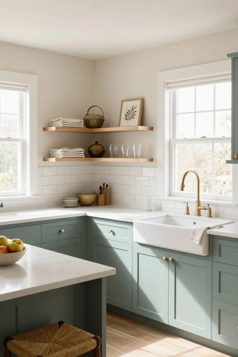
This kitchen pulls off a nice two-tone look with cool grays on the cabinets. The uppers go pale and the island sits deeper, reading close to Sherwin-Williams Repose Gray on top and Benjamin Moore’s Kendall Charcoal below. Or Farrow & Ball’s Pavilion Gray could fit the lighter shade too. It’s a straightforward way to add some interest without overwhelming the room.
Those grays lean cool with a hint of blue undertone, which brightens up next to white marble counters and wood floors. They play well in spaces with decent natural light. Pair with brass pulls to keep it from feeling stark.
Navy Blue Cabinets

The cabinets in this kitchen are a deep navy blue. It seems closest to Sherwin-Williams Naval or Benjamin Moore Hale Navy, maybe Behr’s Midnight Show. That kind of rich blue adds some weight to the lower cabinets. Makes the space feel pulled together.
The cool undertones work best next to white marble like this. Gold hardware pops against it. In good light, it stays fresh… not too dark for everyday use. Pairs well with black and white floors too.
Dusty Mauve Walls

This kitchen wall color is a soft dusty mauve, the kind of muted purple-pink that seems closest to Sherwin-Williams Mystifying Mauve or Benjamin Moore Mauve Mallow. Maybe Farrow & Ball Nancy’s Blushes too. It’s gentle on the eyes and gives a quiet pop without shouting. That’s why it works so well here, letting the wood and whites stay front and center.
With its warm undertone, the mauve picks up nicely in morning light coming through the window. Stick to cream cabinets above like these, and wood accents below. Avoid dim rooms though. It can read flat there.
Pale Aqua Ceiling

This kitchen picks up a pale aqua paint on the ceiling. It sits in that cool blue-green family and looks closest to Sherwin Williams Rainwashed or Benjamin Moore Palladian Blue. Those shades give a fresh lift without overpowering the room. You see it working nicely here against the greige cabinets.
Cool undertones keep it airy in good light from the window. Pair it with warm wood stools or white counters like this, and it feels balanced. In a north-facing spot it might read a touch greener though.
Frequently Asked Questions
Q: Can I paint my existing cabinets for a two-tone refresh instead of replacing them?
A: Paint works great on most cabinets. Prep by cleaning and sanding lightly so the new color grips well. Pick semi-gloss paint for easy wipe-downs later.
Q: In a small kitchen, how do I pick tones that won’t make it feel closed in?
A: Light shades up top lift your gaze and add airiness. Pair them with deeper tones below to ground the room. White uppers with gray lowers never fail.
Q: How do I make sure my two tones actually go together?
A: Start with your countertops or flooring for one color cue. Echo that shade lightly in the other tone. Swatches in your actual light help avoid surprises.
Q: What pulls the two-tone look together without extra cost?
A: Simple hardware like brushed nickel pulls. They link both colors smoothly. Swap them out first for quick impact.
