


I’ve noticed that neutral paints on kitchen cabinets shift more than you’d expect once sunlight moves through the room.
A shade I once used that seemed perfectly balanced ended up looking flat under my overhead lights at night.
The ones that work best layer tones with subtle undertones that echo rather than fight each other.
They create that steady feel without drawing attention to themselves.
Test a couple in your own space first.
Soft Greige Cabinets

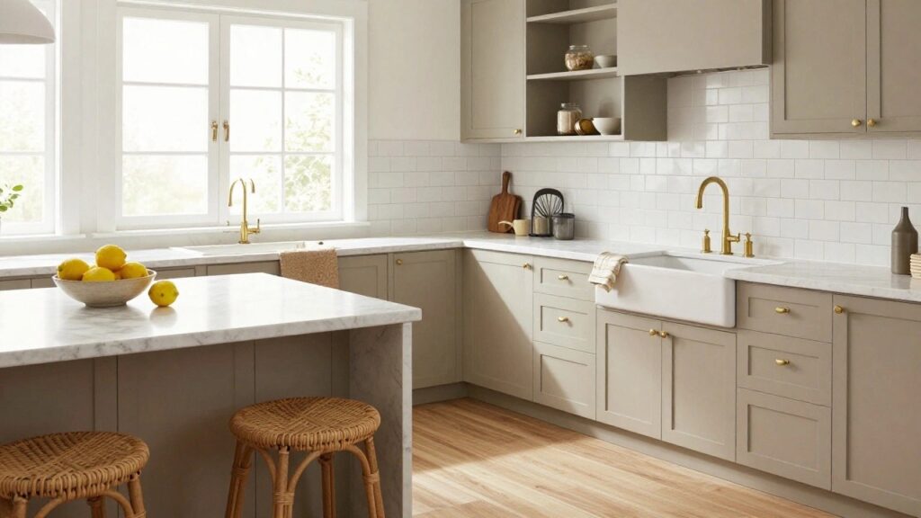
Those cabinets show off a soft greige, the kind of warm gray-beige that’s super popular right now. It looks closest to Sherwin Williams Agreeable Gray or Benjamin Moore Revere Pewter, maybe even Behr’s Silver Screen. What I like about it is how it sits quietly against white marble like on this island. Not too gray, not too beige. Just right for everyday kitchens.
The undertone leans warm, which helps in rooms with natural light coming through the windows. It plays well with gold hardware and rattan stools without clashing. If your space has oak floors, this tone keeps everything looking cozy together. Steer clear of cool blues nearby, though. They can make it read flatter.
Deep Navy Kitchen Island

This kitchen island shows off a deep navy paint that seems closest to Sherwin-Williams Naval or Benjamin Moore’s Hale Navy. It’s the kind of rich blue neutral that holds its own without overwhelming the space. Folks like it because it adds some weight to lighter cabinets up top.
That navy sits cool next to the creamy uppers and wood stools, keeping things from going too sweet. It shines in sunny kitchens like this one, paired with white tiles or butcher block. Just test it in your light first, since it can read almost black in dim spots.
Pale Blue-Green Cabinets

You can’t miss the pale blue-green on these cabinets. It reads very close to Sherwin-Williams Sea Salt or Benjamin Moore Palladian Blue, maybe even Farrow & Ball’s French Gray. It’s that easy neutral shade, not too blue or green, just right for keeping a kitchen feeling fresh without going bold.
The cool undertone picks up nicely in bright light, like from those big windows here. Pair it with white counters and wood stools, and it lets the blue tile floor shine. Works best in coastal spots or sunny rooms. Steer clear if your lighting’s too dim, though. It might read grayer then.
Soft Gray Cabinets Up Top
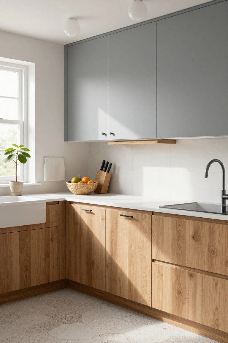
This kitchen pulls off a soft cool gray on the upper cabinets that feels just right. It looks closest to Sherwin-Williams Light French Gray or Benjamin Moore Gray Owl, maybe even Behr’s Silver Drop. Folks like it because it’s neutral enough to let the wood cabinets below shine, but still adds a clean modern touch without overpowering the space.
That cool undertone reads best in rooms with good natural light, like from a nearby window. It works great next to warm oak tones and white counters. Just keep an eye out in dimmer spots, where it can turn a bit flat.
Soft Greige Cabinets

The cabinets in this kitchen lean into a soft greige, that easy gray-beige blend that’s so popular right now. It looks closest to Sherwin-Williams Agreeable Gray or Benjamin Moore Edgecomb Gray, maybe even Farrow & Ball Skimming Stone. What I like about it is how it stays neutral but still feels warm, especially next to the white marble.
Those subtle warm undertones keep it from going cold, and the brass pulls bring out a bit more glow. It shines in spaces with plenty of light like this one, and holds up well with wood accents or subway tile. Just don’t pair it with stark black floors… it can start to feel a touch moody.
Soft Gray Cabinets

These kitchen cabinets use a soft gray paint that’s super versatile for a neutral look. It comes across closest to Sherwin-Williams Repose Gray or Benjamin Moore Gray Owl, with Behr Silver Drop reading pretty similar too. Folks go for this kind of gray because it keeps things feeling open and airy without going stark white.
The undertone leans just warm enough to sit right next to wood like that walnut island. Bright windows help it shine. Stick to white counters and simple floors, and it’ll feel balanced in most any kitchen setup.
Pale Yellow Cabinets

These kitchen cabinets show off a pale yellow paint that’s soft and easy on the eyes. It looks closest to Sherwin Williams Creamy or Benjamin Moore Pale Yellow, with that gentle warmth you get from a good buttery shade. Folks like it because it keeps things bright without going stark white, and it plays nice with wood tones right away.
The warm undertone here picks up the sun coming through the window and makes the gray walls feel balanced. Pair it with shiplap backsplash or butcher block counters like this, and it stays fresh in smaller kitchens. Just test it in your light first, since it can read a touch greener under fluorescents.
Soft Blue-Gray Cabinets
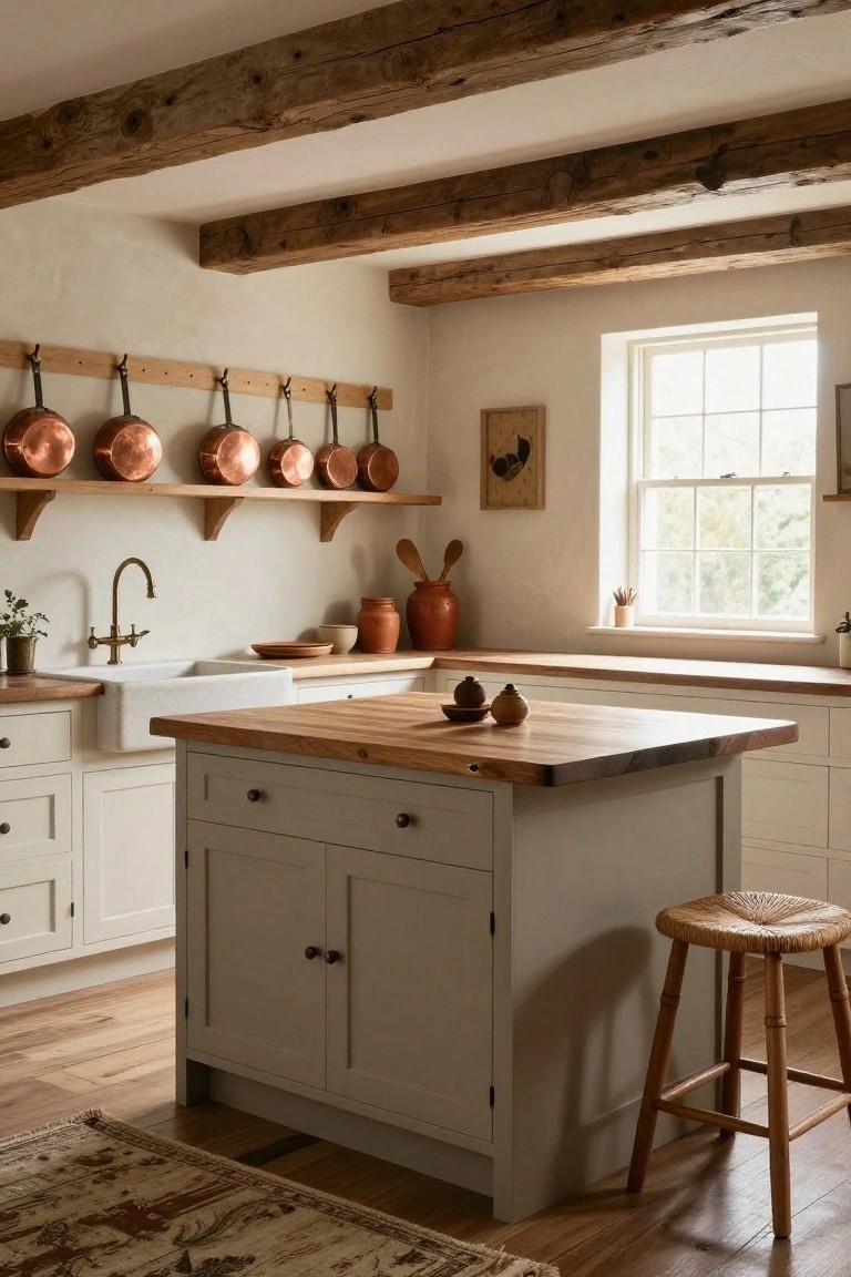
These cabinets pull off a soft blue-gray that’s a solid neutral choice for kitchens. It looks closest to Sherwin-Williams Sea Salt or Benjamin Moore Stonington Gray, maybe Behr Compass Gray too. What I like is how it stays calm and versatile, not too cool or chilly.
That subtle blue undertone shows up best against warmer woods like the walnut here. It works in brighter spaces where you want cabinets to blend back a bit, letting marble counters and brass pulls stand out. Just test samples in your light first.
Deep Charcoal Kitchen Cabinets
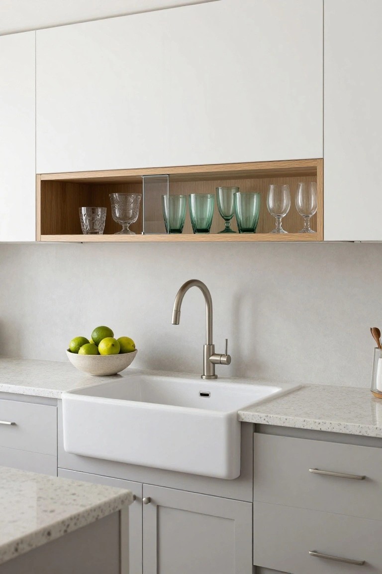
These cabinets use a deep charcoal gray paint that sits right on the edge of black. It reads very close to Sherwin-Williams Iron Ore or Benjamin Moore Kendall Charcoal, maybe even Farrow & Ball’s Railings. What makes it nice is how it anchors the kitchen without overwhelming the lighter walls and wood details.
That cool-leaning neutral tone holds up well in morning light. It pairs easy with beige plaster walls or terracotta floors like you see here. Just make sure your space has enough contrast so it doesn’t close in.
Soft Blue-Gray Upper Cabinets

This kitchen goes with a soft blue-gray on the upper cabinets. It looks closest to Sherwin-Williams Rain or Benjamin Moore Borrowed Light, maybe Behr’s Silver Screen too. That kind of muted blue-gray stays neutral enough for everyday use but adds a quiet cool note people notice without it taking over.
The cool undertone sits right against warmer wood cabinets below, keeping things balanced. It works best in rooms with good natural light, like near a window here. Pair it with creamy islands or white walls, and watch for it looking too chilly in dim spots.
Warm Gray Kitchen Cabinets

The cabinets in this kitchen are done up in a warm gray that’s neutral but not stark. It reads very close to Sherwin-Williams Repose Gray or Benjamin Moore Gray Owl, maybe even Behr’s Blank Canvas for a budget option. Folks like this color because it sits easy next to wood shelves and marble counters, keeping the whole space feeling light.
That warm undertone keeps it from looking cold, especially with ocean views bringing in bright light. It works best in kitchens with some natural wood or soft blues around. Just watch it doesn’t fade too much if your lighting is dim.
Deep Navy Kitchen Island

This kitchen island stands out with its deep navy cabinets. It looks closest to Sherwin-Williams Naval or Benjamin Moore Hale Navy, maybe even Farrow & Ball’s Hague Blue. That rich blue feels grounded and classic, especially when it’s just on the island like this.
The cool undertones keep it from going too dark next to those warm wood uppers. It works great with white subway tile and marble tops. Pair it with herringbone floors for extra warmth. Just make sure you have decent light, or it might read almost black.
Crisp White Cabinets
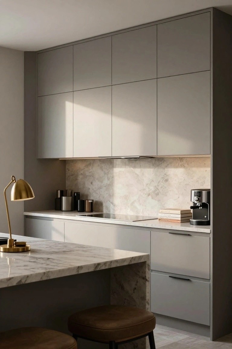
These cabinets show off a crisp white paint that’s close to Sherwin Williams Extra White or Benjamin Moore Chantilly Lace, maybe even Behr Ultra Pure White. It’s a bright neutral that feels clean and easy, the kind that makes a kitchen look bigger without trying too hard. That fresh white lets wood floors and simple plants take center stage.
This shade leans neutral with just a hint of coolness under the light, so it sits right next to warm oak without clashing. Kitchens with lots of windows love it best. Pair with rattan or linen for that lived-in feel, and skip anything too yellow if you want to keep it sharp.
Muted Blue Lower Cabinets

The lower cabinets in this kitchen use a soft muted blue that seems closest to Sherwin-Williams Rain or Benjamin Moore Palladian Blue. Or maybe Farrow & Ball’s Borrowed Light. It’s the kind of neutral blue-gray that’s quiet and easy on the eyes. People go for it when they want a little color that doesn’t shout.
That cool undertone keeps everything balanced against the creamy uppers and wood counters. Brightens up nicely near windows like this. Stick with brass pulls and keep wood tones warm. Avoid dark floors… it can feel a touch chilly there.
Soft Cream Cabinets with Black Island

This kitchen goes with soft cream cabinets up top and a black island down below. That cream is a warm off-white, the kind that feels cozy without going yellow. It looks closest to Sherwin Williams Alabaster or Benjamin Moore White Dove, maybe even Farrow & Ball Skimming Stone on a good day. The black on the island keeps things simple and grounded, reading like a true black such as Tricorn Black from Sherwin Williams.
The cream picks up the warmth from the oak floors and marble counters without clashing. Black adds weight to the island so it doesn’t float away. This combo works best in rooms with good natural light. Pair it with brass pulls like these, and skip anything too shiny on the counters.
Soft Pale Gray Cabinets

Those shaker cabinets here are painted in a soft pale gray. Looks closest to Sherwin-Williams Repose Gray or Benjamin Moore Gray Owl, maybe a touch of Farrow & Ball French Gray too. It’s a light cool neutral that feels clean but not chilly. What stands out is how it balances the oak worktop and blue tiles without overpowering them.
The cool undertone ties right into the pale blue floor and backsplash. Brightens up in natural light. Pair it with warm woods or a few plants to keep it cozy. Avoid too much stark white trim, or it might feel flat.
Creamy Off-White Cabinets
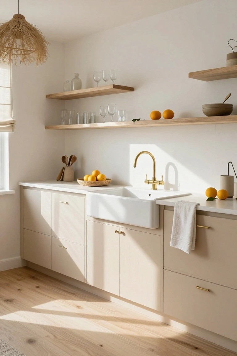
This kitchen uses a creamy off-white on the cabinets that looks closest to Benjamin Moore White Dove or Sherwin Williams Alabaster. Sometimes Farrow & Ball Slipper Satin fits the bill too. It’s a warm neutral with just enough depth to feel lived-in, not cold. People go for it because it brightens the whole space without washing out against wood or stone.
The subtle cream undertone shows best in good light, pulling a soft glow from the window. It works well next to dark counters like the black marble here, and gold pulls add nice contrast. In dimmer kitchens, pair it with warm bulbs to keep that cozy feel.
Sage Green Kitchen Cabinets

This kitchen goes with a soft sage green on most of the cabinets. It reads close to Sherwin-Williams Retreat or Benjamin Moore Saybrook Sage, maybe even Farrow & Ball French Gray. That muted green sits right in the neutral zone, not too bold but with enough color to keep things from going flat. Folks like it because it feels fresh without shouting.
The warm gray undertone plays nice in morning light, like you see here with the wood island and creamy trim. Pair it with natural oak counters or white sinks, and it stays balanced. Just test samples in your space first, since it can shift greener under LEDs.
Soft Greige Cabinets

These cabinets show off a soft greige paint that’s got that easy neutral vibe. It looks closest to Sherwin-Williams Agreeable Gray or Benjamin Moore Revere Pewter, maybe even Behr’s Silver Drop. What makes it nice is how it stays light without going stark white, and it just settles right into a busy kitchen setup.
The warm beige undertone keeps it from feeling cold next to wood tones like that walnut island. It works best in rooms with plenty of window light. Pair it with white counters and brass hardware, and you’re set… but test samples first if your space runs dim.
Pale Blue-Green Walls

The walls in this kitchen are a pale blue-green that’s right in the neutral zone. It reads very close to Sherwin-Williams Sea Salt or Benjamin Moore Palladian Blue, maybe Farrow & Ball Skylight too. It’s got that easy cool tone without going too icy, and it lets the creamy cabinets and wood floor stay front and center.
That grayish undertone keeps it from feeling too tropical. Pairs nicely with brass pulls or a copper pot like the one on the counter here. Works best in rooms with good natural light, where it picks up a bit of green. Just test it north-facing if your space runs cooler.
Frequently Asked Questions
Q: What if my kitchen gets tons of sunlight and neutrals look washed out?
A: Go for deeper taupes or warm grays that hold their depth. They ground the space without fading. Test samples at different times of day to see how light shifts them.
Q: Can I mix cabinet colors and still keep that effortless neutral vibe?
A: Pair a soft white on uppers with sage green lowers or light ash wood bases. The subtle shift adds interest. Keep hardware consistent to tie it all together.
Q: How do I add warmth to all-white neutrals without cluttering?
A: Introduce honey-toned wood accents on islands or open shelves. It brings cozy life right in.
Q: Do these ideas work in older kitchens with existing cabinets?
A: Refinish with a neutral stain over dated oak. But layer in matte black fixtures for modern edge.
