


I’ve always loved experimenting with color in my bedroom.
There is something about using two shades on a wall that makes the space feel playful yet polished.
I used to stick to plain single-color walls, but adding a second tone completely changed the vibe of my room.
Some people love bold contrasts, while I’m more into soft and layered combinations.
My favorite part is how a simple two-color design can make a room feel bigger and more interesting without spending a fortune.
I wanted to put together a list of ideas that actually work in real bedrooms and feel stylish but cozy.
These 19 two-color wall ideas are perfect if you want your space to feel fresh and full of depth.
You might find one that’s exactly what your bedroom has been missing.
Navy Focal Point with Crisp Vertical Trim

This bedroom showcases a clever take on the accent wall by using a centered panel of deep navy blue framed by thin white trim. The dark color is concentrated right behind the headboard, which creates a grounded focal point without making the entire room feel smaller. Surrounding walls are kept in a soft, warm greige that matches the floor-length curtains and helps the natural light from the window bounce around the space. Mixed textures like the chunky knit throw and the patterned grey rug add layers of comfort, while the wood dresser and indoor greenery bring in a touch of organic warmth.
I am honestly obsessed with how that simple white molding makes the blue paint look like a high-end custom installation. It is such a smart way to add architectural interest on a budget, and it really makes the bed feel like a cozy sanctuary tucked away from the rest of the world. The way the navy blue echoes the bedding creates a super cohesive vibe that feels polished but still totally lived in. I think this is a perfect example of how you can play with bold colors in a small dose to get that sophisticated, moody look without losing that bright and airy feeling we all love.
Earthy Tones and Bold Stripes for a Mid Century Vibe

This room nails the art of the “half-wall” paint job by adding a clever navy blue pinstripe right where the sage green meets the warm cream upper. The deep forest green acts as a grounded backdrop for the rich acorn wood tones of the bed frame and dresser, while those mustard velvet pillows provide the perfect pop of contrast. By keeping the darker shade on the lower half of the wall, the space feels cozy and intimate without sacrificing that airy and bright feeling near the ceiling. It is a brilliant way to play with geometry and color without needing a single drop of wallpaper.
I absolutely love how this setup feels like a warm hug from the 1970s but with a totally modern and clean twist. That little navy stripe is such a genius touch because it makes the whole wall look intentionally designed rather than just a simple paint project. There is something so satisfying about the way the snake plant and the round woven rug pull all those natural textures together. Honestly, it makes me want to grab a paintbrush and some painter’s tape immediately to give my own guest room this exact kind of sophisticated and soulful personality.
Geometric Color Blocking in Soft Pastels

This space features a bold mountain-inspired geometric accent wall that instantly draws the eye toward the bed area. By using a deep slate blue to cut diagonally across a soft dusty rose background, the room gains an architectural feel without needing any expensive construction or molding. The crisp lines of the triangle create a sharp focal point while the light wood furniture and cream textiles soften the overall aesthetic. A carefully curated gallery wall and a hanging macramé planter add layers of texture and personality that make the high ceilings feel cozy rather than cold.
I find this look so clever because it uses paint to act as a secondary headboard, which is such a budget-friendly hack. The contrast between the moody blue and the feminine pink feels modern and sophisticated rather than sugary sweet. I am always a fan of how a simple angled line can make a standard rectangular room feel like it has so much more dimension and character. It is exactly the kind of weekend project that delivers a massive payoff with just a couple of rolls of painter’s tape and some leftover paint.
Terracotta Sun Arch Accent

A large hand-painted terracotta circle serves as a clever focal point behind a light oak four-poster bed. This geometric statement piece works beautifully against a creamy off-white backdrop to mimic the warm glow of a setting sun. The room leans into an organic aesthetic by layering natural textures like a chunky jute rug, linen drapery, and a wooden stump side table. Touches of greenery and a simple round mirror balance out the bold color block while keeping the overall vibe feeling airy and grounded.
I think this approach is such a genius way to add a “wow” factor without committing to an entire room of dark paint. It feels like a warm hug every time you walk in, and the way that earthy clay tone plays off the natural wood grain just makes my heart happy. It’s the perfect solution for anyone who wants a bit of drama but still craves a bright and breezy sanctuary for sleeping.
Geometric Hourglass Accent in Soft Taupe

This design uses a clever geometric hourglass shape to break up the monotony of a flat wall and pull the eye toward the center of the room. By combining a light greige base with a deeper, earthy taupe, the wall gains a sense of architectural structure without needing any heavy molding or expensive materials. The crisp diagonal lines create a modern focal point that perfectly frames the bed, while the floating shelves and minimalist furniture maintain a clean, airy vibe throughout the rest of the space. It is a brilliant way to use paint to mimic the look of custom paneling or high-end wallpaper while keeping things totally fresh and contemporary.
I am a total sucker for a paint project that looks much more expensive than it actually was to pull off. There is something so satisfying about how those sharp triangles add a layer of sophistication that makes the whole room feel professionally curated. I also can’t get over how well the brass accents and leafy greens pop against those muted tones. It feels incredibly cozy yet sharp enough to impress anyone who catches a glimpse of your sanctuary. It really proves that you don’t need a massive budget to make a bold statement in your sleeping space.
Vertical Stripes in Teal and Sand

Classic stripes get a modern makeover when they stretch from floor to ceiling in these bold teal and sandy beige tones. The alternating wide bands create an immediate sense of height and architectural interest while acting as a striking backdrop for the warm wood tones of the sleigh bed. To keep the vibe feeling cozy rather than overwhelming, the rest of the room leans into soft textures like the chunky knit throw and the patterned area rug. This balance of sharp geometric lines on the wall and organic shapes from the Monstera plant and round mirror keeps the energy fresh and inviting.
I honestly feel like this look is such a clever way to add personality without cluttering up the room with extra furniture. Those stripes have a way of drawing the eye upward that makes even a standard ceiling height feel a bit grander. It strikes that perfect chord between being a total statement maker and a peaceful retreat for those at the end of a long day. I adore how the teal pops against the natural wood because it gives the whole setup a sophisticated yet playful edge that feels totally timeless.
Retro Olive Checkerboard Accent

This look brings a playful retro energy to the bedroom by using a bold olive green and crisp white checkerboard pattern on a single focal wall. The large scale of the squares adds a structured sense of depth that keeps the room from feeling flat while perfectly complementing the warm wood tones of the mid century modern furniture. Natural textures like the chunky knit throw blanket and the woven rattan pendant light soften the geometric lines of the wall. Lush greenery and mustard yellow accents pull the whole palette together for a cohesive organic feel.
I really appreciate how this design takes a risk with a classic pattern but keeps it feeling fresh and sophisticated through a clever choice of colors. The olive shade feels grounded and earthy rather than overwhelming, and it makes the wooden headboard pop in such a satisfying way. It gives off a cool boutique hotel vibe while still feeling incredibly cozy and lived in. I can definitely see myself waking up here feeling energized and ready to take on the day, surrounded by those stylish squares.
Retro Geometric Framed Accent

A bold pop of burnt orange takes center stage in this mid-century modern-inspired setup. The design uses a clever “frame within a frame” technique by bordering the vibrant orange square with a soft cream trim against the crisp white walls. Natural wood tones from the headboard and the rustic storage trunk at the foot of the bed ground the bright colors. Textured elements like the chunky knit throw and the black globe pendant light add layers of visual interest that make the space feel curated and intentional.
I honestly can’t get over how much energy this color combo gives off without feeling overwhelming. Using a painted border is such a genius way to ground a bright shade so it doesn’t just float aimlessly on the wall. It makes the bed feel like a cozy little island of style. I’m such a fan of how that deep orange mirrors the sunset vibes while the black accents keep everything looking sharp and modern.
Whimsical Lavender Arch Accent

This cozy setup uses a soft grey backdrop to let a bold painted arch do all the heavy lifting. Instead of painting a full accent wall, the dusty purple semi-circle creates a clever focal point right behind the bed. It acts like a budget-friendly headboard while grounding the gallery wall of botanical prints. The mix of natural wood furniture, a chunky knit throw, and a woven jute rug keeps the room feeling grounded and organic.
I honestly can’t get enough of how a simple geometric shape makes the whole room feel professionally designed without a massive price tag. Purple can sometimes feel a bit much in a bedroom, but this muted lilac shade hits that perfect sweet spot between playful and sophisticated. It makes the sleeping area feel like its own little private sanctuary, and that pop of color against the neutral wall gives me so much inspiration for my next weekend DIY project.
Burnt Orange Zigzag Statement Wall

Bold geometric patterns aren’t just for wallpapers, and this oversized chevron design proves it. A burnt orange meets a soft cream base to create a focal point that acts as a giant piece of art right behind the headboard. The look relies on earthy tones like olive green and clay to ground the energy of the stripes. Natural textures from the rattan mirror and the chunky knit throw blanket balance the sharp lines of the paint job. It is a brilliant way to play with two colors without making the room feel too busy or overwhelming.
I honestly get such a kick out of how this wall acts as its own headboard because it saves so much space and money. There is something so playful about the way the zigzags lead your eye upward and make the ceiling feel miles high. I find the mix of that spicy orange with the calming green pillows to be the perfect recipe for a room that feels both energized and cozy. It feels like a space where you could actually wake up feeling refreshed and ready to take on the day.
Forest Green Vertical Stripes
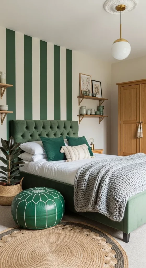
Vertical stripes in deep forest green and soft cream act as a bold focal point behind the bed. This design choice draws the eye upward and makes the ceiling feel much higher than it actually is. The rich velvet textures of the tufted headboard and matching throw pillows complement the painted stripes perfectly. Natural wood accents in the shelving and wardrobe provide a warm contrast to the cooler green tones. Touches of gray in the chunky knit blanket and woven jute rug ground the room and add layers of tactile comfort.
I admire how this bold pattern manages to feel incredibly calming and sophisticated. It reminds me of a modern boutique hotel where every little detail is intentional, but nothing feels too stiff. Using stripes as an accent wall is such a clever way to add personality without having to commit to a busy wallpaper. I really enjoy how the green shades play off the natural textures of the plants and baskets to create a fresh garden vibe indoors.
Dusky Rose and Charcoal Color Blocking

The color palette in this room works so well because it balances soft femininity with a grounded neutral tone. A horizontal split wall creates an instant focal point that doubles as a visual headboard for the low wooden bed frame. The top section uses a muted dusty pink, while the bottom half anchors the space with a deep slate grey. To add a clever bit of detail, a thin stripe of pink runs through the grey section to keep the two colors feeling connected. Natural wood elements like the platform bed and the woven armchair bring in much-needed warmth to prevent the cool tones from feeling flat.
I am convinced that this layout makes a small space feel much more expansive than it actually is. It reminds me of a calm sunset over a rocky coastline, which is exactly the kind of vibe I want when I am trying to unwind after a long day. The way the framed art and the minimal clock are perfectly aligned with the paint line shows such a fun attention to detail. It feels modern and fresh without trying too hard, and it gives off that effortlessly cool Scandinavian energy that makes a home feel so inviting.
Diagonal Moss Green Accent Wall

A bold diagonal line transforms this sleeping space into a modern sanctuary by pairing a rich forest green with a soft almond white. The paint doesn’t just sit there but actually mimics the shape of a mountain or a structural architectural element that gives the room an immediate sense of purpose. This clever use of color blocking extends behind the wooden shelving to create a unified zone for decor and greenery. Warm oak furniture and a textured woven light fixture round out the organic vibe, while a thick tasseled throw blanket adds that necessary touch of softness.
I am such a fan of how this look proves you don’t need a massive budget to make a huge impact in a small room. Using paint to create a fake headboard is a total genius move that keeps the floor plan feeling open and uncluttered. It makes me feel like I’m retreating into a high-design boutique hotel every single night. If you’re looking for a way to liven up a plain white box, this sharp angle is the perfect way to add some serious drama without needing a single power tool.
Mustard Yellow Painted Frame Detail

The walls utilize a clever painted border technique to create a focal point without the need for an expensive headboard. A warm mustard yellow rectangle is framed by a crisp white stripe which helps it pop against the off white background. This geometric approach adds a layer of architectural interest to the room while keeping the vibe grounded and earthy. The use of natural textures like a chunky knit throw and a woven basket complements the golden tones and brings a sense of organic warmth to the entire arrangement.
I honestly can’t look away from how this sunny yellow shade makes the whole room feel like it is glowing from the inside out. It is such a genius way to make a statement on a budget because all you really need is some painters tape and a steady hand. The way the landscape art sits perfectly inside that painted frame feels so intentional and high design. It gives me all the cozy autumn vibes year round and makes the bed look like the most inviting spot on the planet.
Geometric Color Blocking in Teal and Sand

Geometric shapes aren’t just for math class anymore. This design uses a bold hourglass shape to turn a plain wall into the main event without needing a single piece of expensive art. By pairing a deep teal with a soft sandy beige, the room gains an instant sense of architectural interest. The sharp lines pull the eye toward the center of the room, which creates a cool focal point for the dresser and mirror. To keep things from feeling too stiff, the rest of the space uses soft textures like a chunky knit throw and a vintage-inspired rug to balance out those crisp painted edges.
I’m impressed by how a little painter’s tape can totally transform a boring flat surface. There is something so clever about using paint to mimic depth instead of buying more furniture or heavy decor. It feels fresh and youthful but still very grounded because of those earthy tones. I would probably spend way too much time admiring those perfect points while lounging in bed with a coffee. It is such a smart way to make a statement on a budget while still looking like you hired a pro designer.
Lavender and Grey Vertical Stripes

Vertical stripes in soft lavender and dove grey turn a plain bedroom wall into a playful focal point without overwhelming the senses. The uniform width of the bands draws the eye upward to make the ceiling feel taller while providing a structured backdrop for the minimalist wooden bed frame and white dresser. Natural textures like the chunky knit throw and the woven jute rug ground the whimsical colors to create a balanced look that feels both curated and comfortable. Simple botanical prints and light wood accents keep the aesthetic airy and modern.
I honestly believe there is something so magical about using stripes to add dimension to a small room. The way these two muted tones play off each other gives the wall a rhythmic energy that plain paint just cannot match. It reminds me of a high-end boutique hotel but with all the warmth of a lived-in home. I find myself gravitating toward this specific palette because it feels fresh and feminine without being too sweet. It is the kind of design that makes me want to curl up with a good book and enjoy the peaceful atmosphere.
Mustard Yellow Waves and Mid Century Modern Charm

Organic shapes meet retro vibes in this playful bedroom setup. The accent wall uses a bold mustard yellow and a creamy off-white to create large wavy patterns that instantly make the room feel taller and more dynamic. Pairing these fluid lines with the structured look of a walnut slatted bed frame and a matching dresser keeps the energy grounded. The geometric rug pulls all the colors together while adding a touch of pattern that balances the smooth curves on the wall. Floating shelves filled with earthy ceramics and tiny greens add that lived-in texture that every bedroom needs.
I honestly can’t stop smiling at how much personality this color combo has. It reminds me of a warm sunset or a vintage 70s postcard, but it feels totally fresh for today. I’m usually a bit nervous about using bright yellow in a sleeping space because it can be overwhelming. However, the way these soft curves break up the color makes it feel like a giant hug rather than a loud wake-up call. It’s the perfect mix of quirky and sophisticated that makes me want to spend my entire Sunday morning right here with a good book.
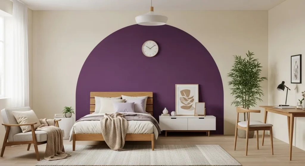
Royal Purple Arch Accent

A bold purple arch painted directly onto a neutral cream wall serves as a clever focal point behind a mid-century modern wooden sideboard. The deep violet hue creates an instant sense of architectural interest without the need for expensive structural changes. Natural textures like the chunky knit throw, woven plant basket, and light oak bed frame balance the intensity of the paint. Simple decor pieces, including a minimalist wall clock and a framed botanical print, are placed thoughtfully within the arch to anchor the entire look.
I find myself gravitating toward this specific design because it manages to feel incredibly playful and sophisticated at the same time. Using a rounded shape instead of a standard rectangular accent wall adds a soft touch that mimics the curves of the ceiling light and the rounded edges of the furniture. It is such a smart way to zonethe room and give a simple dresser its own little stage to shine on.
Diagonal Sage and Cream Stripes

Diagonal stripes offer a playful twist on traditional accent walls by drawing the eye upward and across the room. This specific design pairs a soft sage green with a creamy off-white to create a pattern that feels energetic yet grounded. The sage tones are mirrored in the bedding and pillows, while natural wood textures and woven wicker furniture add warmth to the overall palette. A large geometric rug ties all the colors together and provides a nice foundation for the light colored wardrobe and minimalist shelving.
I’m such a big believer in using patterns to wake up a sleepy corner, and this striped wall does exactly that without being too loud. It gives the room a sense of movement that straight horizontal or vertical lines just can’t quite capture. The way the green hues play off the indoor plants makes the whole space feel like a fresh garden retreat. To me, this is the perfect balance of quirky and sophisticated for anyone who wants a bedroom with a real personality.
