


I have always believed that paint is the easiest way to completely change the mood of a room.
One clever sweep of color across a wall and ceiling can make a space feel framed, cozy, and intentionally designed without adding a single extra piece of furniture.
I love how this trick creates instant architecture, even in the simplest rooms.
If you are into spaces that feel styled but still effortless, this idea is about to become your new favorite move.
Some of these looks are bold and dramatic, others are soft and subtle, but every single one proves that a little paint can go a very long way.
I cannot wait for you to see how powerful one wall and a matching ceiling can really be.
Moody Blue Bedroom Nook With Framed Ceiling Detail

This bedroom features a recessed nook painted in a rich dusty blue that wraps across the back wall and continues onto the ceiling inside the alcove. The surrounding walls remain crisp white, which makes the blue feel like a built in frame around the bed. The color adds depth without overwhelming the small space, and the clean lines keep everything looking modern and intentional. Soft neutral bedding and a simple bedside lamp balance the bold paint choice beautifully.
I honestly love how this makes the bed feel tucked away in its own little retreat. It feels cozy in the most grown up way, like a boutique hotel moment right at home. The contrast between the white walls and the blue frame is so satisfying to my eyes. If I had a small bedroom nook like this, I would absolutely copy this idea in a heartbeat.
Warm Terracotta Dining Frame With Matching Ceiling
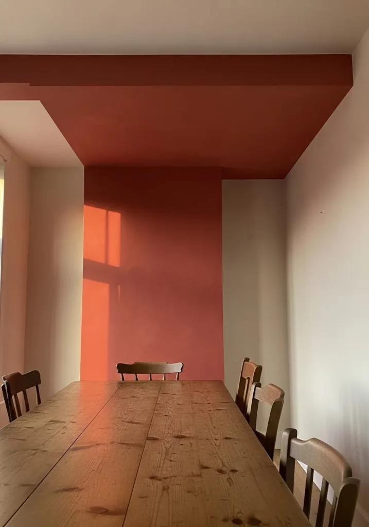
In this dining space, a rich terracotta tone covers one end wall and continues seamlessly across the ceiling above the table. The surrounding walls remain light and neutral, which makes the color block feel bold but balanced. The paint visually anchors the long wooden table and chairs, almost like a built in canopy over the dining area. Natural light enhances the warm tone and gives the whole room a welcoming glow.
I am such a fan of this look because it makes everyday dinners feel special. The color adds depth and warmth without adding clutter, and it defines the dining zone in a really clever way. It feels cozy, stylish, and a little bit unexpected. For anyone who wants their dining room to feel more intimate and designed, this approach is pure magic.
Deep Charcoal Feature Wall And Ceiling For A Dramatic Office Corner
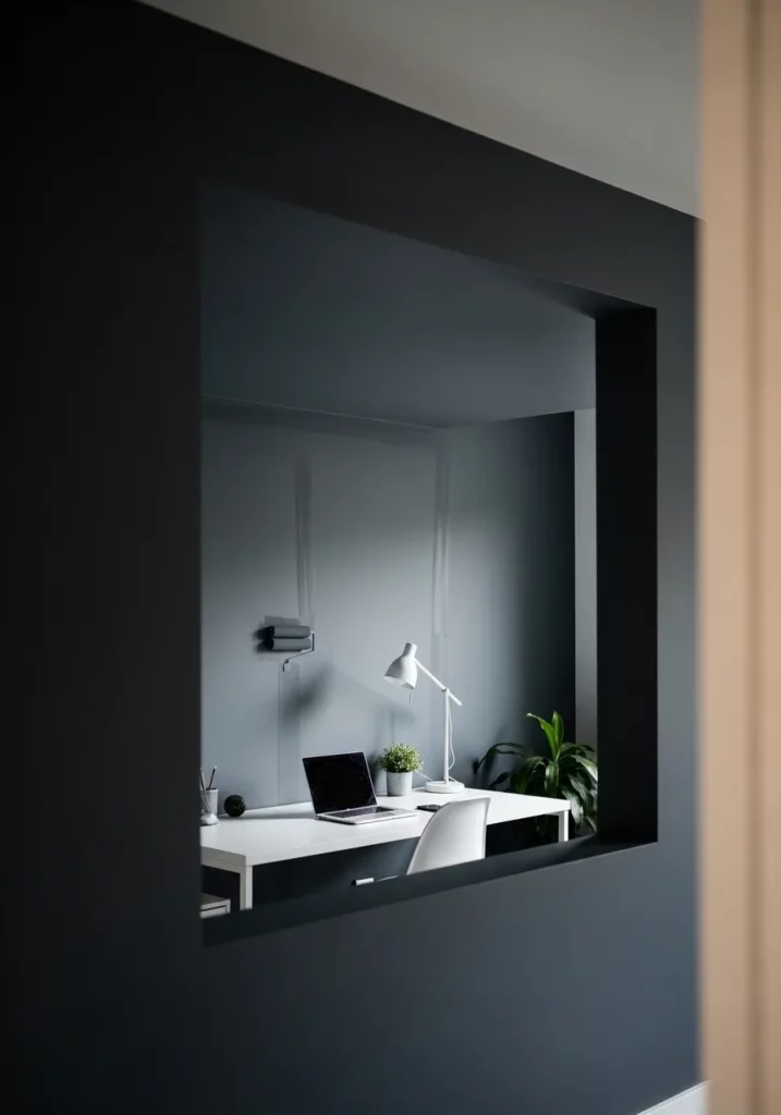
This moody charcoal shade covers a single wall and extends over the ceiling of a recessed office nook, instantly creating depth and contrast. The dark paint frames the window like a picture and makes the lighter desk and decor stand out beautifully. The rest of the space remains bright, which keeps the overall look from feeling heavy. It is bold, modern, and incredibly chic.
I love how this design proves that dark colors can feel cozy instead of gloomy. The way it hugs the workspace makes it feel focused and intentional, almost like your own little creative studio at home. It has that cool, editorial vibe while still being practical. If you want your home office to feel inspiring and elevated, this is such a powerful choice.
Blush Pink Entryway Frame With Ceiling Accent
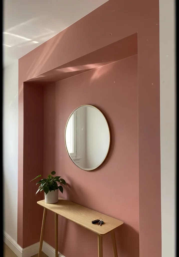
A soft blush pink wraps around one wall of this entryway and flows right onto the ceiling, creating a framed moment around a slim console table and round mirror. The surrounding walls stay light, which makes the pink pop in a gentle and elegant way. The color defines the small area without the need for extra decor, letting simple accessories shine.
I think this is such a charming way to welcome guests into your home. The pink feels warm and inviting without being too sweet, and the ceiling detail makes the whole setup look custom. It turns a small, often overlooked entry into a stylish statement. Honestly, I would smile every time I walked through this door.
Terracotta Wrapped Reading Nook
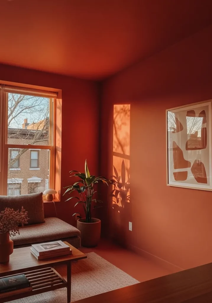
This cozy corner is drenched in a rich terracotta tone that flows seamlessly from one wall up onto the ceiling, creating a warm little cocoon by the window. The color frames the seating area beautifully, making the natural light feel even softer and more golden. Paired with light wood accents, a simple coffee table, and a few leafy plants, the bold paint choice feels grounded rather than overwhelming. The contrast between the saturated wall and the crisp white trim keeps everything looking intentional and polished.
I absolutely love how this design turns a small nook into a full mood. It feels like the perfect spot to sip tea, journal, or just stare out the window on a slow afternoon. The ceiling color makes the space feel hugged in the best way, and honestly, I think more rooms deserve this kind of fearless warmth.
Soft Mocha Accent That Climbs Upward

Here, a velvety mocha shade covers one main wall and continues onto the ceiling above the sofa, subtly framing the seating zone. The rest of the room stays light with pale flooring and a creamy couch, which allows the darker paint to anchor the space without making it heavy. Sunlight streaming in casts gentle shadows that add depth and dimension to the painted surfaces. The overall effect feels modern, calm, and thoughtfully layered.
I find this look so effortlessly chic. It proves that you do not need bright colors to make a statement. Extending the wall color onto the ceiling creates a quiet drama that feels grown up and cozy at the same time. It is the kind of living room that makes you want to curl up with a blanket and stay awhile.
Taupe Framed Kitchen Transition
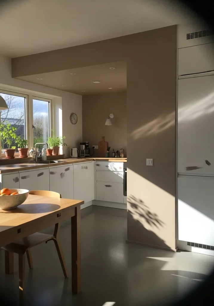
In this open kitchen layout, a warm taupe shade wraps one structural wall and continues across the ceiling above the cooking zone, visually separating it from the rest of the home. The cabinetry remains light and fresh, which keeps the deeper color from overpowering the space. Natural light from nearby windows highlights the subtle undertones in the paint, making the transition feel smooth and intentional rather than abrupt.
What I adore about this idea is how clever it feels. Instead of building a divider, the paint does all the work. It frames the kitchen area so beautifully while still keeping everything open and airy. It is such a smart trick for defining spaces in a modern home without sacrificing flow.
Sky Blue Ceiling Nook for Playful Charm
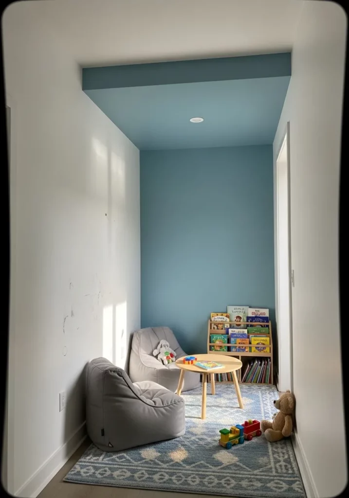
This narrow alcove becomes instantly more inviting thanks to a soft sky blue paint that stretches from the back wall onto the ceiling. The surrounding white walls keep the space feeling bright, while the gentle blue creates a sweet little zone perfect for a bean bag and toys. The color choice adds personality without overwhelming the compact area, and the ceiling extension makes the nook feel intentional rather than leftover.
I think this is such a fun way to give kids their own little world. The blue overhead feels almost like a patch of sky tucked inside the house. It is playful, calming, and just different enough to make the space feel special without needing a lot of decor.
Deep Emerald Hallway Cocoon
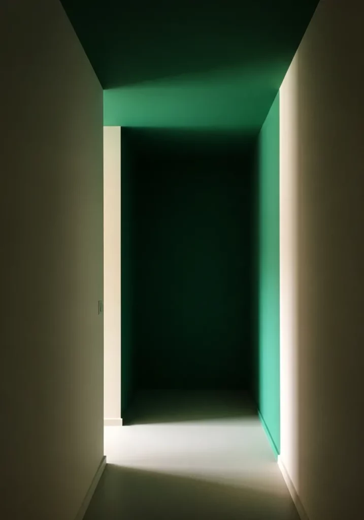
This dramatic hallway uses a saturated emerald tone that wraps the end wall and ceiling, creating a bold tunnel effect. The surrounding lighter walls heighten the contrast, drawing the eye straight through the space. Soft lighting at the base adds a subtle glow that enhances the richness of the green and makes the corridor feel more like a design feature than just a pass through.
I love how daring this one feels. Hallways are usually forgotten, but this treatment turns it into a moment. The ceiling color pulls you forward and makes the whole space feel immersive and a little mysterious in the best way.
Golden Ochre Bedroom Frame

In this serene bedroom, a golden ochre shade highlights the wall behind the bed and stretches across the ceiling above it, framing the sleeping area like a warm canopy. The rest of the walls remain light, which keeps the room feeling open and breathable. As sunlight filters in, the paint glows softly, enhancing the cozy textures of the bedding and creating a peaceful atmosphere.
This design feels like a warm hug at the end of a long day. I adore how the ceiling color makes the bed feel extra tucked in and intimate. It is such a simple idea, yet it completely transforms the mood of the room into something deeply comforting.
Charcoal Ceiling That Grounds the Living Room

This contemporary living room uses a deep charcoal tone across one wall and the ceiling above the fireplace area, giving the space a strong architectural frame. The remaining walls stay light, allowing the dark paint to define the seating zone without shrinking the room. The contrast highlights the clean lines of the fireplace and furniture, creating a sleek and balanced look.
I am honestly such a fan of this bold move. Dark ceilings can sound intimidating, but here it just works. It adds depth, sophistication, and a bit of edge while still feeling welcoming. It makes the entire living room look styled and intentional.
Layered Olive Dining Alcove

This dining space features a rich olive green that coats the back wall and extends onto the ceiling, creating a cozy alcove effect around the wooden table. The layered tones within the green add subtle texture, while the surrounding white walls keep everything fresh. Natural wood furniture pops beautifully against the earthy backdrop, making the dining area feel grounded and inviting.
I think this is such a gorgeous way to make a dining space feel intimate. The ceiling color pulls everything together and makes the table feel like the heart of the room. It is warm, stylish, and perfect for long dinners that turn into even longer conversations.
Soft Beige Cocooned Bedroom Nook

This serene bedroom uses a warm beige tone that wraps from the back wall up onto the ceiling inside a recessed alcove, instantly framing the bed like a built in retreat. Crisp white surrounding walls keep the look airy while the color block creates depth and intimacy. Natural light bounces softly off the ceiling, giving the small space a gentle glow that feels calm and grounded. The simplicity of the palette allows the textures of bedding and wood accents to really shine.
I love how this design makes a small sleeping area feel intentional instead of squeezed in. It feels like a hug in room form. The ceiling color pulls everything together in such a subtle way, and it proves that you do not need bold patterns to make a statement. Sometimes a quiet wash of color is exactly what makes a space feel special.
Dusty Rose Framed Living Lounge

A muted dusty rose stretches across one feature wall and continues onto the ceiling above a built in seating niche, forming a soft architectural frame within the living room. The color defines the cozy corner without the need for extra partitions, while neutral furnishings balance the warmth. Clean lines and minimal decor let the pink tone act as both backdrop and design moment.
There is something so chic about using color to carve out a space like this. I can imagine curling up here with coffee and a good book. The blush tone feels playful but still grown up, and carrying it onto the ceiling makes the whole nook feel thoughtfully styled instead of randomly painted.
Moody Blue Bathroom Accent Block

In this bathroom, a deep blue tone covers the upper wall and extends across the ceiling above the vanity zone, creating a bold block of color against classic white tile. The contrast feels crisp and modern, while the rounded mirror and simple fixtures soften the overall look. The color placement visually lowers the ceiling just enough to make the vanity area feel intimate and defined.
I think this is such a smart way to add drama without overwhelming a small bathroom. The blue instantly draws your eye, yet it still feels polished and clean. It is proof that even practical spaces deserve a little personality, and I adore how confident this choice feels.
Plum Framed Attic Bedroom

A rich plum shade wraps around the angled wall and ceiling in this attic bedroom, embracing the unique roofline instead of fighting it. The color highlights the geometry of the space and turns what could feel awkward into a design feature. Soft bedding and warm bedside lighting balance the bold tone, making the room feel snug rather than dark.
I am obsessed with how this turns an attic into the coziest hideaway. Instead of trying to hide the sloped ceiling, the color celebrates it. It feels dramatic in the best way, like a boutique hotel tucked under the eaves.
Minimalist Gray Dining Frame

A soft gray panel extends from one dining room wall onto a dropped ceiling section, creating a visual frame above the table. The rest of the room stays bright and neutral, allowing the subtle contrast to define the dining zone. Clean wooden furniture and simple pendant lighting keep the look Scandinavian and uncluttered.
This is the kind of understated idea that quietly elevates a room. I love how it anchors the dining table without adding bulk or heavy decor. It feels calm, balanced, and incredibly sophisticated while still being easy to recreate.
Mint Green Bay Window Highlight

A fresh mint green surrounds the bay window and continues onto the ceiling inside the nook, transforming it into a charming focal point. The color draws attention to the architectural detail and enhances the natural light pouring through the windows. Soft furnishings in neutral tones keep the look sweet and inviting.
I cannot get over how cheerful this feels. The mint shade makes the window seat look like its own little world within the room. It is bright but still soothing, and it would make any morning coffee feel just a bit more magical.
Warm Wood Toned Reading Corner

This cozy reading nook is wrapped in rich wood tones that extend from the walls up across the ceiling, creating a cabin like atmosphere within the larger home. The built in bench and warm lighting amplify the snug effect, while the framed window brings in golden light that enhances the natural hues. The ceiling color ties the entire alcove together beautifully.
I absolutely adore how intimate this space feels. It is like having a tiny retreat right inside your home. The way the ceiling matches the walls makes it feel intentional and cocooned, and I can already picture rainy afternoons spent here with a blanket and a novel.
Deep Teal Passageway Frame

A deep teal shade covers one wall and continues across the ceiling in a hallway opening, visually framing the transition between rooms. The bold color contrasts with pale surrounding walls, making the doorway feel architectural and dramatic. Simple decor and light wood flooring prevent the space from feeling heavy.
This idea feels so clever to me because hallways are often overlooked. By carrying the color onto the ceiling, the passage instantly feels styled and purposeful. It adds depth and personality in a spot that usually gets ignored, and I love how it turns a simple walkway into a statement moment.
